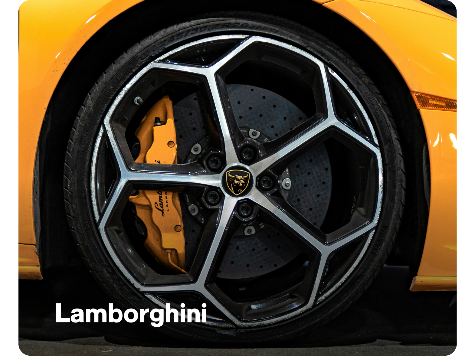
This was a self-initiated concept to push my thinking and design skills further. As an admirer of supercars, I’ve always been drawn to Lamborghini. Not just for the performance, but for the presence. The way each car feels deliberate, aggressive, and unmistakable from every angle.
That character can be traced back to its origins. The company was founded by Ferrucio Lamborghini, originally building tractors from surplus military machinery after the war. Known for his attention to engineering and quality, he eventually turned his focus to cars; driven by his frustrations with what was already on the market, particularly from Ferrari.
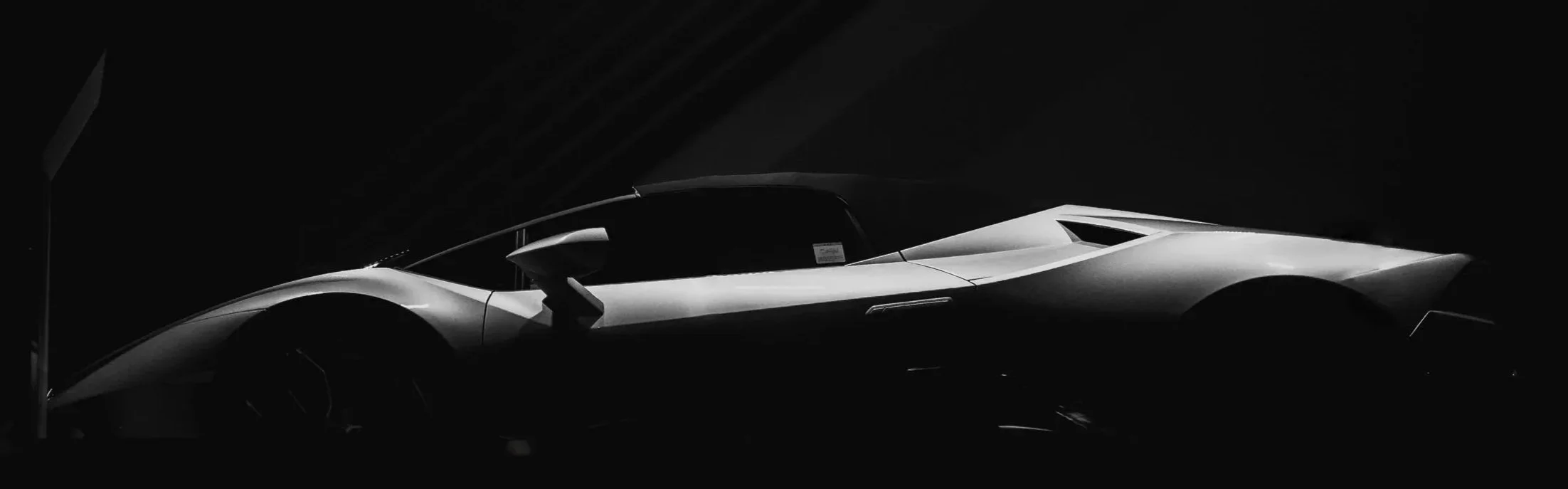
What followed was a shift in tone within the industry. Lamborghini didn’t just aim to compete, it approached design differently. Lower, wider, sharper. Cars that felt more like statements than machines. That mindset carried through the decades, shaping some of the most distinctive and aggressive forms in automotive design. That same thinking became the starting point for this project.
The aim was to reimagine the badge in a more modern and refined direction, while still holding onto the presence and heritage that defines it. I wanted to bring the Raging Bull closer, and make it feel more immediate and imposing.
The story behind one of the most
recognisable marques
The story behind one of the most recognisable marques
This was a self-initiated concept to push my thinking and design skills further. As an admirer of supercars, I’ve always been drawn to Lamborghini. Not just for the performance, but for the presence. The way each car feels deliberate, aggressive, and unmistakable from every angle.
That character can be traced back to its origins. The company was founded by Ferrucio Lamborghini, originally building tractors from surplus military machinery after the war. Known for his attention to engineering and quality, he eventually turned his focus to cars; driven by his frustrations with what was already on the market, particularly from Ferrari.
What followed was a shift in tone within the industry. Lamborghini didn’t just aim to compete, it approached design differently. Lower, wider, sharper. Cars that felt more like statements than machines. That mindset carried through the decades, shaping some of the most distinctive and aggressive forms in automotive design. That same thinking became the starting point for this project.
The aim was to reimagine the badge in a more modern and refined direction, while still holding onto the presence and heritage that defines it. I wanted to bring the Raging Bull closer, and make it feel more immediate and imposing.
Reframing the bull,
without losing its power
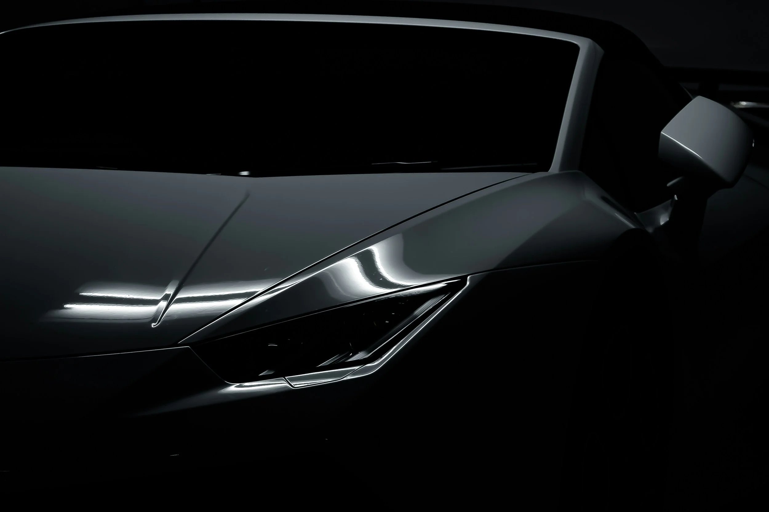
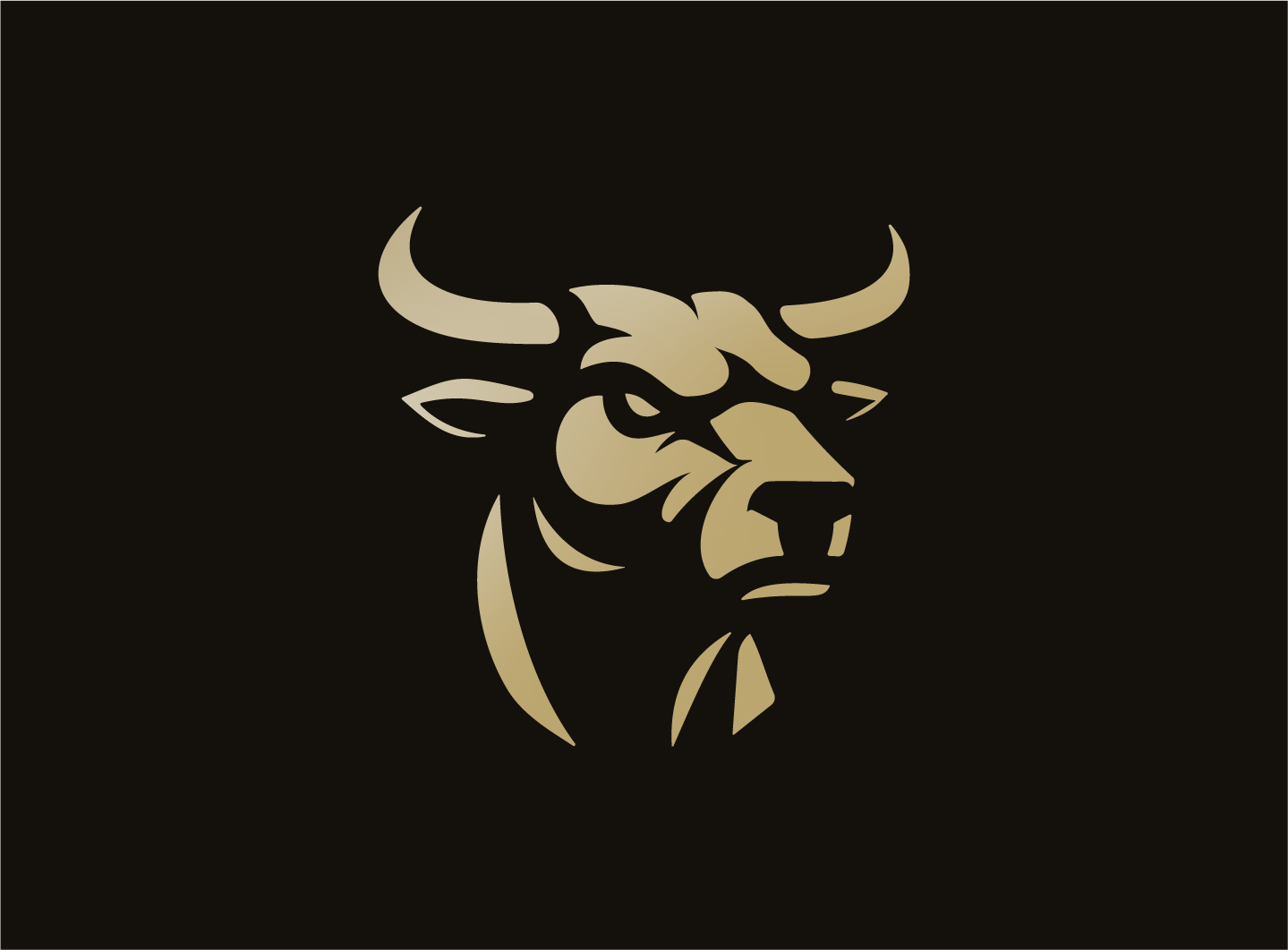
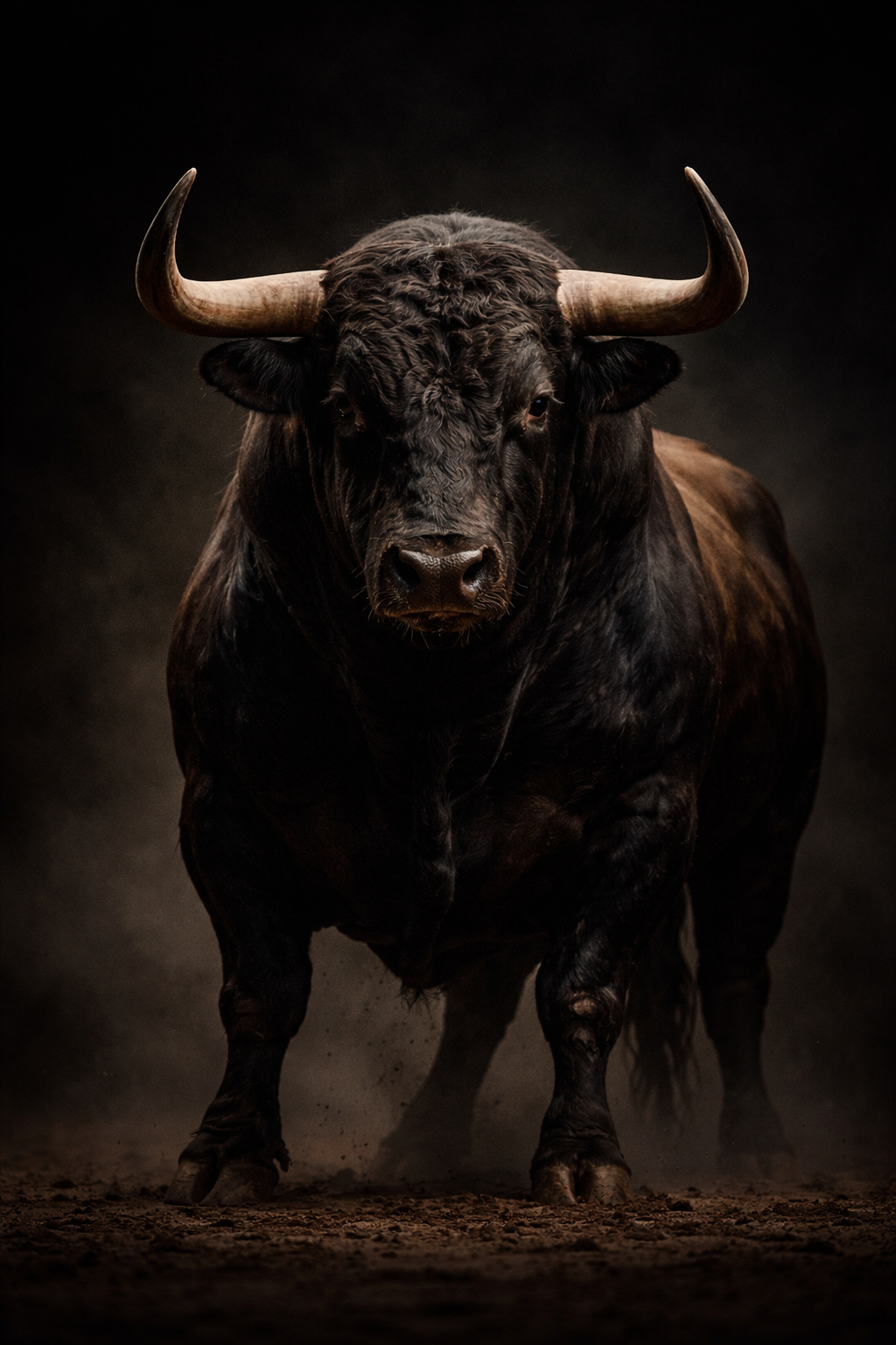
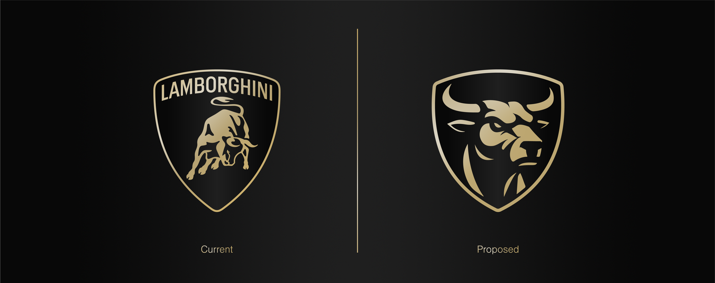
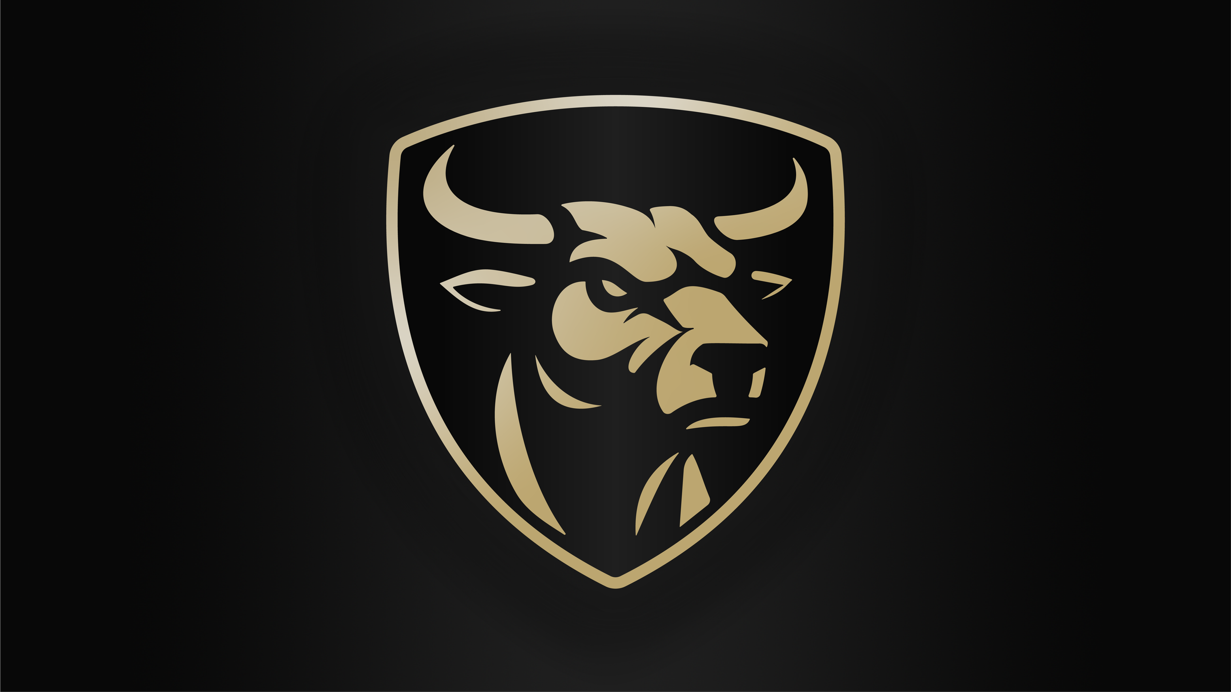
he Raging Bull has always been central to the brand’s identity. Traditionally, it’s shown in motion. Charged with energy and mid-attack, it represents speed, aggression, and raw power. It reflects what the cars are known for.
But looking at Lamborghini more closely, that sense of power is not limited to movement. Even when still, the cars feel imposing. Low, wide, and sharply contoured, they carry a presence that doesn’t rely on speed to be understood. That became the starting point for the redesign.
The bull was reframed to reflect that same idea. Rather than showing it in motion, the focus shifted onto the head. More controlled, but still dominant. It brings the viewer closer and creates a more direct interaction, while still holding that sense of strength and unpredictability. The expression plays an important role in that. It needed to feel calm, but not passive. There’s a tension to it, as if the energy is contained rather than released. Something that feels powerful without needing to prove it.
That thinking carries through into the form itself. The shape of the bull draws from the same langauge as the cars. Sharp edges balanced with flowing curves, with only key features highlighted. It keeps the mark focused while giving it a more sculpted and dramatic feel.
The result is a reinterpretation that shifts the emphasis. Less about movement, more about presence. Bringing the bull closer and allowing it to hold its ground.
The Raging Bull has always been central to the brand’s identity. Traditionally, it’s shown in motion. Charged with energy and mid-attack, it represents speed, aggression, and raw power. It reflects what the cars are known for.
But looking at Lamborghini more closely, that sense of power is not limited to movement. Even when still, the cars feel imposing. Low, wide, and sharply contoured, they carry a presence that doesn’t rely on speed to be understood. That became the starting point for the redesign.
The bull was reframed to reflect that same idea. Rather than showing it in motion, the focus shifted onto the head. More controlled, but still dominant.
It brings the viewer closer and creates a more direct interaction, while still holding that sense of strength and unpredictability. The expression plays an important role in that. It needed to feel calm, but not passive. There’s a tension to it, as if the energy is contained rather than released. Something that feels powerful without needing to prove it.
That thinking carries through into the form itself. The shape of the bull draws from the same language as the cars. Sharp edges balanced with flowing curves, with only key features highlighted. It keeps the mark focused while giving it a more sculpted and dramatic feel.
The result is a reinterpretation that shifts the emphasis. Less about movement, more about presence. Bringing the bull closer and allowing it to hold its ground.

Alongside the bull, the badge itself was carefully reconsidered. The shield was widened slightly to give
the mark more presence, but also to better frame the bull. It centres the form confidently, as if the bull is taking control and demanding the space it sits within. The points were also sharpened to bring a more aggressive edge, aligning it closer to the character of the vehicles.
The outer border was thickened to add a sense of weight and strength. This helps the badge hold it’s structure more confidently, particularly at smaller sizes, while reinforcing that sense of durability. The wordmark was removed entirely. There was some exploration around including the name using the La Macchina typeface, as seen on the cars themselves, but it introduced issues with scalability. Stripping it back allowed the mark to function more cleanly, while giving the bull more space to take focus. Lamborghini is already recognisable without it, so the badge becomes simpler, stronger, and more effective across different applications.
The original black and gold palette was retained. It’s a defining part of the brand, and keeping it ensures the design still feels familiar and connected to it’s heritage. The result is a more focused and refined badge. One that keeps the identity intact, while pushing it towards a more modern and confident direction.
Sharpening the identity without losing recognition
Alongside the bull, the badge itself was carefully reconsidered. The shield was widened slightly to give the mark more presence, but also to better frame the bull. It centres the form confidently, as if the bull is taking control and demanding the space it sits within. The points were also sharpened to bring a more aggressive edge, aligning it closer to the character of the vehicles.
The outer border was thickened to add a sense of weight and strength. This helps the badge hold it’s structure more confidently, particularly at smaller sizes, while reinforcing that sense of durability. The wordmark was removed entirely. There was some exploration around including the name using the La Macchina typeface, as seen on the cars themselves, but it introduced issues with scalability. Stripping it back allowed the mark to function more cleanly, while giving the bull more space to take focus. Lamborghini is already recognisable without it, so the badge becomes simpler, stronger, and more effective across different applications.
The original black and gold palette was retained. It’s a defining part of the brand, and keeping it ensures the design still feels familiar and connected to it’s heritage. The result is a more focused and refined badge. One that keeps the identity intact, while pushing it towards a more modern and confident direction.


More projects worth exploring