Understanding the machine,
and what makes it worth capturing
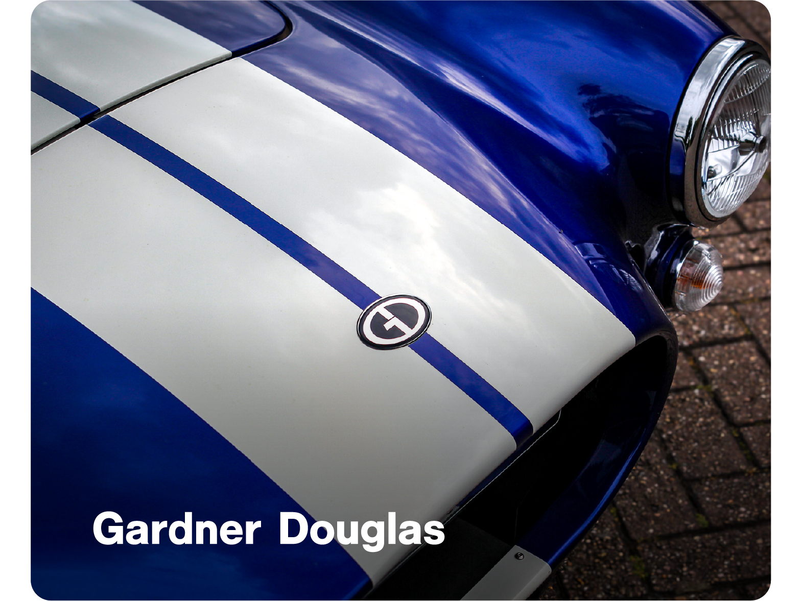
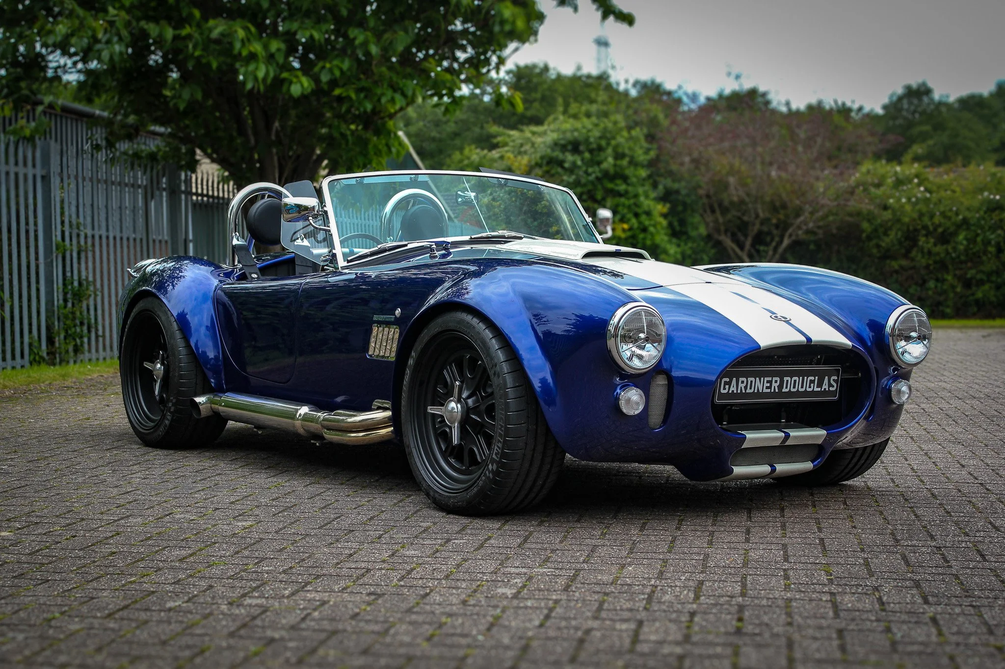
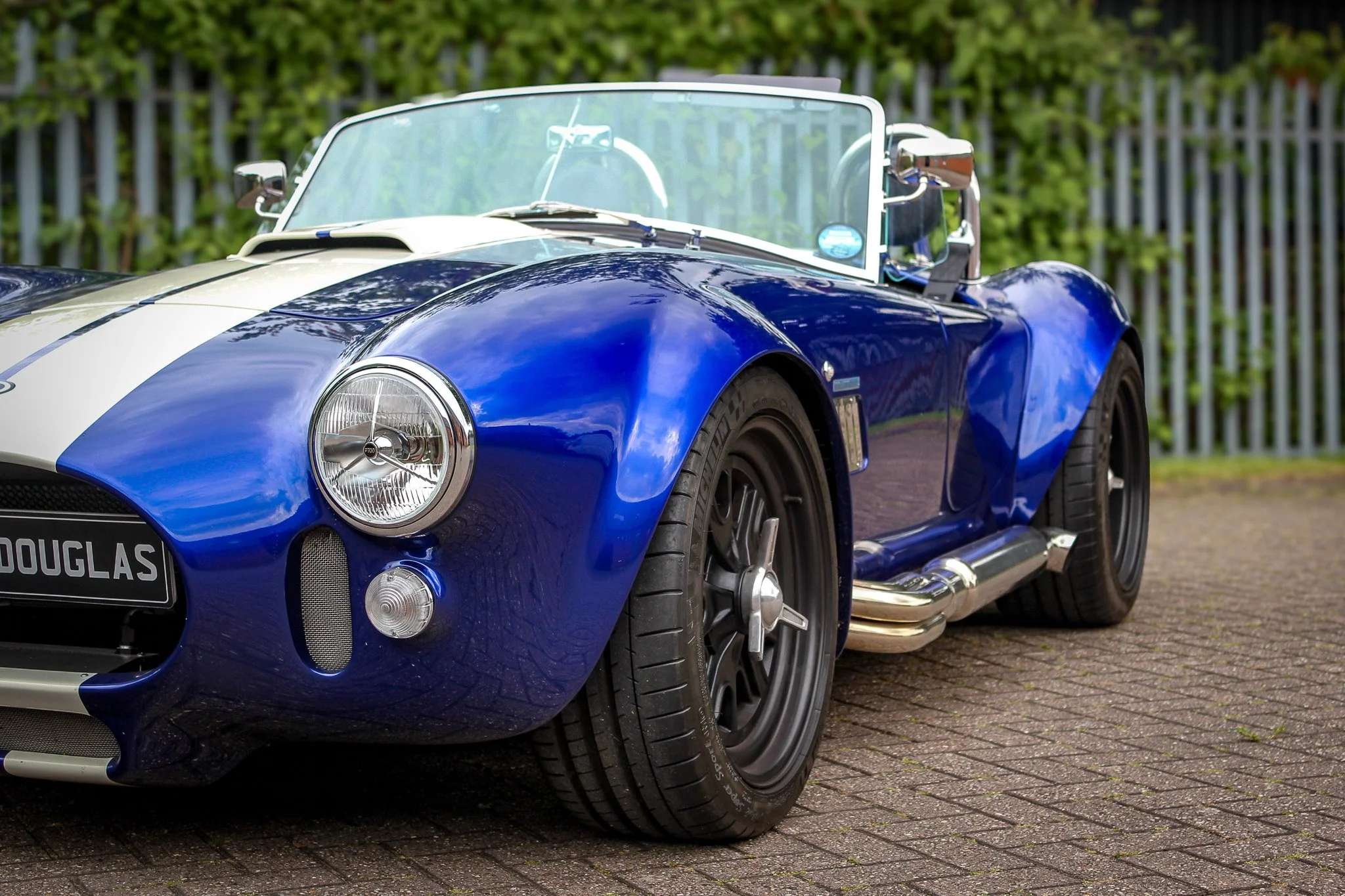
Gardner Douglas is a family-run specialist sports car brand built around performance and craftsmanship, and the GD427 Mk4 is a perfect example of that. It’s one thing seeing it in photos, but being up close and personal is something else entirely.
I had the chance to experience it properly, and that changes how you see it. The shape, the stance, the sound on startup, everything about it has presence. It’s the kind of car that doesn’t need to try hard to get attention. That made the brief straightforward in principle, but not easy in execution.
What the Gardner Douglas team needed from me was a detailed illustration that stayed true to the car. Something that could be used across their website and printed onto merchandise without losing quality or accuracy. They experimented with AI-generated versions, but the results weren’t quite there.
The proportions felt off, and a lot of the finer details that give the car its character were missing. So the focus shifted to doing it properly.
The aim was to create an illustration that respected the shape, held onto the detail, and presented the car in a way that felt timeless. No unnecessary distractions, just the car as it should be seen.
Gardner Douglas is a family-run specialist sports car brand built around performance and craftsmanship, and the GD427 Mk4 is a perfect example of that. It’s one thing seeing it in photos, but being up close and personal is something else entirely.
I had the chance to experience it properly, and that changes how you see it. The shape, the stance, the sound on startup, everything about it has presence. It’s the kind of car that doesn’t need to try hard to get attention. That made the brief straightforward in principle, but not easy in execution.
What the Gardner Douglas team needed from me was a detailed illustration that stayed true to the car. Something that could be used across their website and printed onto merchandise without losing quality or accuracy. They experimented with AI-generated versions, but the results weren’t quite there. The proportions felt off, and a lot of the finer details that give the car its character were missing. So the focus shifted to doing it properly.
The aim was to create an illustration that respected the shape, held onto the detail, and presented the car in a way that felt timeless. No unnecessary distractions, just the car as it should be seen.
Laying the groundwork
before bringing it to life
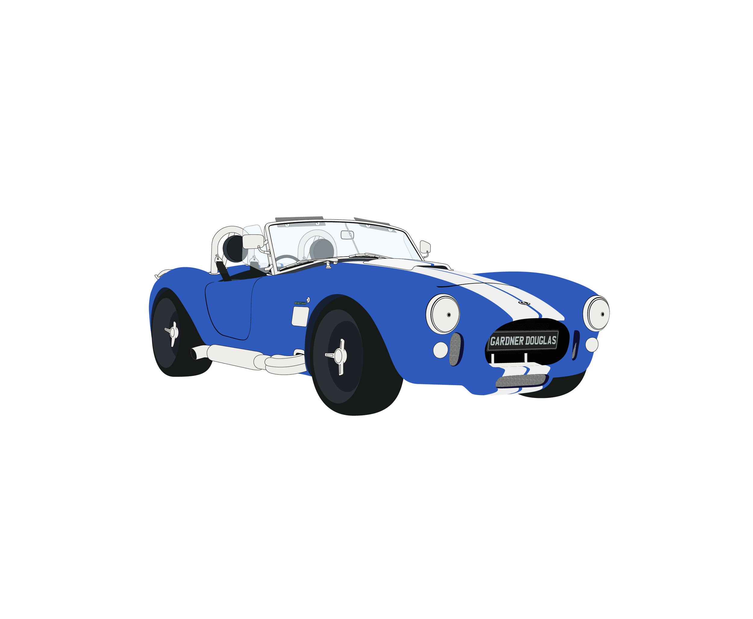
The process started in Illustrator, working directly from the reference image to lock in the proportions. Tracing it out might seem simple, but it’s what ensures everything sits where it should. At this stage, it’s just a flat 2D outline, but it gives a solid foundation to build from.
Once that was in place, the artwork was brought into Photoshop to start developing the detail. This is where the car really begins to take shape. Using a digital drawing tablet, each section was worked through gradually rather than trying to tackle everything at once. It’s a slower process but it keeps things controlled and makes it easier to focus on getting each part right.
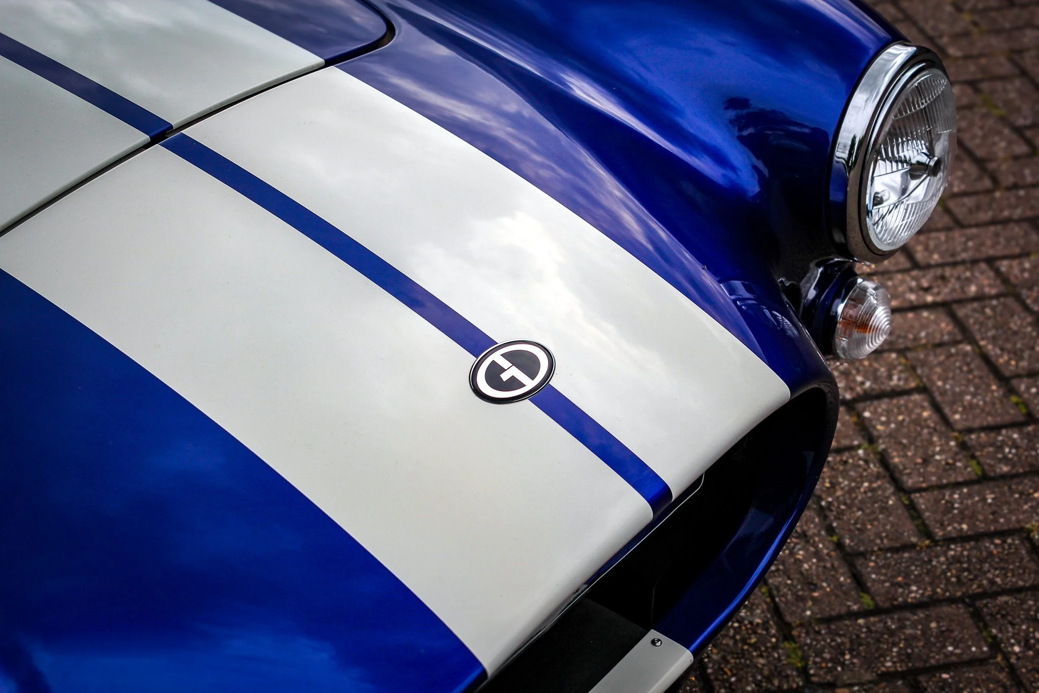
One of the bigger decisions was how to handle the reflections. The original image included some surrounding detail from the environment, which didn’t fit the direction of the final piece. Instead of replicating that exactly, the reflections were reworked to feel more neutral, giving the car a cleaner, showroom-style setting.
Certain areas needed more attention than others. The rims and headlights in particular stood out as parts that could easily look off if not handled properly. Taking the time to work through those details carefully made sure they held up alongside the rest of the car. This level of attention is what kept the final artwork consistent throughout.
The process started in Illustrator, working directly from the reference image to lock in the proportions. Tracing it out might seem simple, but it’s what ensures everything sits where it should. At this stage, it’s just a flat 2D outline, but it gives a solid foundation to build from.
Once that was in place, the artwork was brought into Photoshop to start developing the detail. This is where the car really begins to take shape. Using a digital drawing tablet, each section was worked through gradually rather than trying to tackle everything at once. It’s a slower process but it keeps things controlled and makes it easier to focus on getting each part right.
One of the bigger decisions was how to handle the reflections. The original image included some surrounding detail from the environment, which didn’t fit the direction of the final piece. Instead of replicating that exactly, the reflections were reworked to feel more neutral, giving the car a cleaner, showroom-style setting.
Certain areas needed more attention than others. The rims and headlights in particular stood out as parts that could easily look off if not handled properly. Taking the time to work through those details carefully made sure they held up alongside the rest of the car. This level of attention is what kept the final artwork consistent throughout.
Where everything comes together
and the car takes centre stage
Where everything comes together and the car takes centre stage
With the detail in place and the reflections simplified, the artwork started to feel more controlled. From there, it made sense to push it a bit further and give the car a setting that matched its presence.
The background was darkened, a subtle spotlight was introduced, and a floor reflection was added to ground it. It wasn’t part of the original plan, but it felt like the right direction. It puts the focus exactly where it should be, with nothing else competing for attention. At the same time, the artwork was kept flexible. Different variations were created so it could be used across a range of applications, whether that’s on a dark background, a lighter surface, or printed onto merchandise.
Each version keeps the integrity of the illustration, while giving the team options depending on where it’s being used. Knowing it would be used both digitally and in print, everything was prepared accordingly. Colour formats and resolution were handled properly to make sure the quality holds up wherever it appears.
The final piece does what it needs to. It stays true to the car, holds the detail, and presents it in a way that feels clean and considered. It’s a project I took seriously from the start. Not just because of the work itself, but because of who it was for. Getting that balance right mattered, and it shows in the result.


More projects worth exploring