Ember & Origin is an artisan coffee roaster with the simple idea that coffee is something worth slowing down for. It’s more than the end result, it’s about everything that leads up to it. The sourcing, the roasting, and the journey each bean takes before it reaches the cup. That thinking sits at the core of the brand.
Beans are sourced through fair trade farmers across different regions, each bringing its own character and flavour. There’s a story behind every blend, shaped by where it comes from and how it’s handled along the way.
That sense of origin, combined with the warmth and richness associated with coffee, became the foundation for the identity. It needed to reflect more than just the product. It had to capture the feeling of slowing down, appreciating the process, and understanding what’s actually behind the cup.
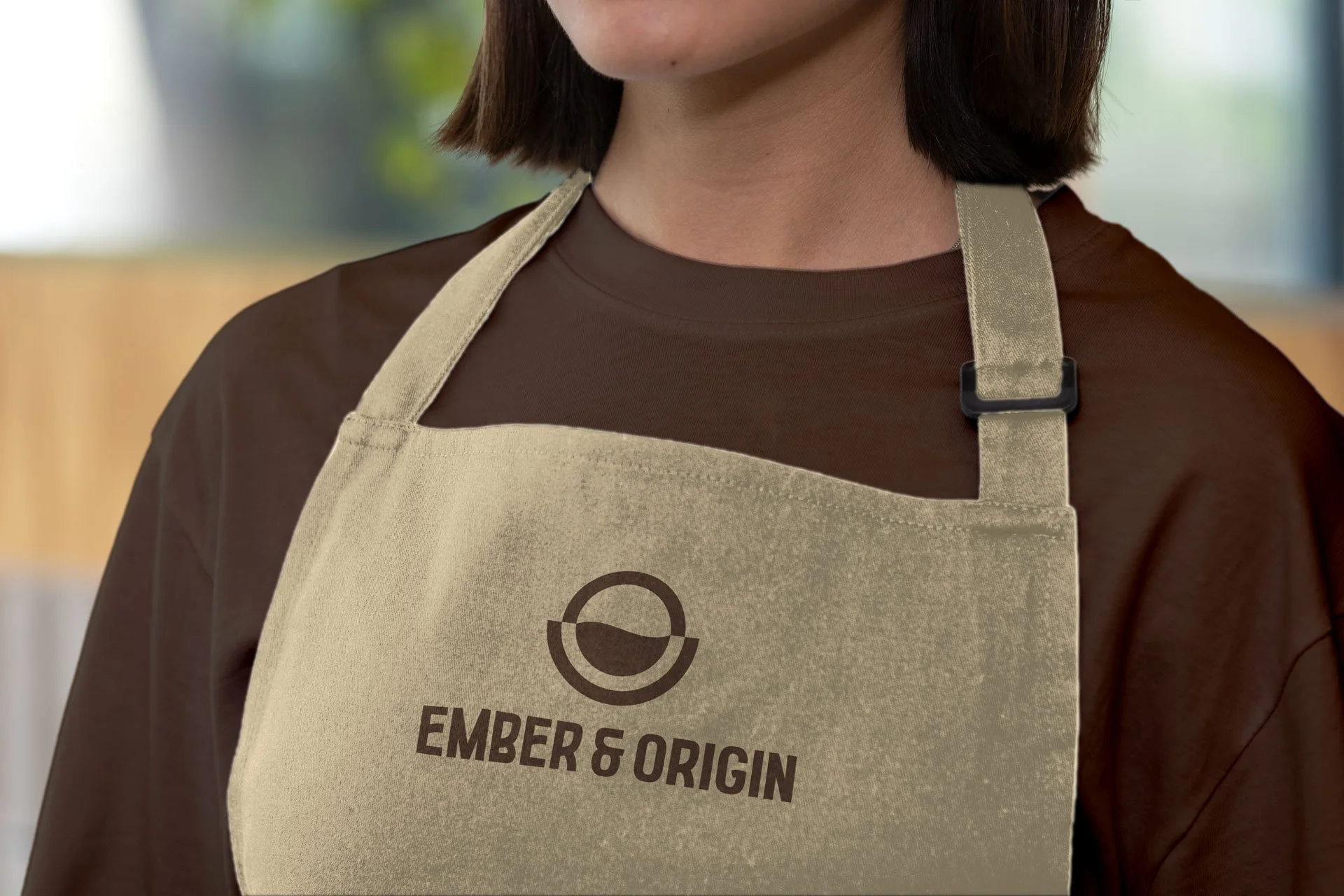
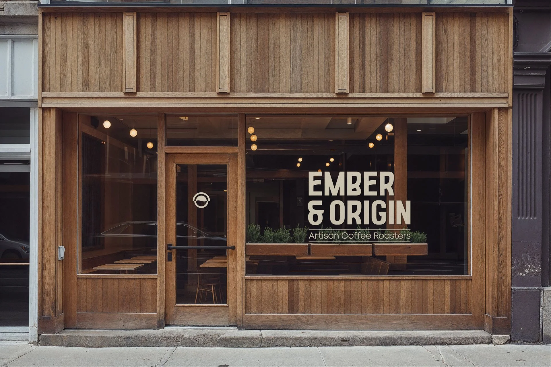
This opened up the opportunity to explore how these ideas could be translated into something visual. I knew it had to be simple but meaningful. The logo had to work naturally on cups and coffee bags, along with a wordmark and colour palette that brings a sense of flavour and warmth.
More than coffee,
it’s about the journey behind it

More than coffee, it’s about the journey behind it
Ember & Origin is an artisan coffee roaster
with the simple idea that coffee is something
worth slowing down for. It’s more than the end result, it’s about everything that leads up to it. The sourcing, the roasting, and the journey each bean takes before it reaches the cup. That thinking sits at the core of the brand.
Beans are sourced through fair trade farmers
across different regions, each bringing its own character and flavour. There’s a story behind every blend, shaped by where it comes from and how it’s handled along the way.
That sense of origin, combined with the warmth and richness associated with coffee, became the foundation for the identity. It needed to reflect more than just the product. It had to capture the feeling of slowing down, appreciating the process, and understanding what’s actually behind the cup.
This opened up the opportunity to explore how these ideas could be translated into something visual. I knew it had to be simple but meaningful. The logo had to work naturally on cups and coffee bags, along with a wordmark and colour palette that brings a sense of flavour and warmth.
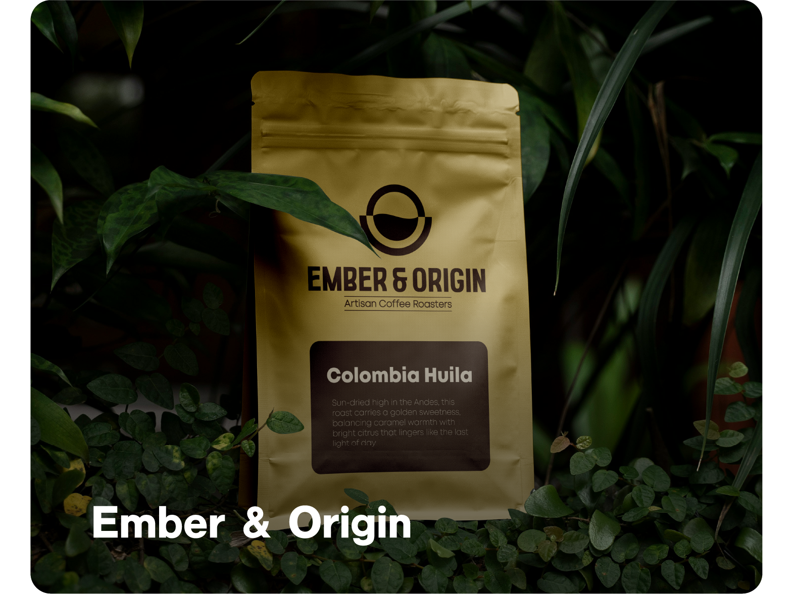
This was a challenging project from the start. The aim was to create something that expressed more than just coffee. It needed to show the ethos behind the brand, not so much the product itself. But it was easy to fall into familiar territory: coffee beans, cups, and the usual visual cues.
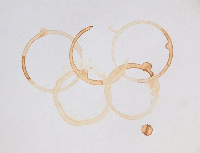
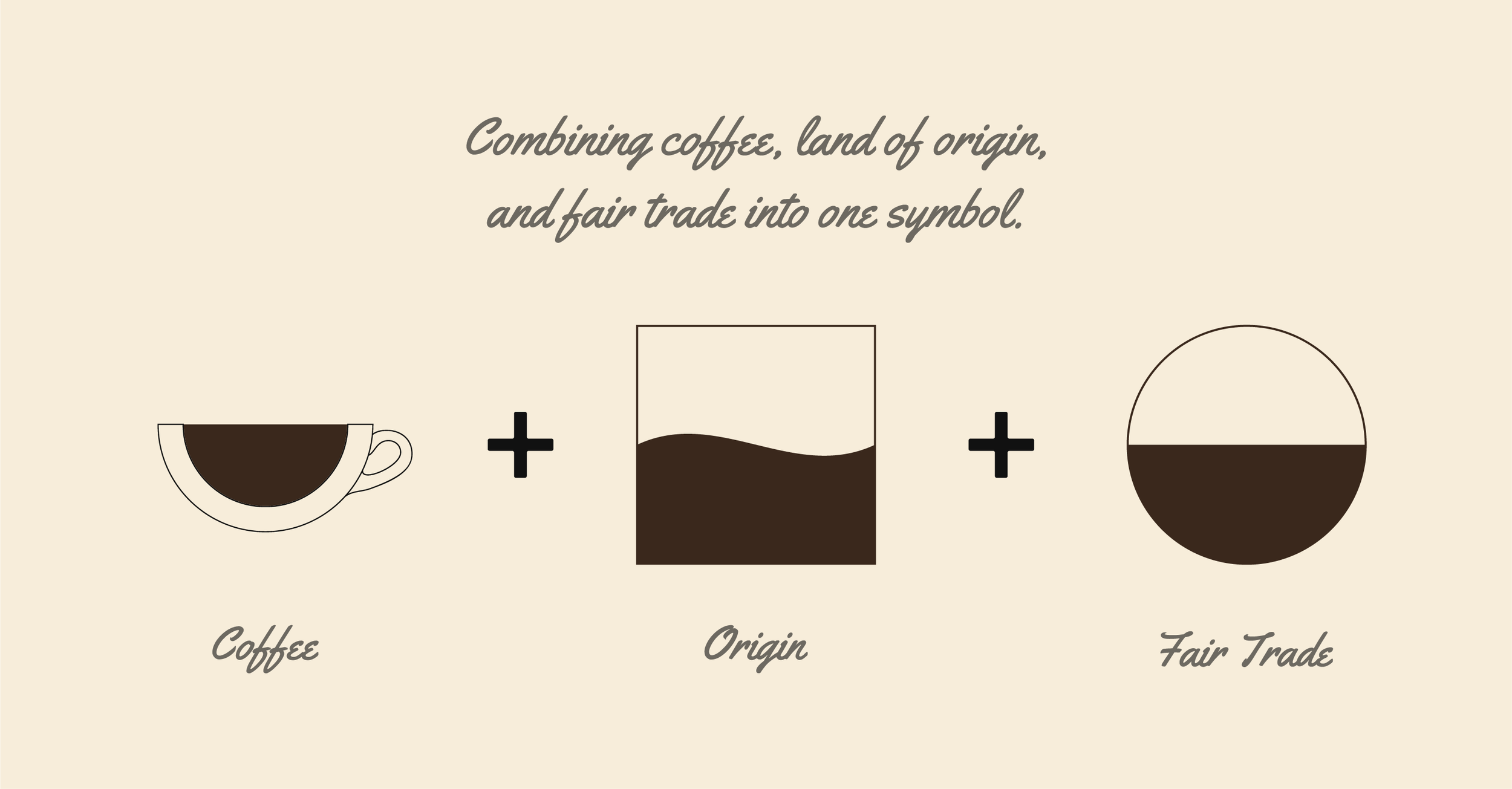
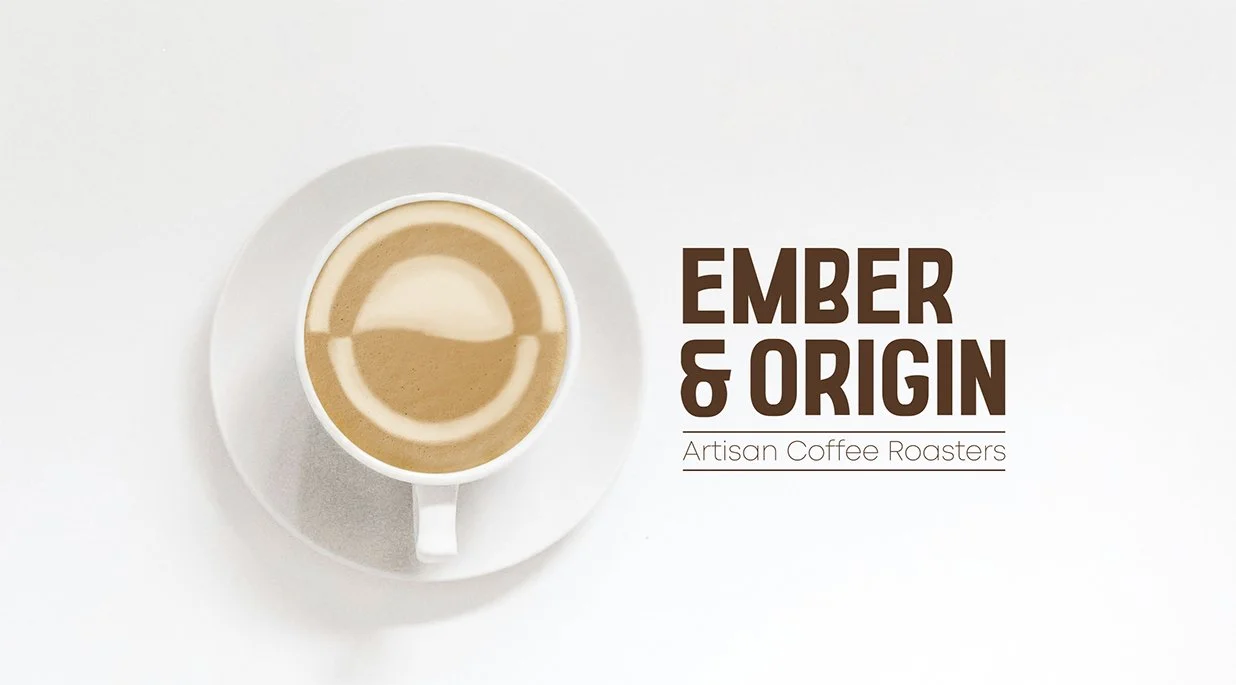
So the approach shifted. Everything was stripped back to a single starting point, with the intention of building something more considered from there. That’s where the idea of coffee rings came in. The marks left behind from a cup felt like a more subtle and interesting way to reference coffee, without relying on the obvious. From there, the concept began to develop. A central form was introduced to represent the cup itself, while the balance between light and dark started to hint at the idea of fair trade. It added another layer of meaning, but at this stage, the design still felt a bit flat. It needed something more interesting that disrupted it’s simplicity.
That led to exploring the natural flow of coffee. The way it shifts and settles became the basis for shaping the inner form, which then evolved into something that could also represent the land of origin. A reference to where the coffee comes from, and the journey it takes before reaching the cup.
Throughout it all, the balance between light and dark was kept consistent. It ties back to the idea of fairness and exchange, while helping the mark feel complete and considered.
Finding a way to express
more than just coffee
This was a challenging project from the start. The aim was to create something that expressed more than just coffee. It needed to show the ethos behind the brand, not so much the product itself. But it was easy to fall into familiar territory: coffee beans, cups, and the usual visual cues.
So the approach shifted. Everything was stripped back to a single starting point, with the intention of building something more considered from there. That’s where the idea of coffee rings came in.
The marks left behind from a cup felt like a more subtle and interesting way to reference coffee, without relying on the obvious. From there, the concept began to develop. A central form was introduced to represent the cup itself, while the balance between light and dark started to hint at the idea of fair trade. It added another layer of meaning, but at this stage, the design still felt a bit flat. It needed something more interesting that disrupted it’s simplicity.
That led to exploring the natural flow of coffee. The way it shifts and settles became the basis for shaping the inner form, which then evolved into something that could also represent the land of origin. A reference to where the coffee comes from, and the journey it takes before reaching the cup.
Throughout it all, the balance between light and dark was kept consistent. It ties back to the idea of fairness and exchange, while helping the mark feel complete and considered.

Everything working together
without needing to shout
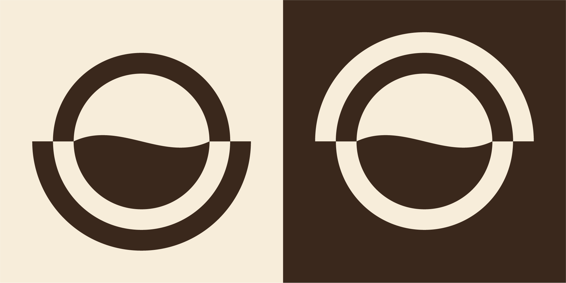
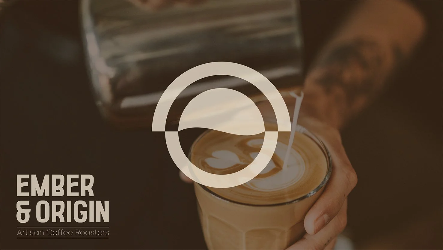
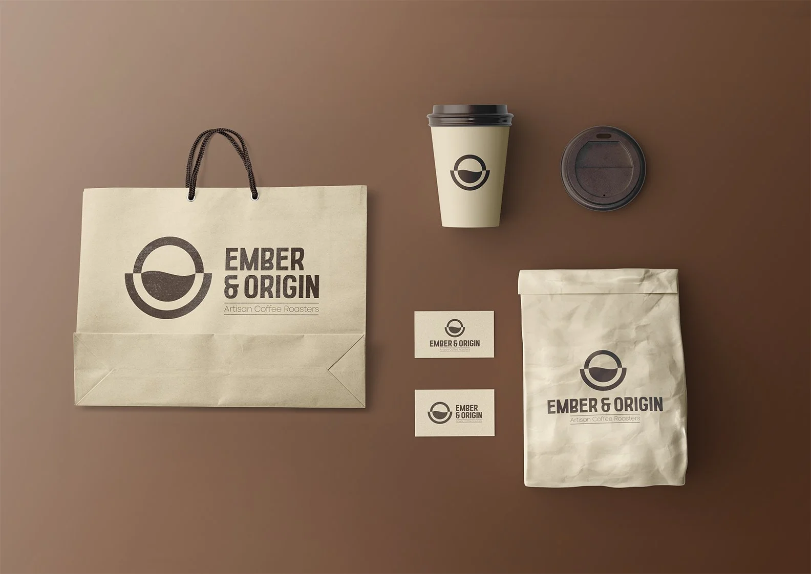
As the identity came together, the focus was on keeping everything balanced and consistent. The logo was designed around contrast, but rather than relying on a standard colour inversion, it takes a slightly different approach.
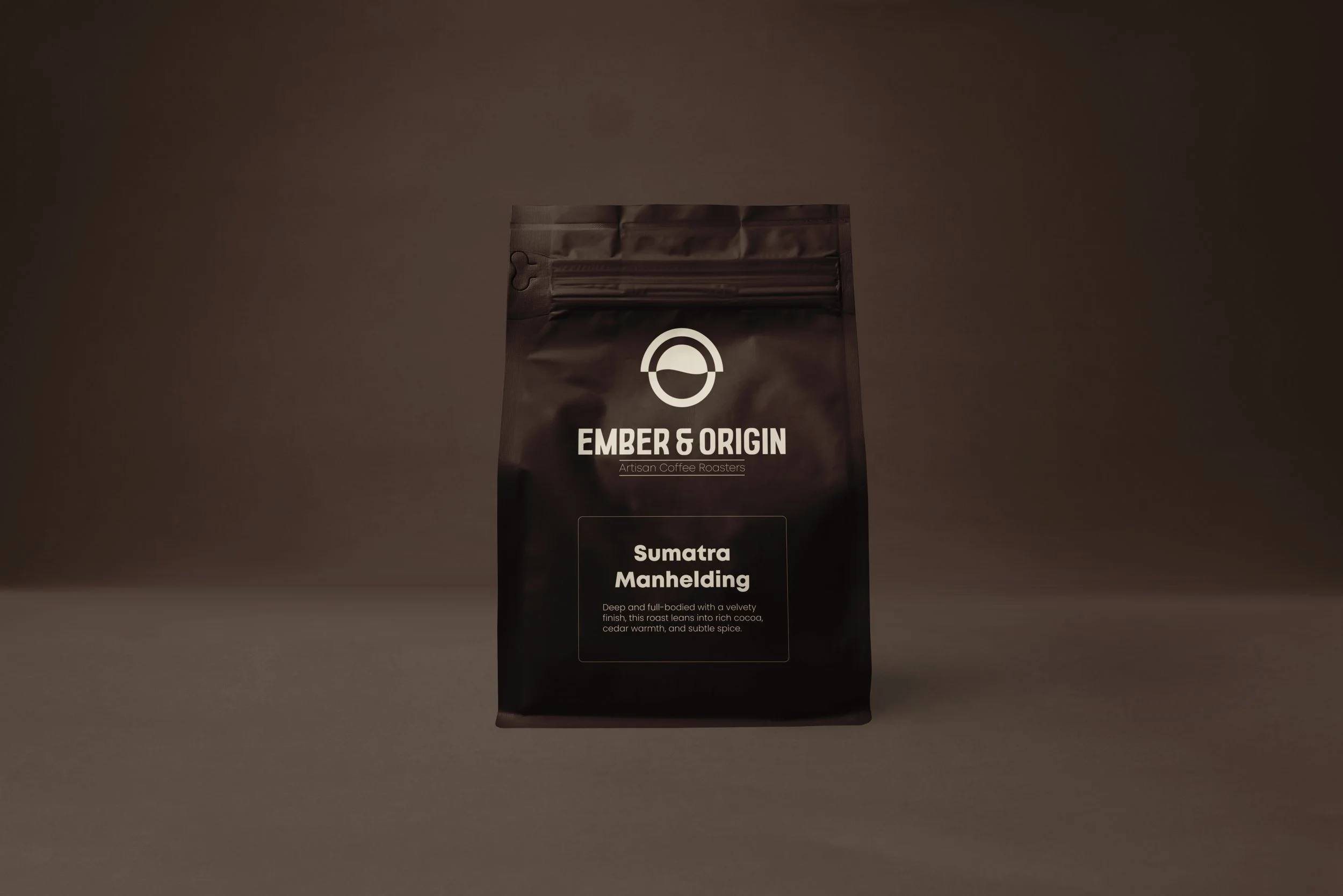
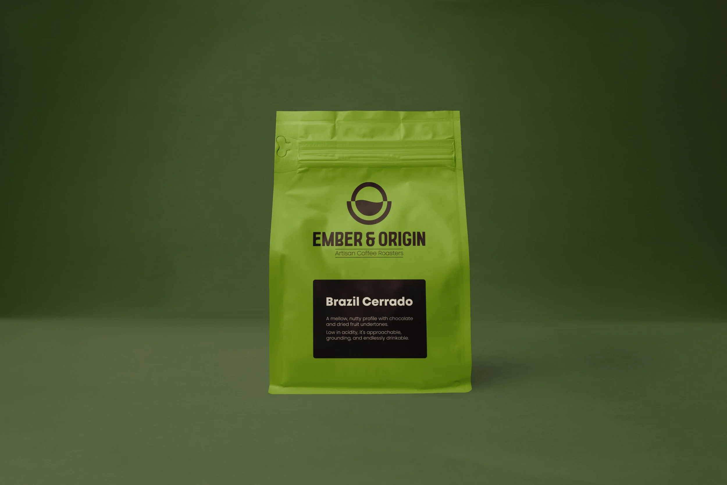
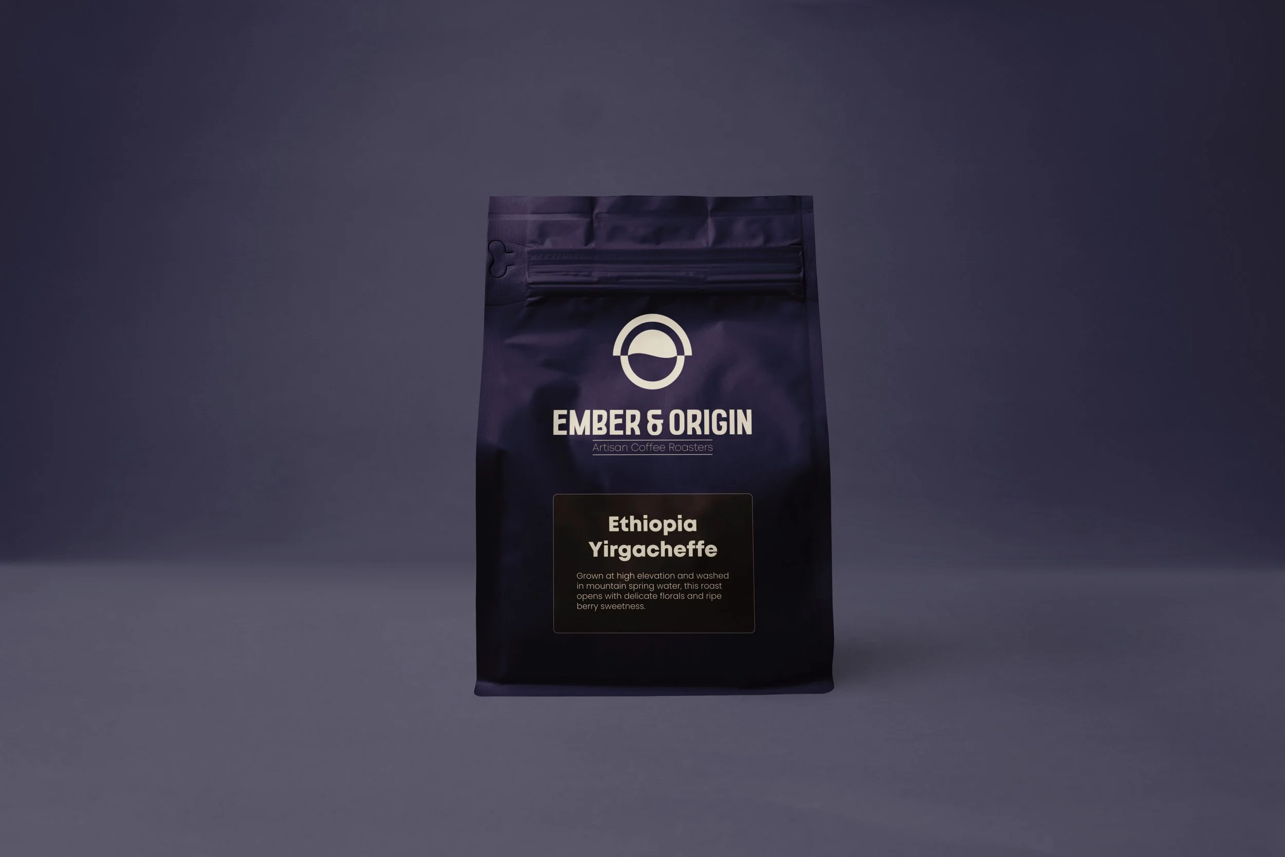
For darker backgrounds, the mark is rotated and lightened, instead of simply switching the colours. This allows the central form, representing both the coffee and land of origin, to remain visually correct, with the darker weight always sitting at the base. It also means the background becomes part of the mark itself, rather than something separate.
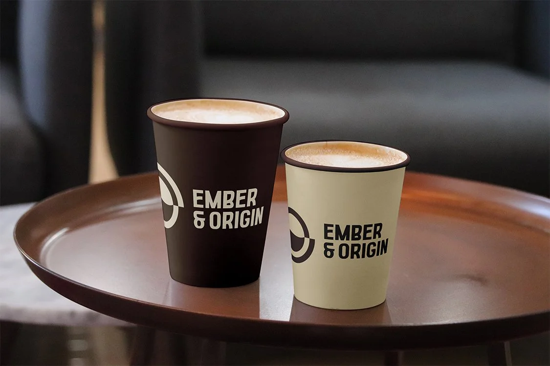
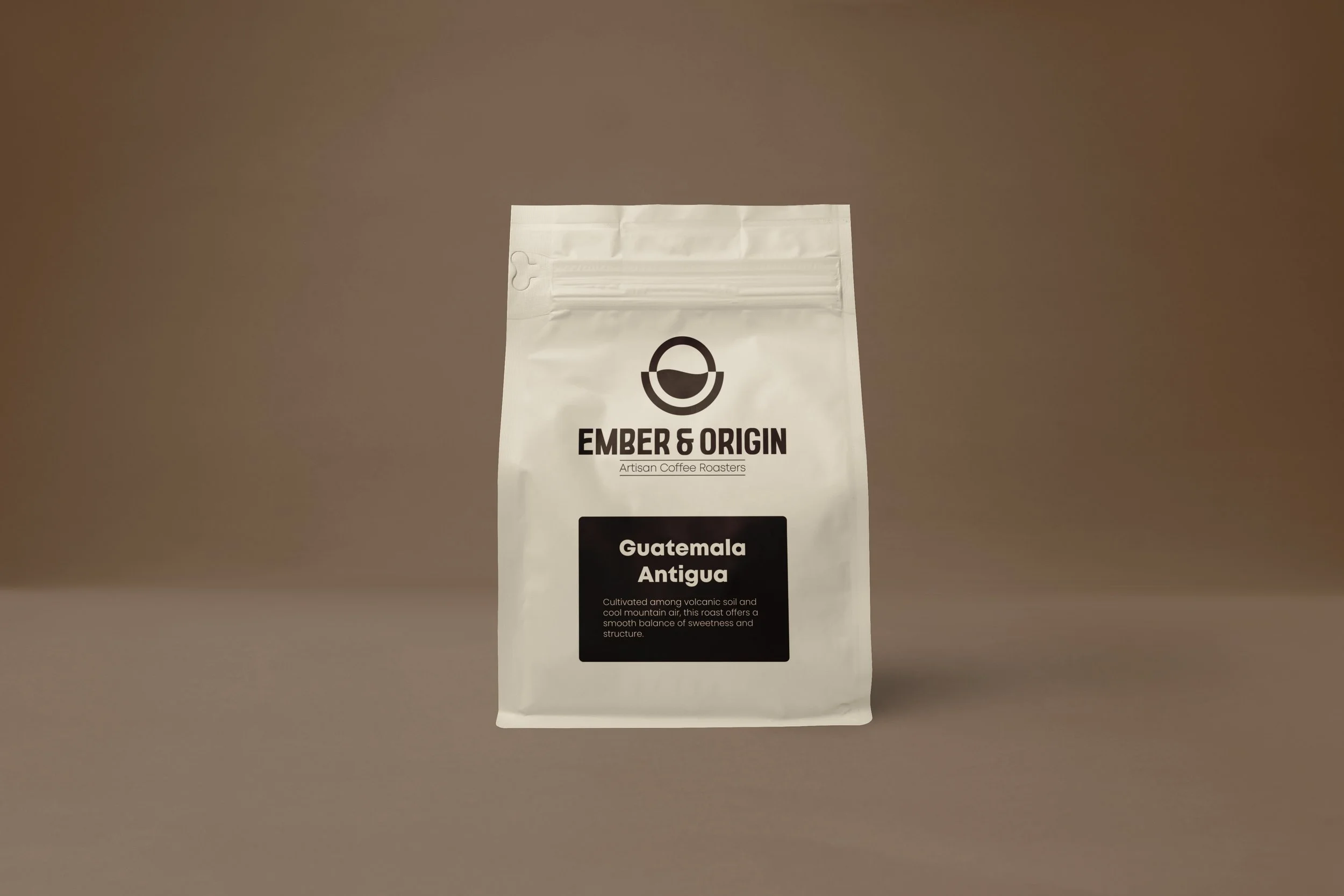
The colour palette was deliberately kept minimal. A rich coffee tone paired with a warm cream creates a natural contrast, while subtly reflecting the depth and warmth associated with the product. It’s subtle, but enough to shape the overall feel.
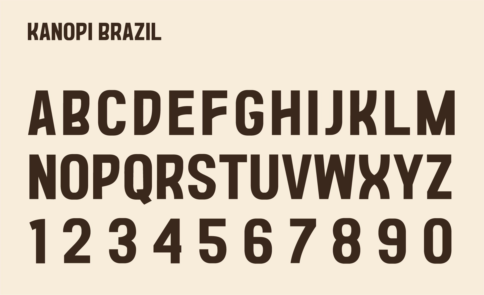
Typography follows the same thinking. The letterforms are bold, with slight curves that give them a sense of character without becoming decorative. Set in all caps, the wordmark holds a strong presence while still feeling grounded and authentic.
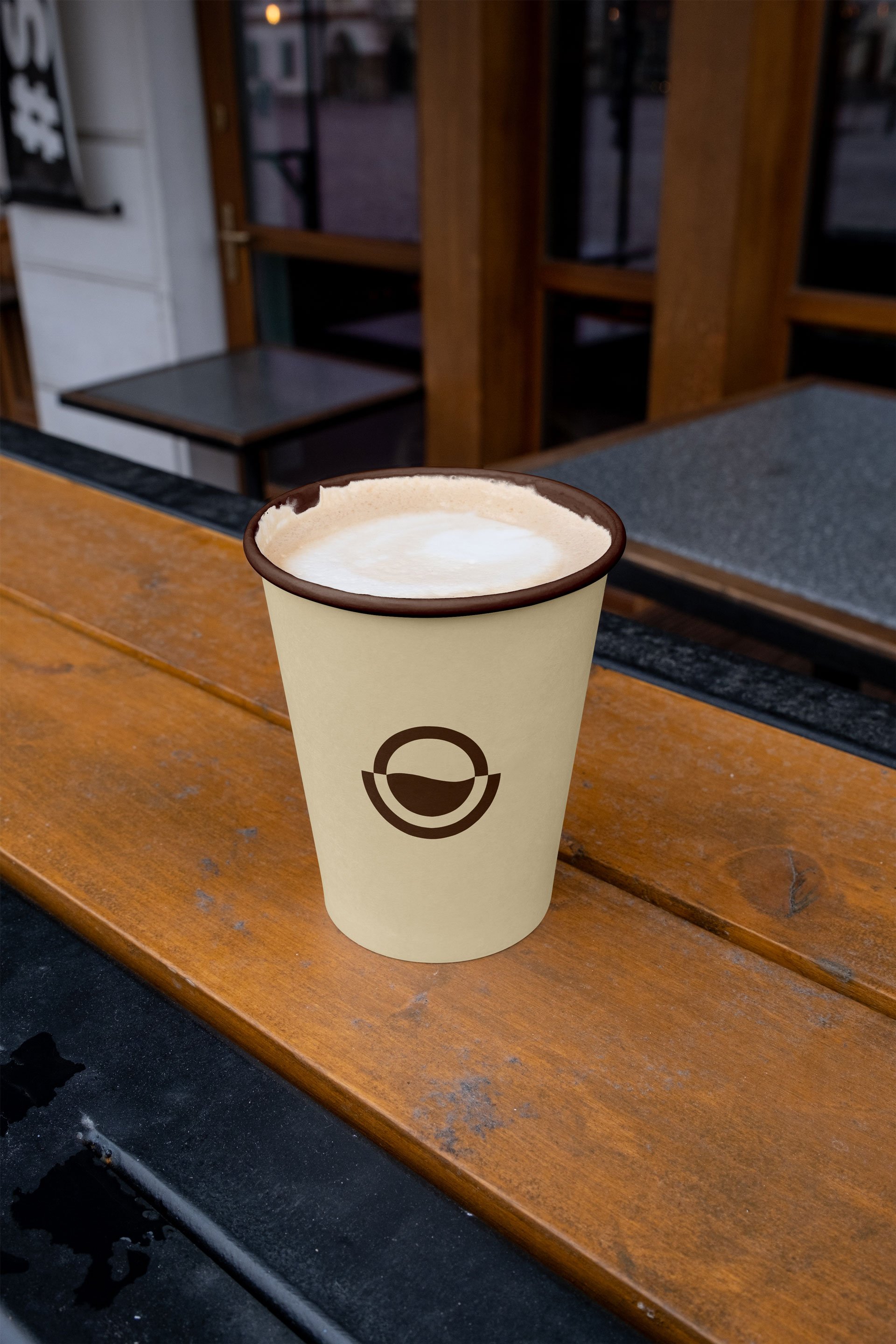
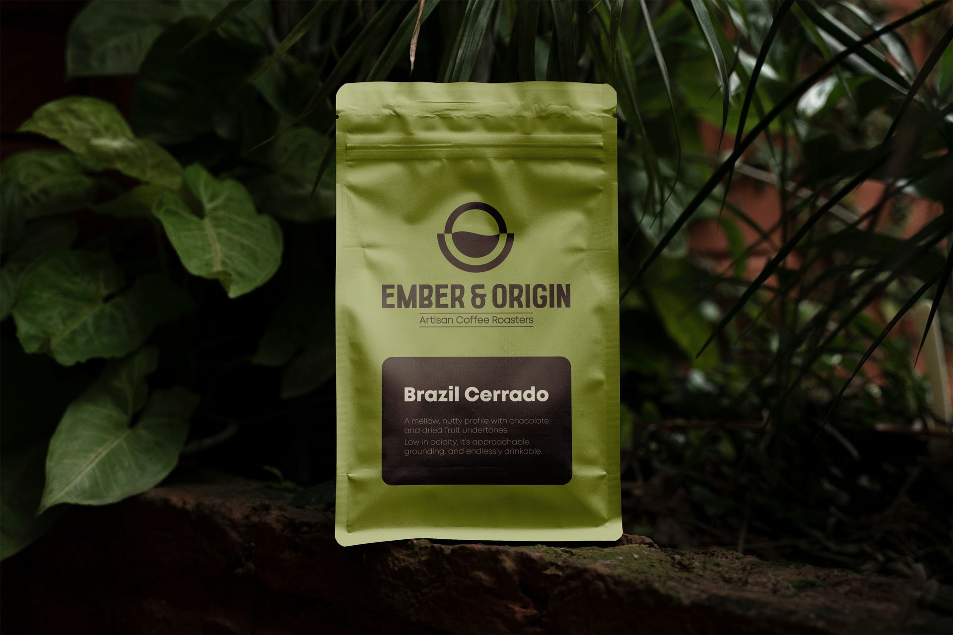
When applied to packaging, the system stays flexible. The simplicity of the logo allows it to sit comfortably across a range of colours, giving each blend its own presence while keeping the overall identity connected. The logo adapts without losing its structure, which keeps it consistent across different applications.
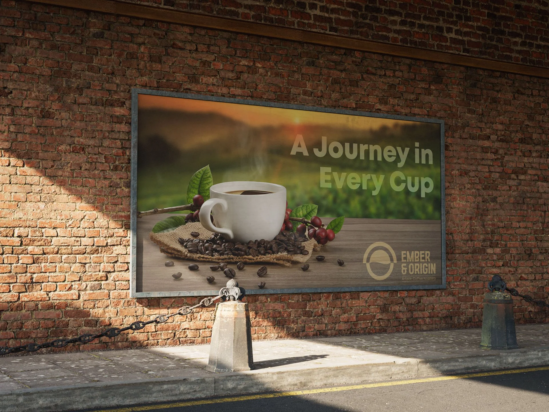
Everything was prepared to work across both print and digital use, ensuring the identity carries through clearly wherever it appears. The result is a brand that feels considered, balanced, and quietly confident.
As the identity came together, the focus was
on keeping everything balanced and consistent. The logo was designed around contrast, but rather than relying on a standard colour inversion, it takes a slightly different approach.
For darker backgrounds, the mark is rotated and lightened, instead of simply switching the colours. This allows the central form, representing both the coffee and land of origin, to remain visually correct, with the darker weight always sitting at the base. It also means the background becomes part of the mark itself, rather than something separate.
The colour palette was deliberately kept minimal. A rich coffee tone paired with a warm cream creates a natural contrast, while subtly reflecting the depth and warmth associated with the product. It’s subtle, but enough to shape the overall feel. Typography follows the same thinking. The letterforms are bold, with slight curves that give them a sense of character without becoming decorative. Set in all caps, the wordmark holds a strong presence while still feeling grounded and authentic.
When applied to packaging, the system stays flexible. The simplicity of the logo allows it to sit comfortably across a range of colours, giving each blend its own presence while keeping the overall identity connected. The logo adapts without losing its structure, which keeps it consistent across different applications.
Everything was prepared to work across both print and digital use, ensuring the identity carries through clearly wherever it appears. The result is a brand that feels considered, balanced, and quietly confident.


More projects worth exploring