
Speaking clearly
and raising awareness
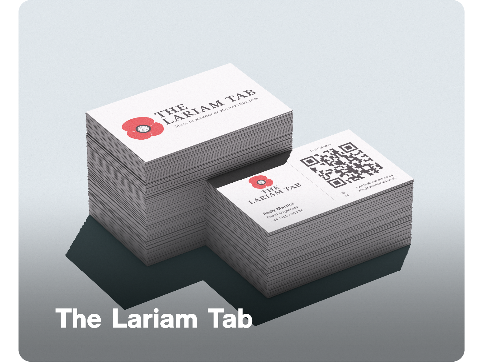
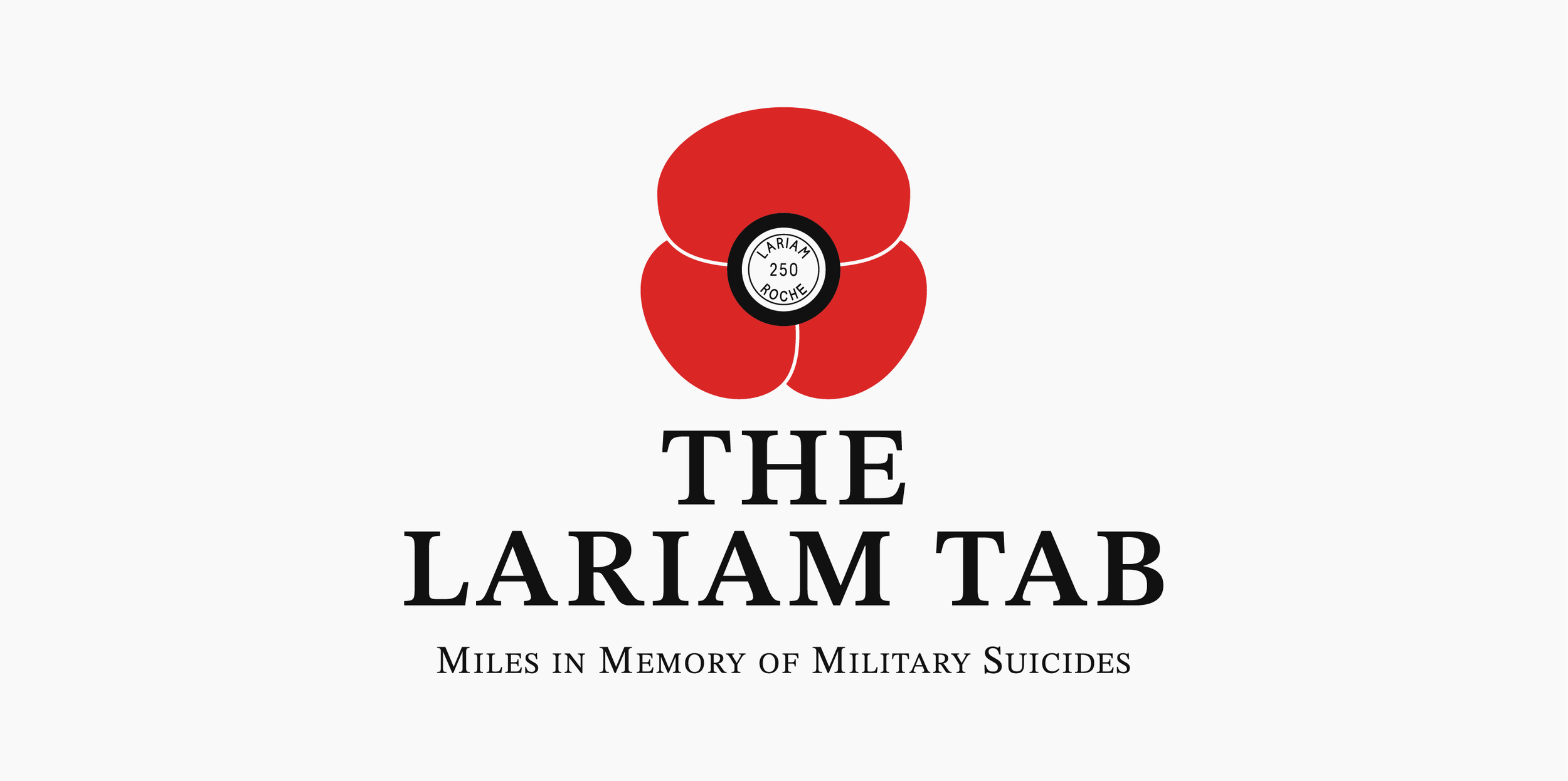
The Lariam Tab is an awareness campaign led primarily by veterans who have been affected by the drug Lariam. Their mission is to bring attention to the harm it has caused across the military community, while also reaching a wider audience including the general public, medical professionals, and politicians. It’s about making the issue visible, understood, and taken seriously.
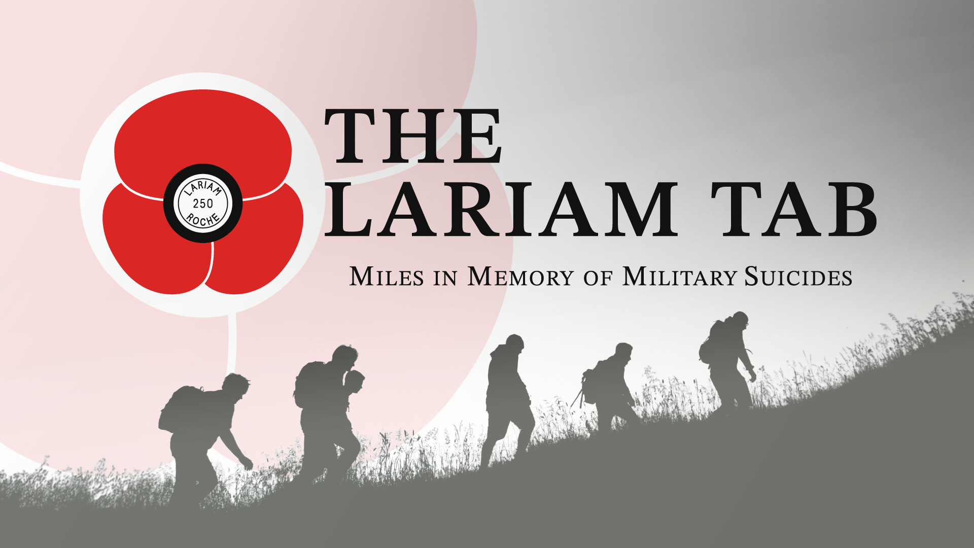
At the centre of the campaign is a walk spanning across 22 days, from Scotland to London, with each mile walked in memory of a veteran lost to suicide. The cause behind it is serious. Lariam has been linked to permanent neurological damage, including microscopic brain injuries that can present with symptoms similar to PTSD. This has led to cases where affected personnel were misdiagnosed, leaving them without the correct treatment or understanding of what they were dealing with. The Lariam Tab exists to change that.
As a veteran, this project carried personal weight.
I already had an understanding of the audience, the language, and the sensitivity this message required. That made it important to approach the work in a way that felt clear, respectful, and direct. The role of the visual identity was to support their message, helping it resonate with the right people and giving the campaign a strong presence.
The Lariam Tab is an awareness campaign led primarily by veterans who have been affected by the drug Lariam. Their mission is to bring attention to the harm it has caused across the military community, while also reaching a wider audience including the general public, medical professionals, and politicians. It’s about making the issue visible, understood, and taken seriously.
At the centre of the campaign is a walk spanning across 22 days, from Scotland to London, with each mile walked in memory of a veteran lost to suicide. The cause behind it is serious. Lariam has been linked to permanent neurological damage, including microscopic brain injuries that can present with symptoms similar to PTSD. This has led to cases where affected personnel were misdiagnosed, leaving them without the correct treatment or understanding of what they were dealing with. The Lariam Tab exists to change that.
As a veteran, this project carried personal weight. I already had an understanding of the audience, the language, and the sensitivity this message required. That made it important to approach the work in a way that felt clear, respectful, and direct. The role of the visual identity was to support their message, helping it resonate with the right people and giving the campaign a strong presence.

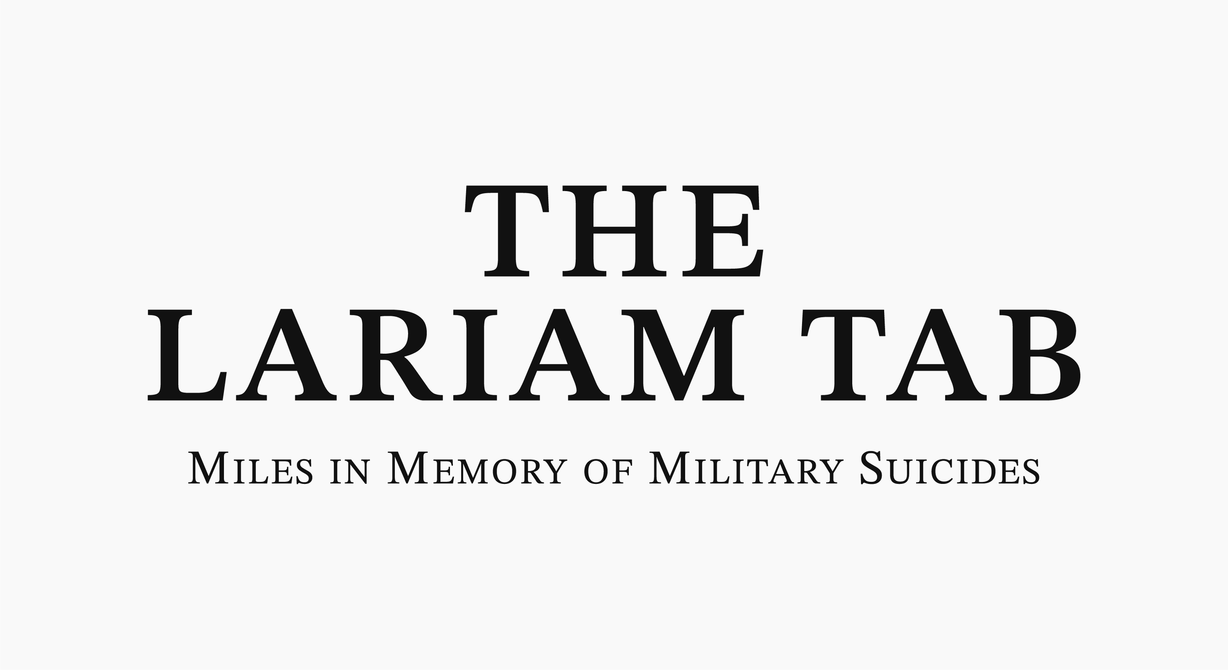
Design has to communicate feeling. People respond to something visually long before they read into it, so the wordmark needed to set the right tone immediately. It had to feel serious, but also familiar to the audience it was aimed at.
With part of the campaign centred around loss and remembrance, the direction drew from military memorials. Cenotaphs and gravestones became a reference point, as they carry a sense of weight and recognition within that environment.
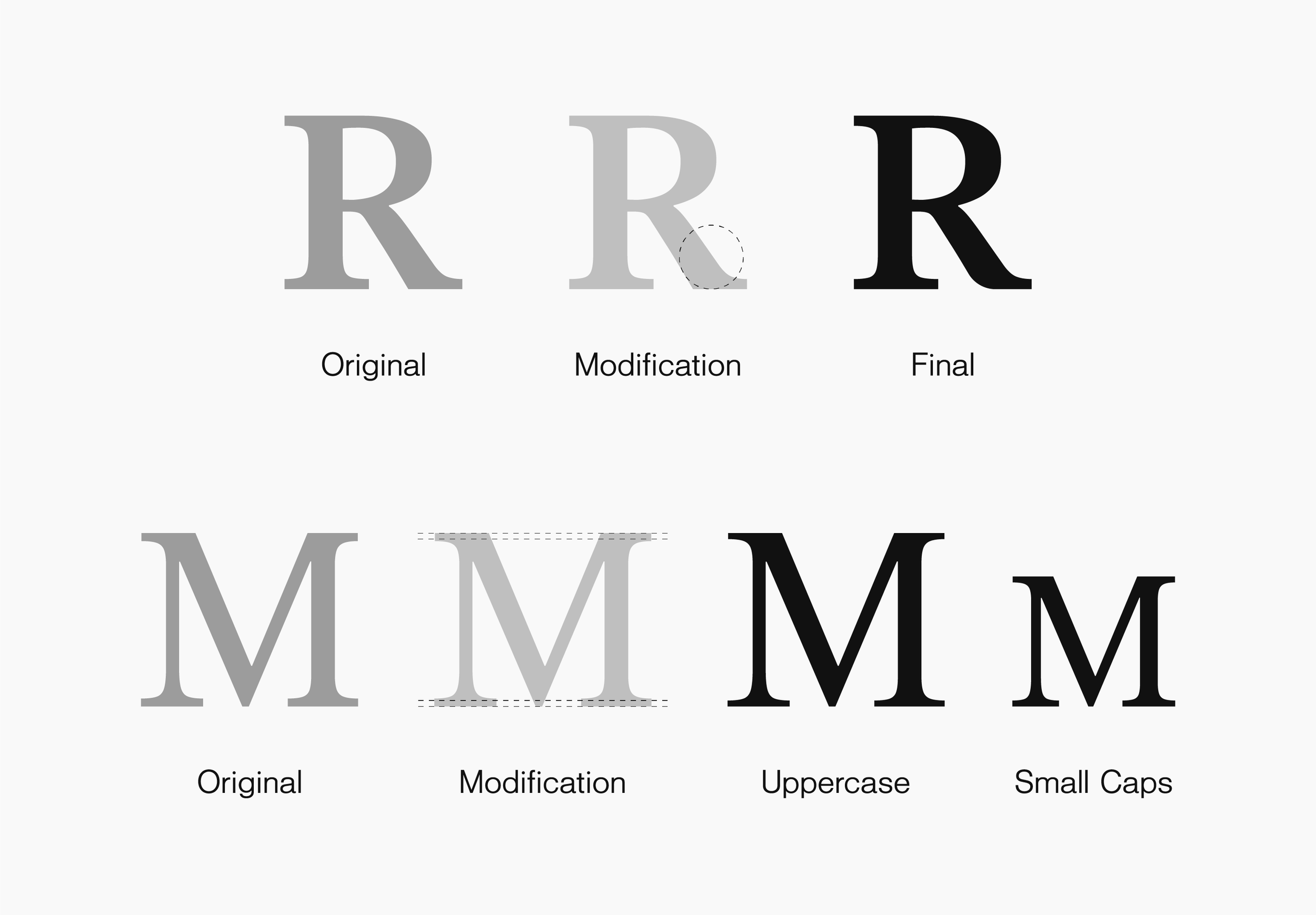
A serif typeface formed the base, but it needed refinement. The leg of the “R” felt too rigid in its original form. Softening that edge slightly removed some of the harshness, while keeping the strength of the letter intact. It’s a small change, but one that shifts the overall feel. The tagline followed a similar level of consideration. Keeping everything uppercase felt too forceful, so a controlled title case was introduced instead. The challenge was in maintaining consistency across the letterforms, particularly with the serifs. Adjusting these uppercase characters to match the proportions of the smaller letters created a more balanced and unified result.
Individually, these are subtle decisions. But together, they shape how the wordmark is perceived. It holds enough presence to stand out, while still feeling appropriate to the subject matter and the audience it’s speaking to.
Where the message is felt
before it’s read
Design has to communicate feeling. People respond to something visually long before they read into it, so the wordmark needed to set the right tone immediately. It had to feel serious, but also familiar to the audience it was aimed at.
With part of the campaign centred around loss and remembrance, the direction drew from military memorials. Cenotaphs and gravestones became a reference point, as they carry a sense of weight and recognition within that environment.
A serif typeface formed the base, but it needed refinement. The leg of the “R” felt too rigid in its original form. Softening that edge slightly removed some of the harshness, while keeping the strength of the letter intact. It’s a small change, but one that shifts the overall feel. The tagline followed a similar level of consideration. Keeping everything uppercase felt too forceful, so a controlled title case was introduced instead. The challenge was in maintaining consistency across the letterforms, particularly with the serifs. Adjusting these uppercase characters to match the proportions of the smaller letters created a more balanced and unified result.
Individually, these are subtle decisions. But together, they shape how the wordmark is perceived. It holds enough presence to stand out, while still feeling appropriate to the subject matter and the audience it’s speaking to.
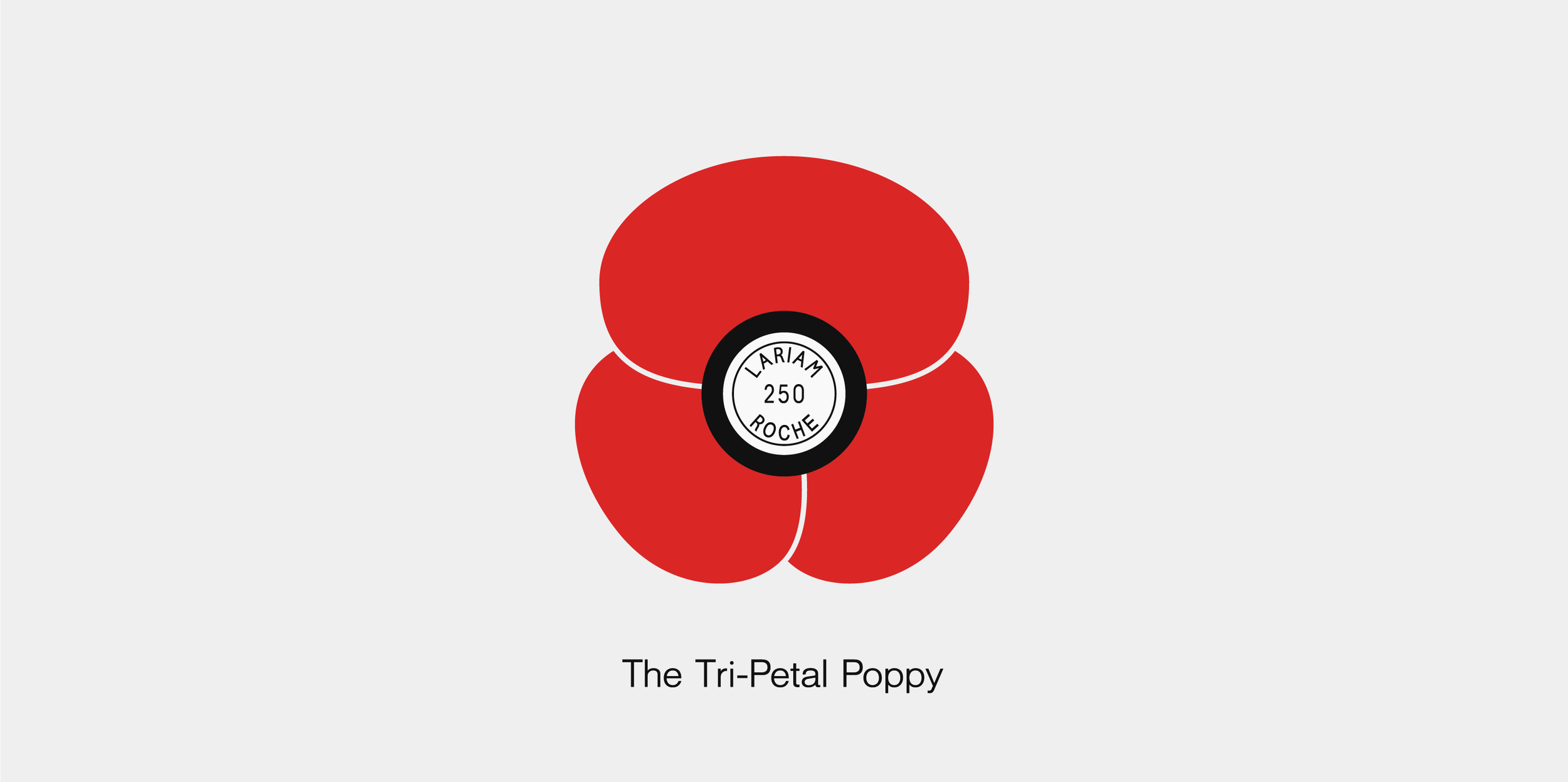
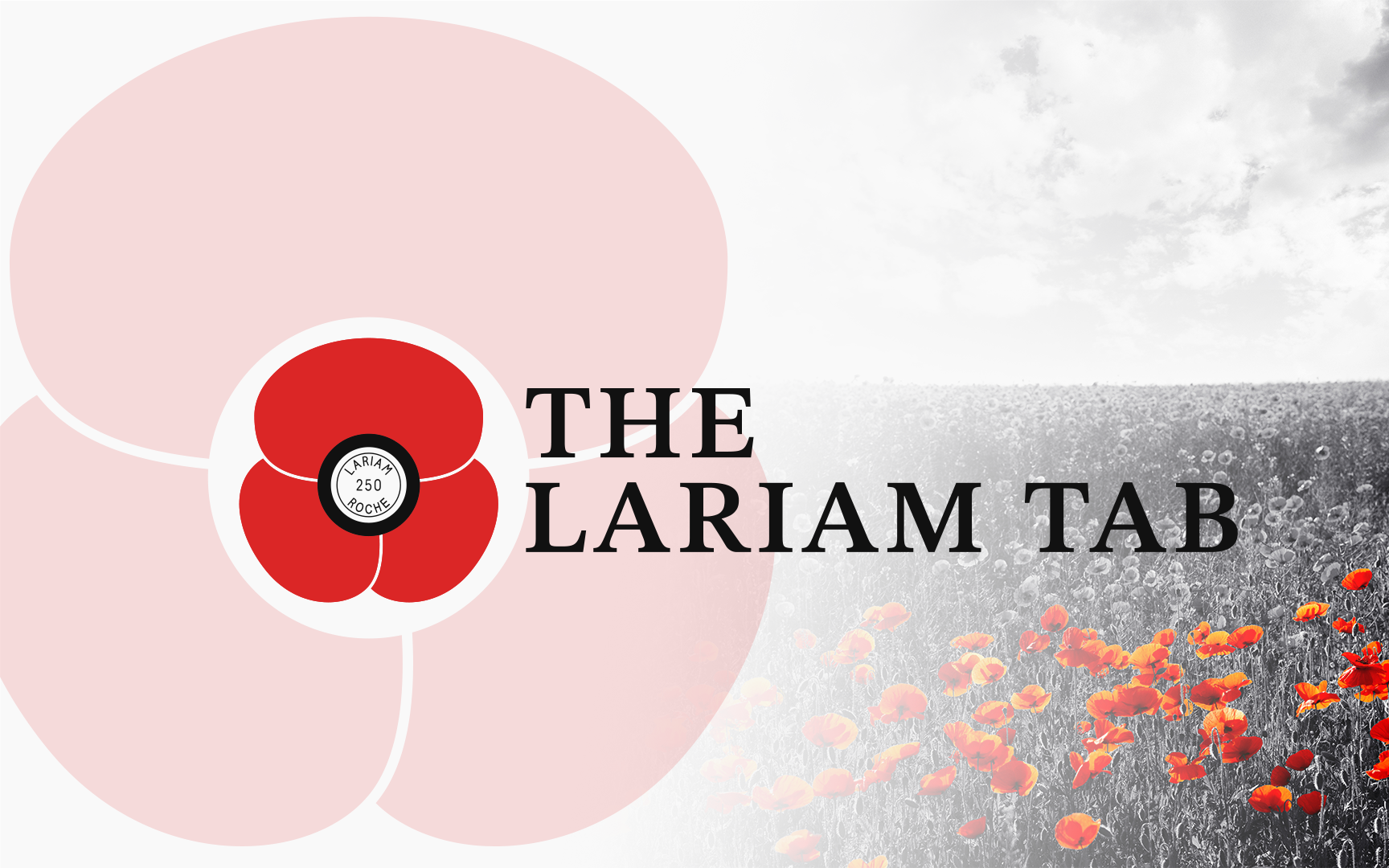
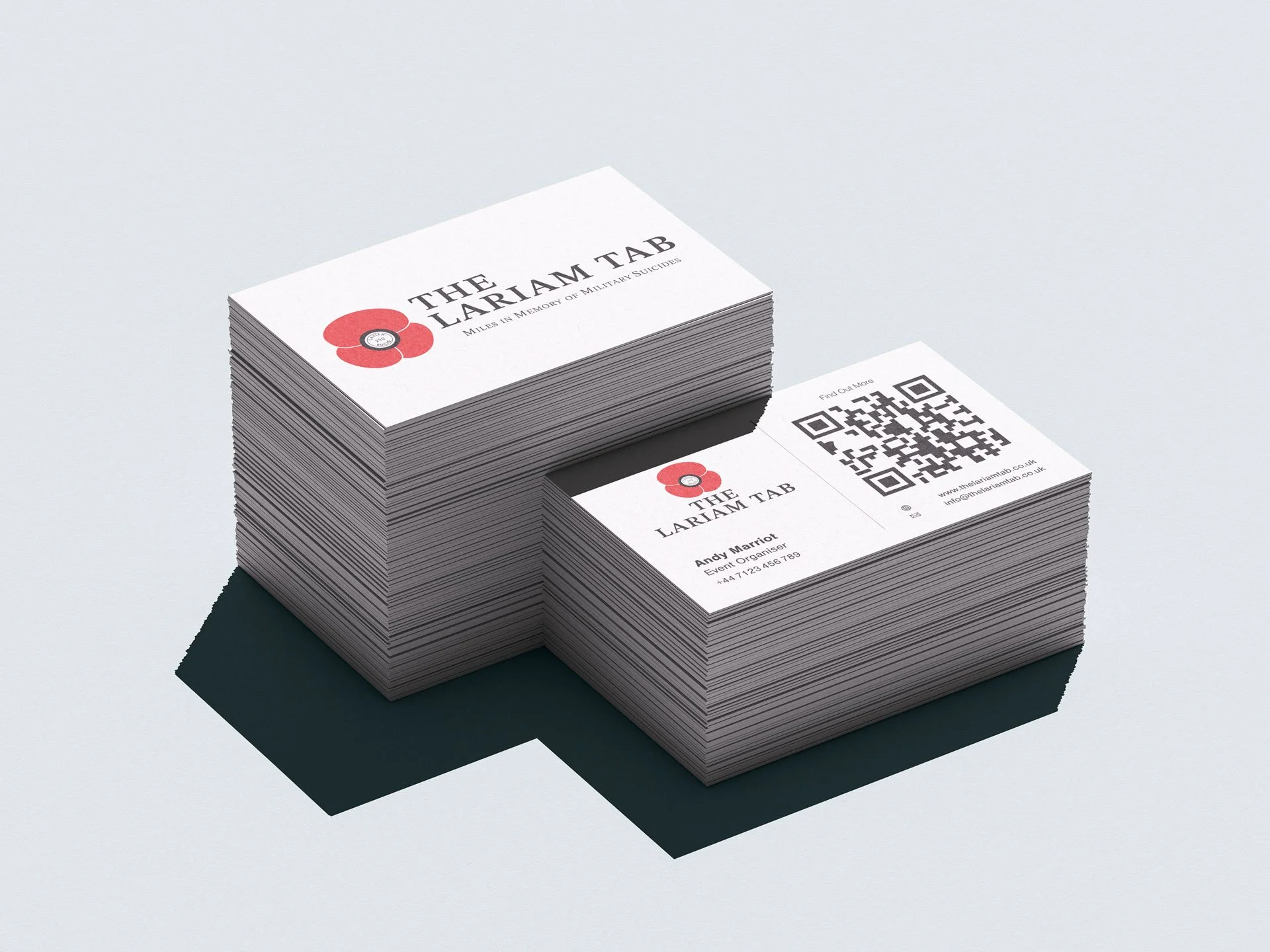
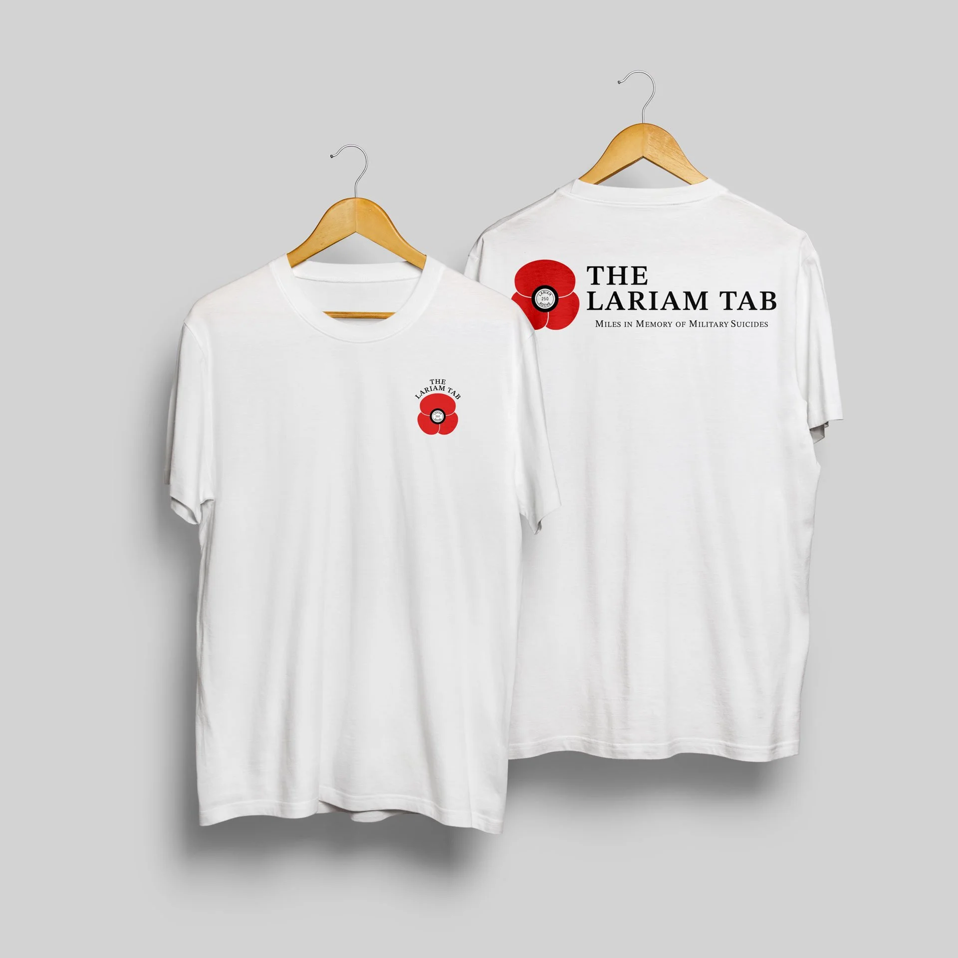
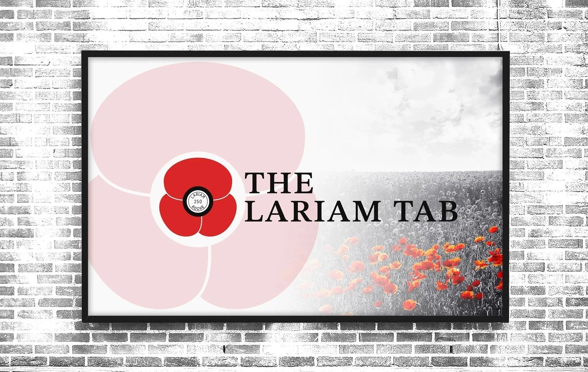
A symbol designed to carry meaning at a glance
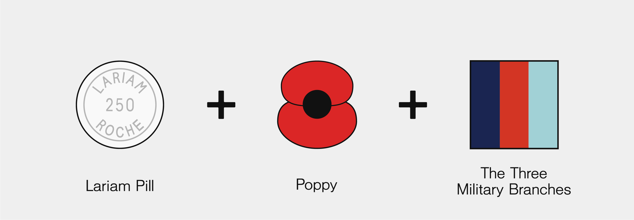
Alongside the wordmark, the campaign needed a symbol that could stand on it’s own. Something recognisable, and clear enough to carry meaning at a glance. The starting point was the poppy. It holds immediate meaning within the military community, making it a natural way to create recognition and connection. But to keep it aligned with the campaign, it needed to go beyond its traditional form.
The centre of the poppy was replaced with a white Lariam tablet, including the markings. It keeps the familiarity, while introducing a shift in meaning that encourages a second look. From there, the structure of the poppy was developed further. It was built using three petals to represent the Navy, Army, and Air Force. A way of showing that the impact is shared across all branches.
Getting that balance right was important. Keeping all three petals the same size felt visually awkward, so the lower two were reduced slightly, which created a more natural shape while still holding the meaning behind it.
Colour was kept deliberately restrained. Red is used for the petals, standing as the only colour within the identity. Everything else remains black and white. That contrast allows the symbol to stand out more clearly, especially in environments where attention is limited.
The result is a mark that feels familiar, but carries a different message. One that connects quickly, while still encouraging people to look closer and understand what it represents.
Alongside the wordmark, the campaign needed a symbol that could stand on it’s own. Something recognisable, and clear enough to carry meaning at a glance. The starting point was the poppy. It holds immediate meaning within the military community, making it a natural way to create recognition and connection. But to keep it aligned with the campaign, it needed to go beyond its traditional form.
The centre of the poppy was replaced with a white Lariam tablet, including the markings. It keeps the familiarity, while introducing a shift in meaning that encourages a second look. From there, the structure of the poppy was developed further. It was built using three petals to represent the Navy, Army, and Air Force. A way of showing that the impact is shared across all branches. Getting that balance right was important. Keeping all three petals the same size felt visually awkward, so the lower two were reduced slightly, which created a more natural shape while still holding the meaning behind it.
Colour was kept deliberately restrained. Red is used for the petals, standing as the only colour within the identity. Everything else remains black and white. That contrast allows the symbol to stand out more clearly, especially in environments where attention is limited.
The result is a mark that feels familiar, but carries a different message. One that connects quickly, while still encouraging people to look closer and understand what it represents.
More projects worth exploring