Finding the balance between
urban life and the outdoors
Wild Loop is a clothing brand built around a lifestyle that sits between two environments. It’s aimed at people who spend most of their time in the city,
but look for any chance to get out of it. Weekend escapes, quieter spaces, a break from the pace. Not full-on exploration, but enough to reset. That balance is what defines the brand.
The challenge was to create an identity that reflects both sides without leaning too far in either direction. Too rugged, and it starts to feel aimed at a different kind of audience. Too clean and urban, and it loses that connection to the outdoors. It needed to sit comfortably in both. The direction had to focus on creating something that feels natural in either setting. A visual identity which speaks the same language whether it’s worn on the street or taken out of it.
Because it’s a clothing brand, the identity also needed to work in a practical sense. It had to be simple enough to sit well on garments, adaptable across different materials, and supported by a colour palette that feels right both in the city and outdoors. Not overly loud, not too muted, but something that fits naturally into how people already dress.
Wild Loop is a clothing brand built around a lifestyle that sits between two environments. It’s aimed at people who spend most of their time in the city, but look for any chance to get out of it. Weekend escapes, quieter spaces, a break from the pace. Not full-on exploration, but enough to reset. That balance is what defines the brand.
The challenge was to create an identity that reflects both sides without leaning too far in either direction. Too rugged, and it starts to feel aimed at a different kind of audience. Too clean and urban, and it loses that connection to the outdoors. It needed to sit comfortably in both. The direction had to focus on creating something that feels natural in either setting. A visual identity which speaks the same language whether it’s worn on the street or taken out of it.
Because it’s a clothing brand, the identity also needed to work in a practical sense. It had to be simple enough to sit well on garments, adaptable across different materials, and supported by a colour palette that feels right both in the city and outdoors. Not overly loud, not too muted, but something that fits naturally into how people already dress.
Exploring the idea until
it landed in the right place
After the brief, I knew what was needed, but the challenge was figuring out how to actually bring it to life. A lot of early ideas leaned too far in one direction. Mountains, antlers, twigs. They pushed the brand into a more rugged space that didn’t quite fit the audience. On the other side, more literal ideas started to feel a bit too on-the-nose.
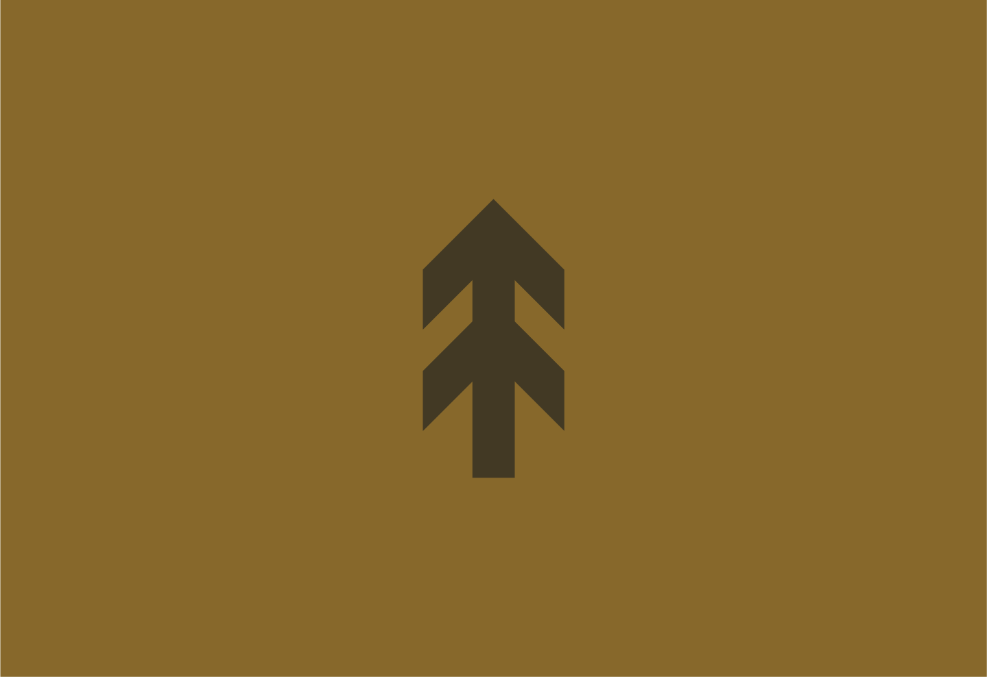
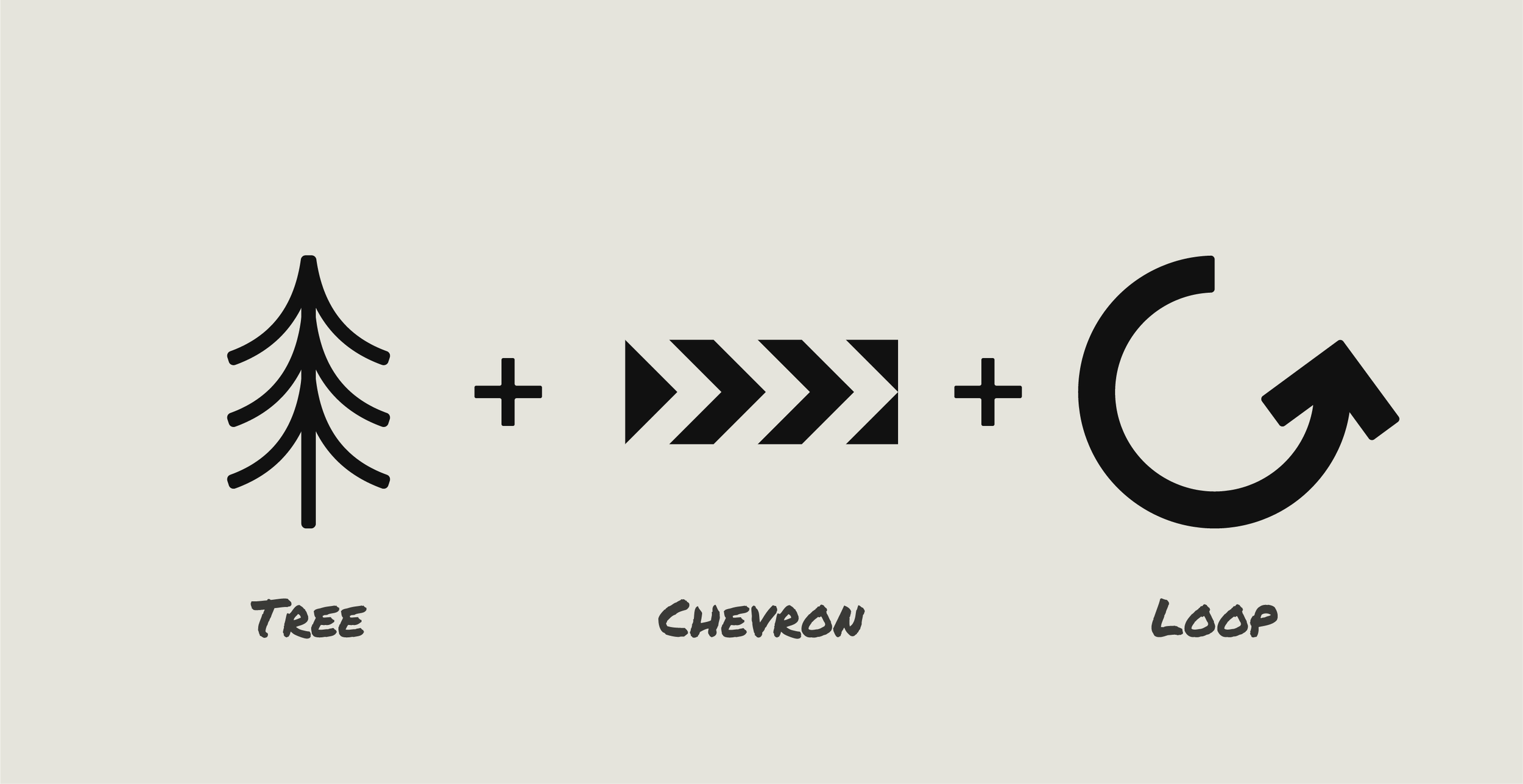
It took a bit of back and forth to find something that sat in the middle. The turning point came from noticing the similarity between the shape of a tree and the chevrons used on road signs. And this connection felt right straight away. It naturally brought together the outdoors and the city without forcing it.
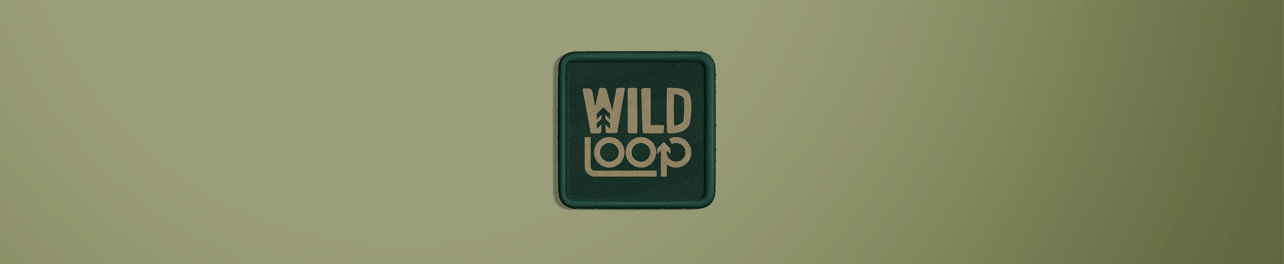
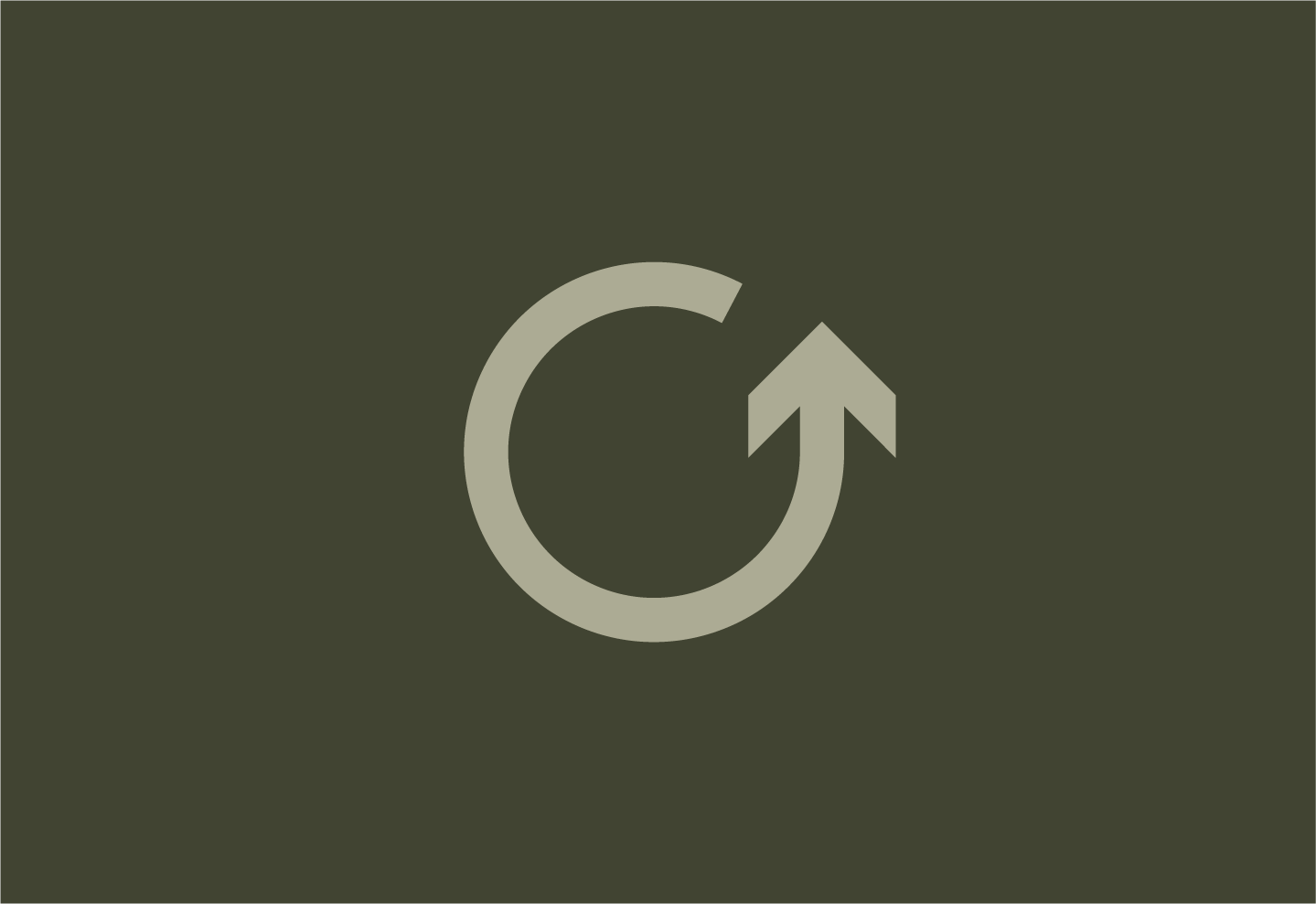
From there, the tree was simplified into a clean symbol that echoed chevrons, keeping that urban feel while still representing something natural. To build on that, the symbol was enclosed within a circular path, but then the idea came to turn that into a looping arrow. That shift tied the idea together. It introduced movement, while reinforcing the link between “wild” and “loop” in a way that felt subtle but intentional.
Alongside the symbol, the wordmark needed
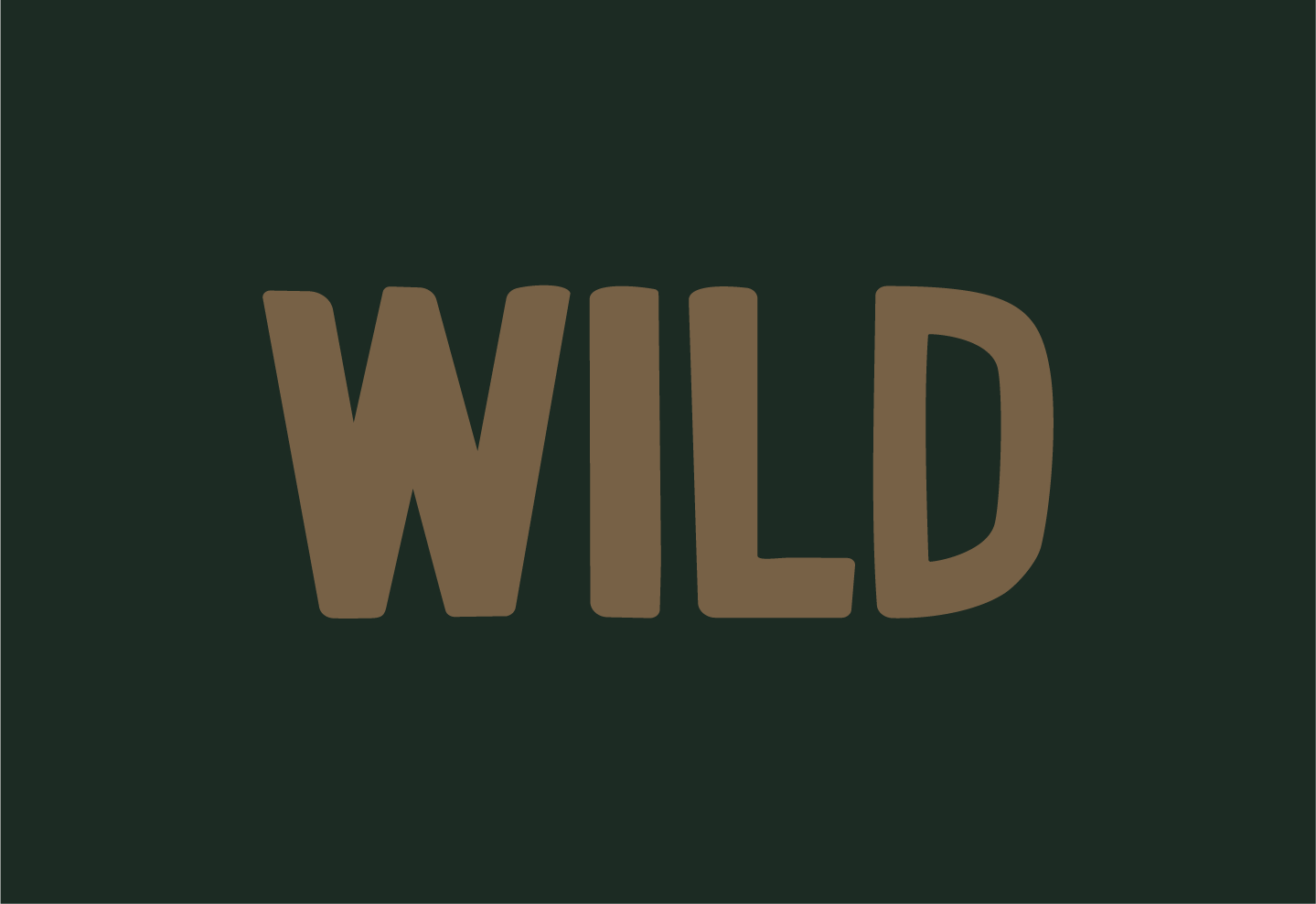
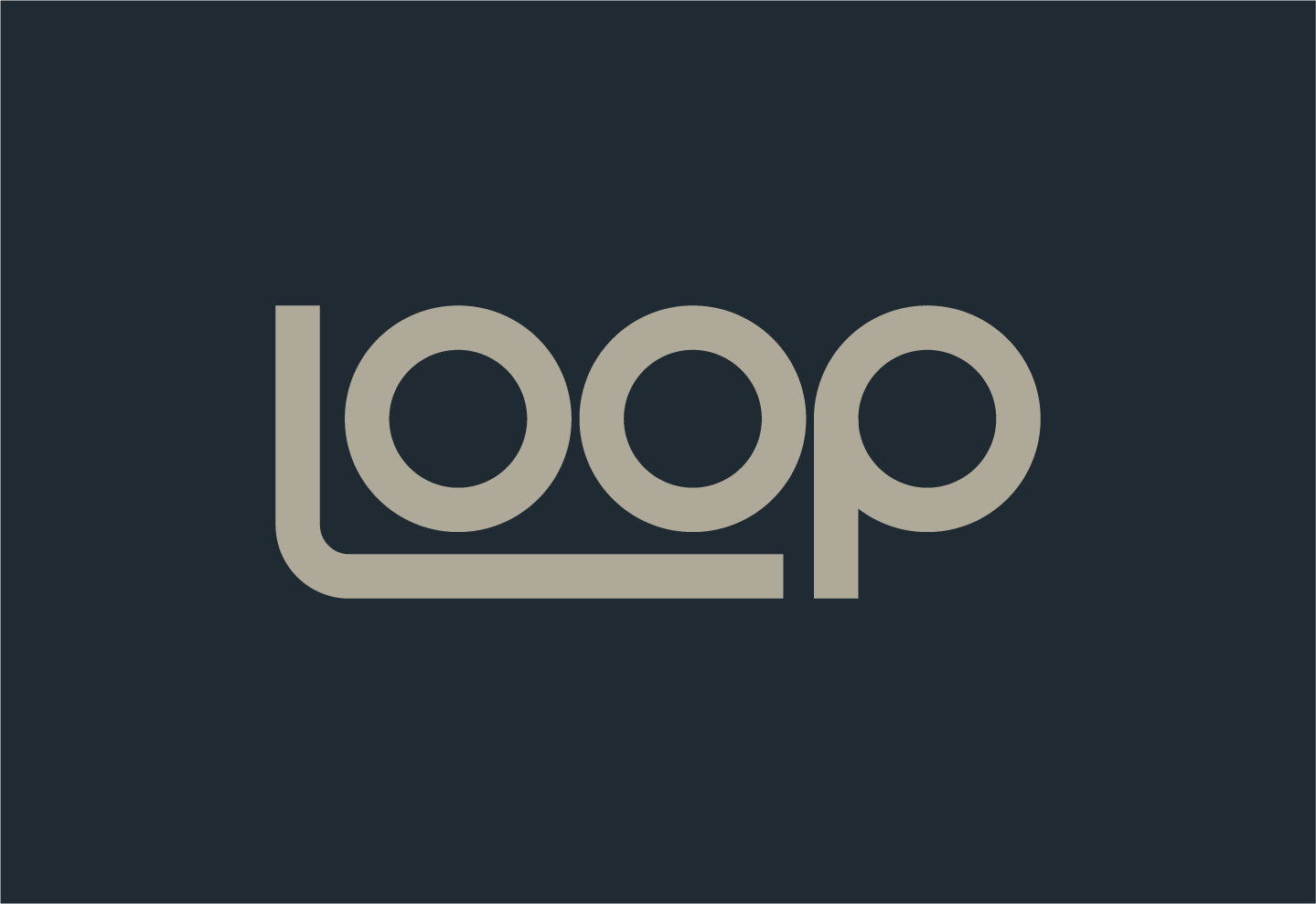
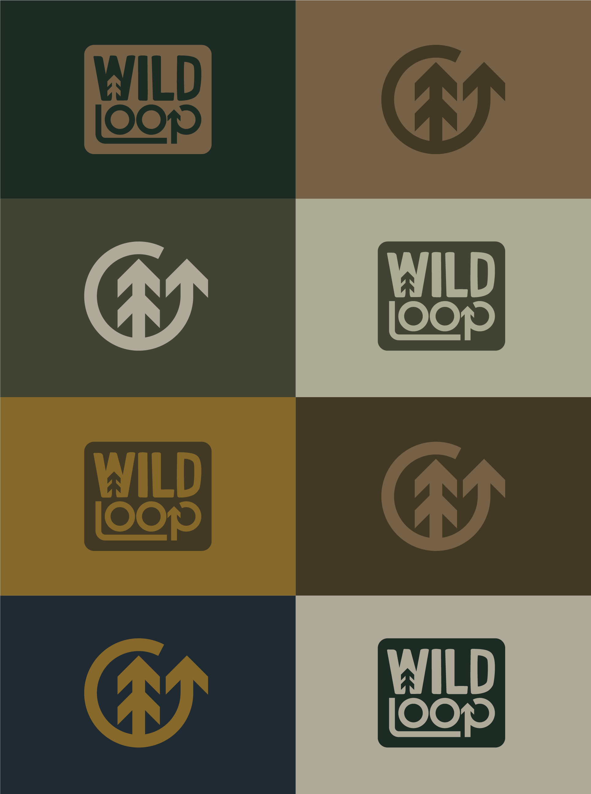
to carry that same balance. Rather than relying on an existing typeface, it was built from scratch to get the right feel. “WILD” was designed to feel slightly rugged, with uneven edges and rounded corners, giving it a more natural, less controlled look. In contrast, “LOOP” was kept precise, with consistent line weight and sharper geometry. That contrast mirrors the brand itself. One side more organic, the other more controlled.
To tie everything together, elements of the symbol were worked into the lettering. The chevron tree sits within the “W”, while the loop form is echoed in the “P”. It’s subtle, but enough to connect the sytem without making it feel overdesigned.
After the brief, I knew what was needed, but the challenge was figuring out how to actually bring it to life. A lot of early ideas leaned too far in one direction. Mountains, antlers, twigs. They pushed the brand into a more rugged space that didn’t quite fit the audience. On the other side, more literal ideas started to feel a bit too on-the-nose.
It took a bit of back and forth to find something that sat in the middle. The turning point came from noticing the similarity between the shape of a tree and the chevrons used on road signs. And this connection felt right straight away. It naturally brought together the outdoors and the city without forcing it.
From there, the tree was simplified into a clean symbol that echoed chevrons, keeping that urban feel while still representing something natural.
To build on that, the symbol was enclosed within a circular path, but then the idea came to turn that into a looping arrow. That shift tied the idea together. It introduced movement, while reinforcing the link between “wild” and “loop” in a way that felt subtle but intentional.
Alongside the symbol, the wordmark needed to carry that same balance. Rather than relying on an existing typeface, it was built from scratch to get the right feel. “WILD” was designed to feel slightly rugged, with uneven edges and rounded corners, giving it a more natural, less controlled look. In contrast, “LOOP” was kept precise, with consistent line weight and sharper geometry. That contrast mirrors the brand itself. One side more organic, the other more controlled.
To tie everything together, elements of the symbol were worked into the lettering. The chevron tree sits within the “W”, while the loop form is echoed in the “P”. It’s subtle, but enough to connect the system without making it feel overdesigned.
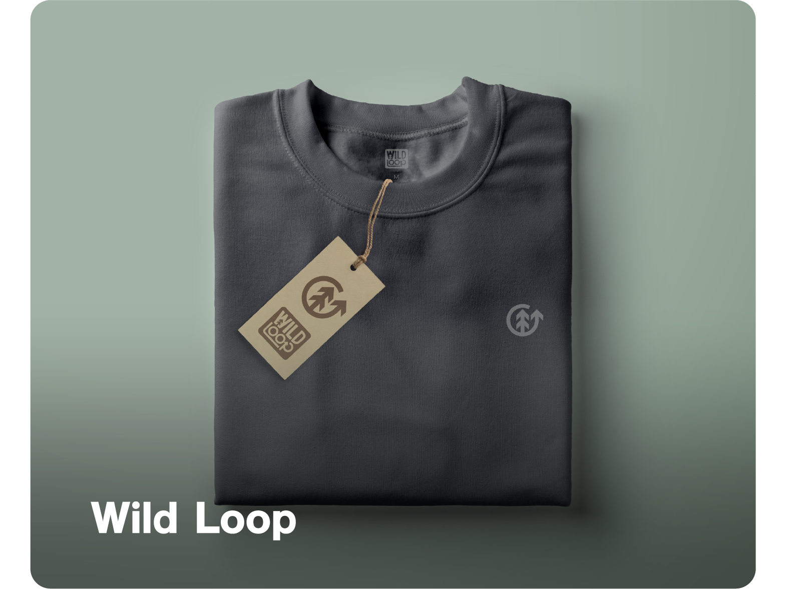
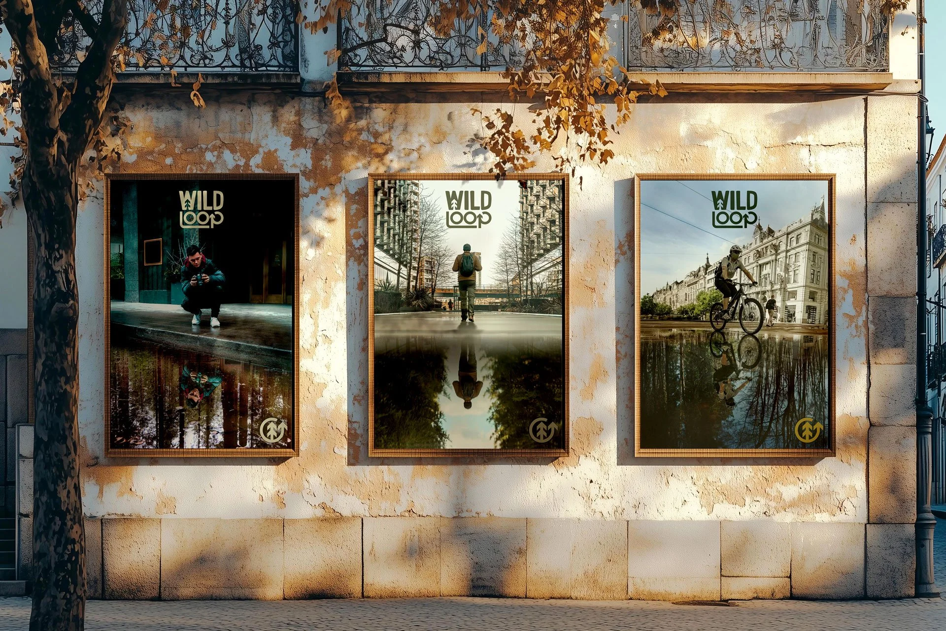
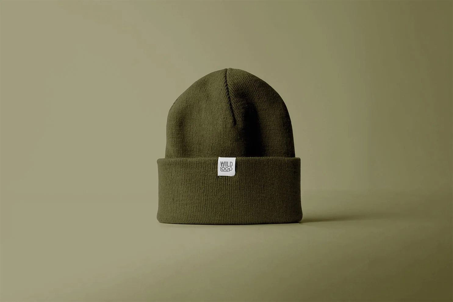
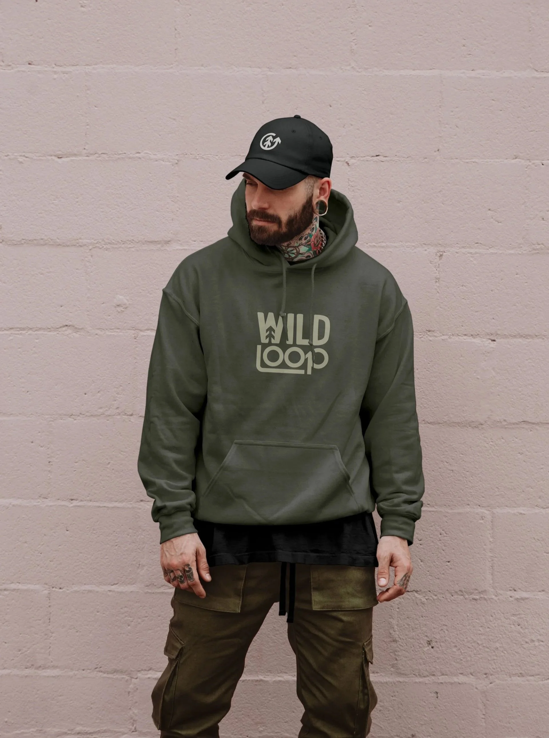
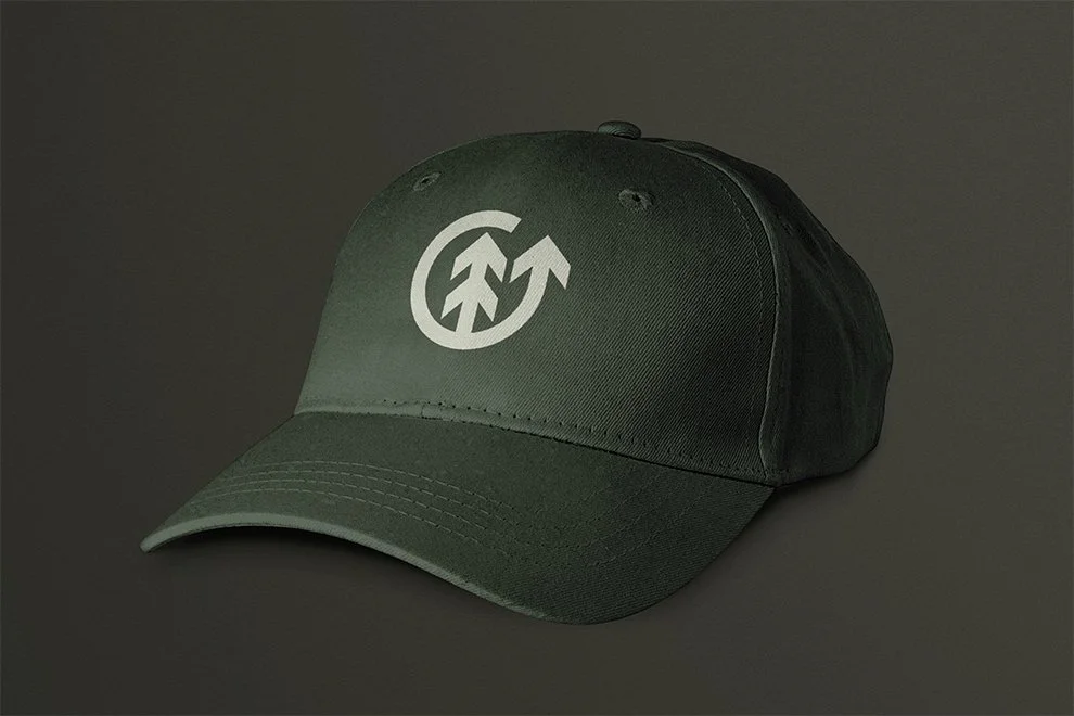
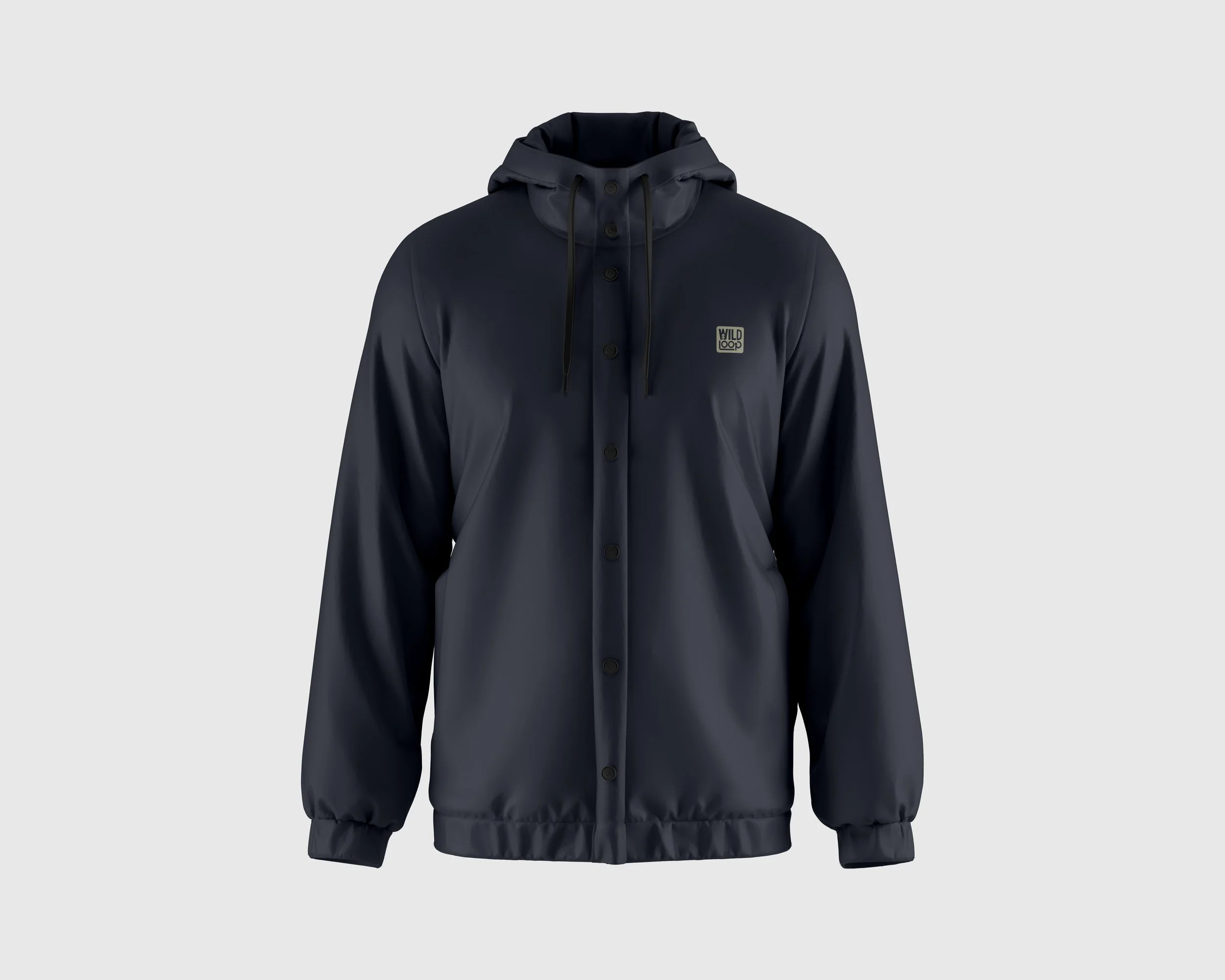
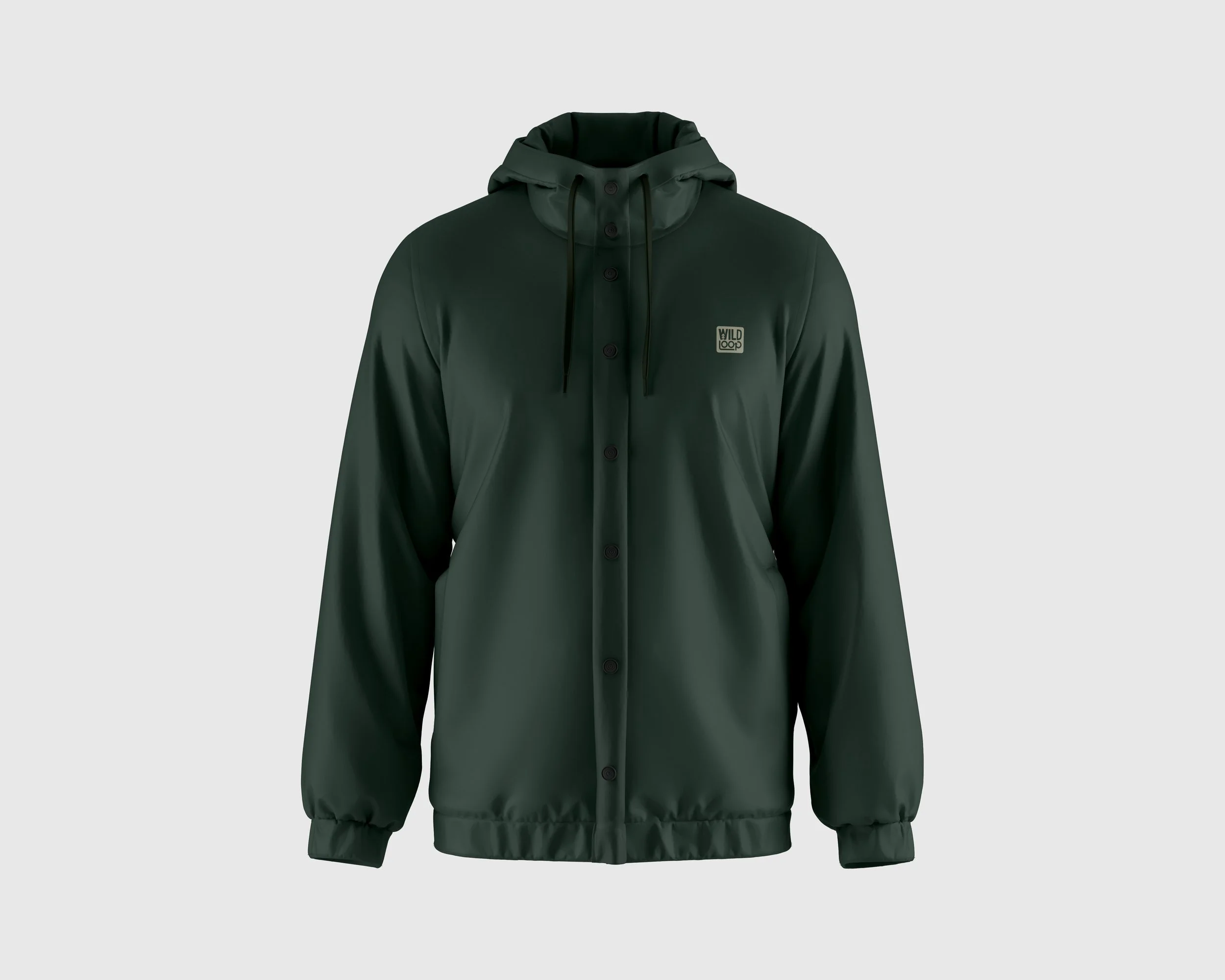
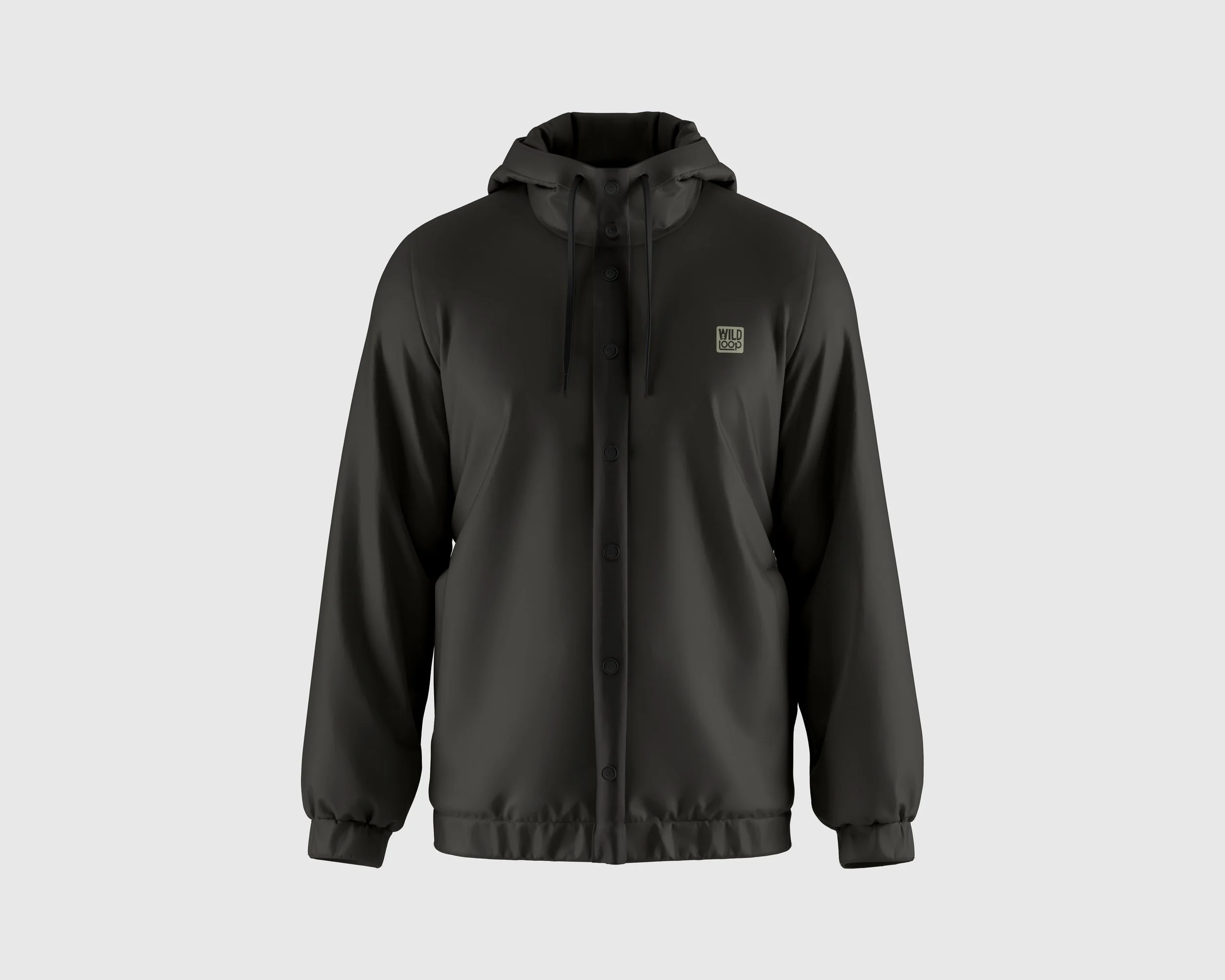
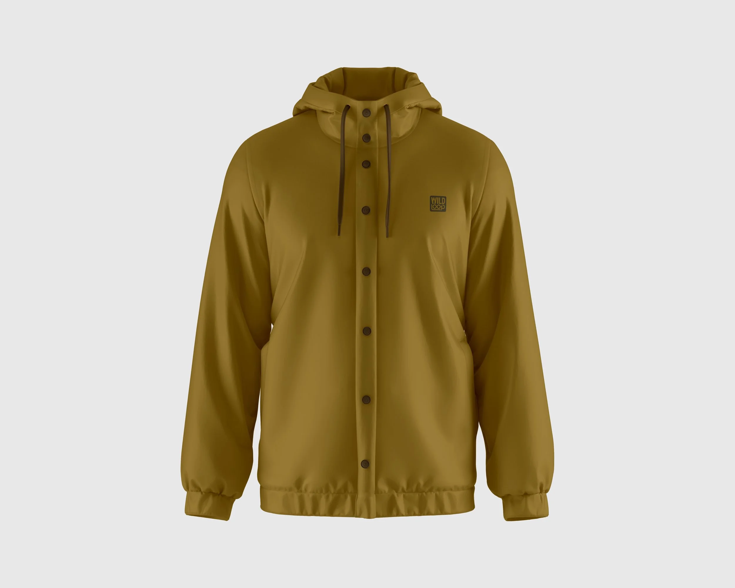
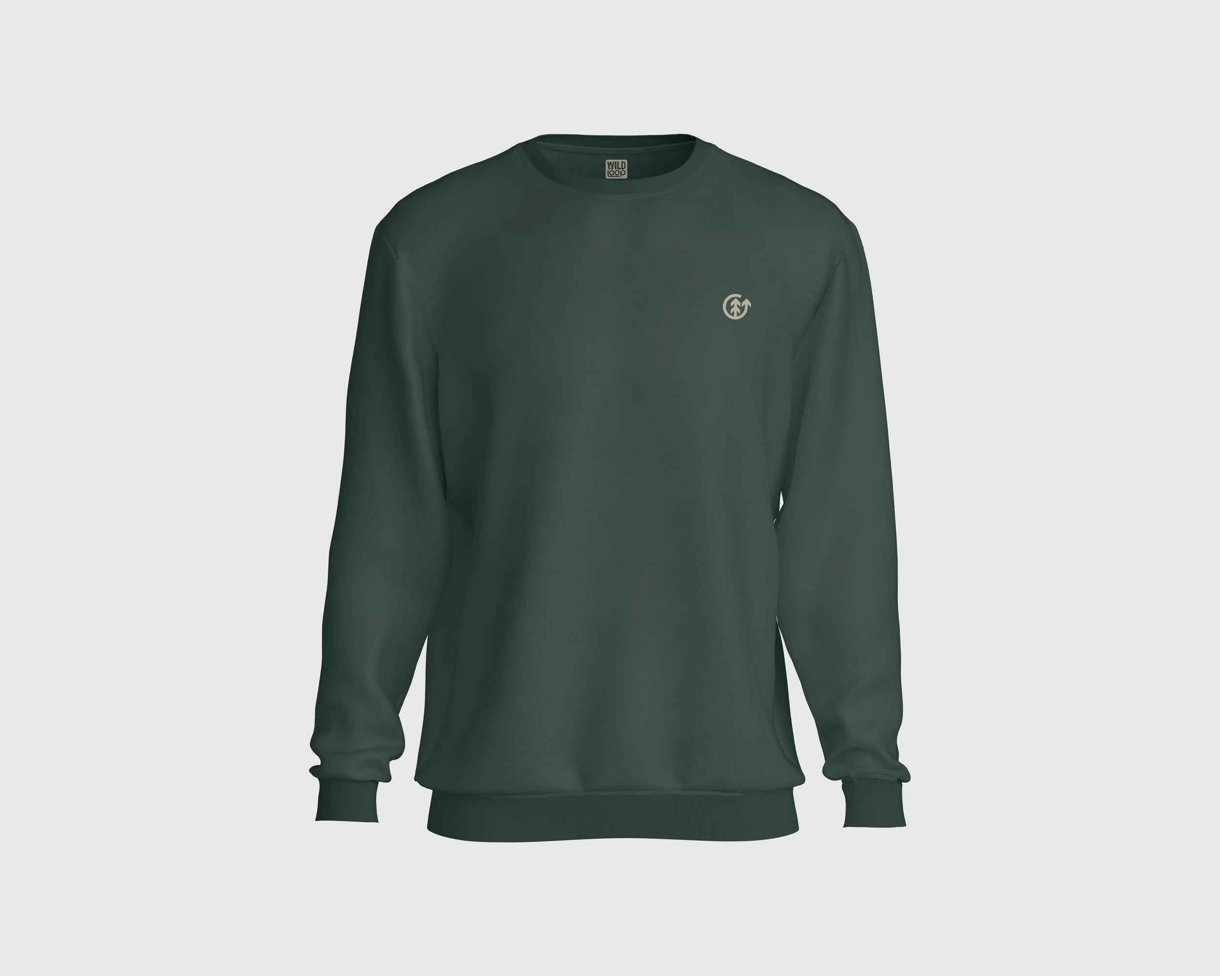
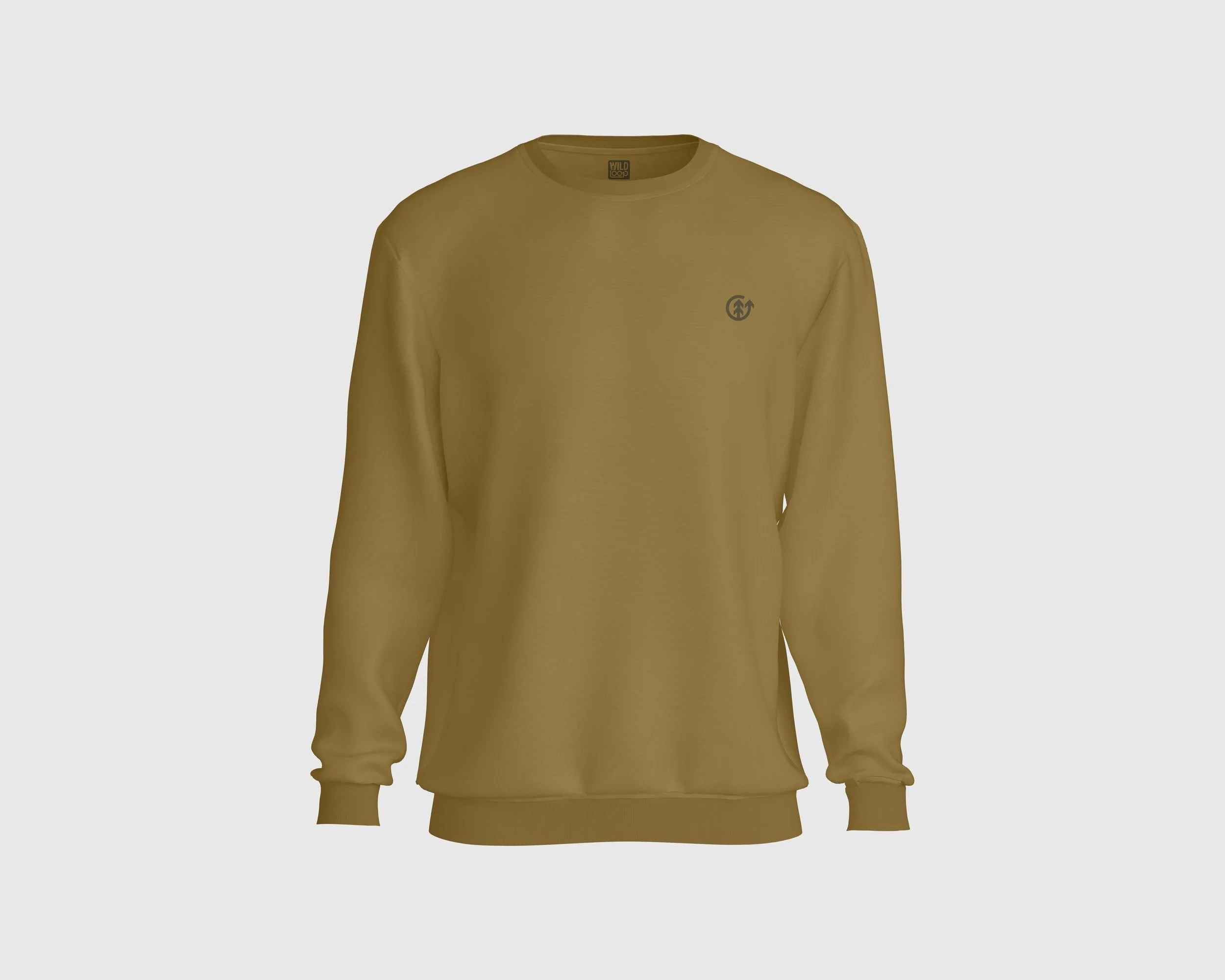
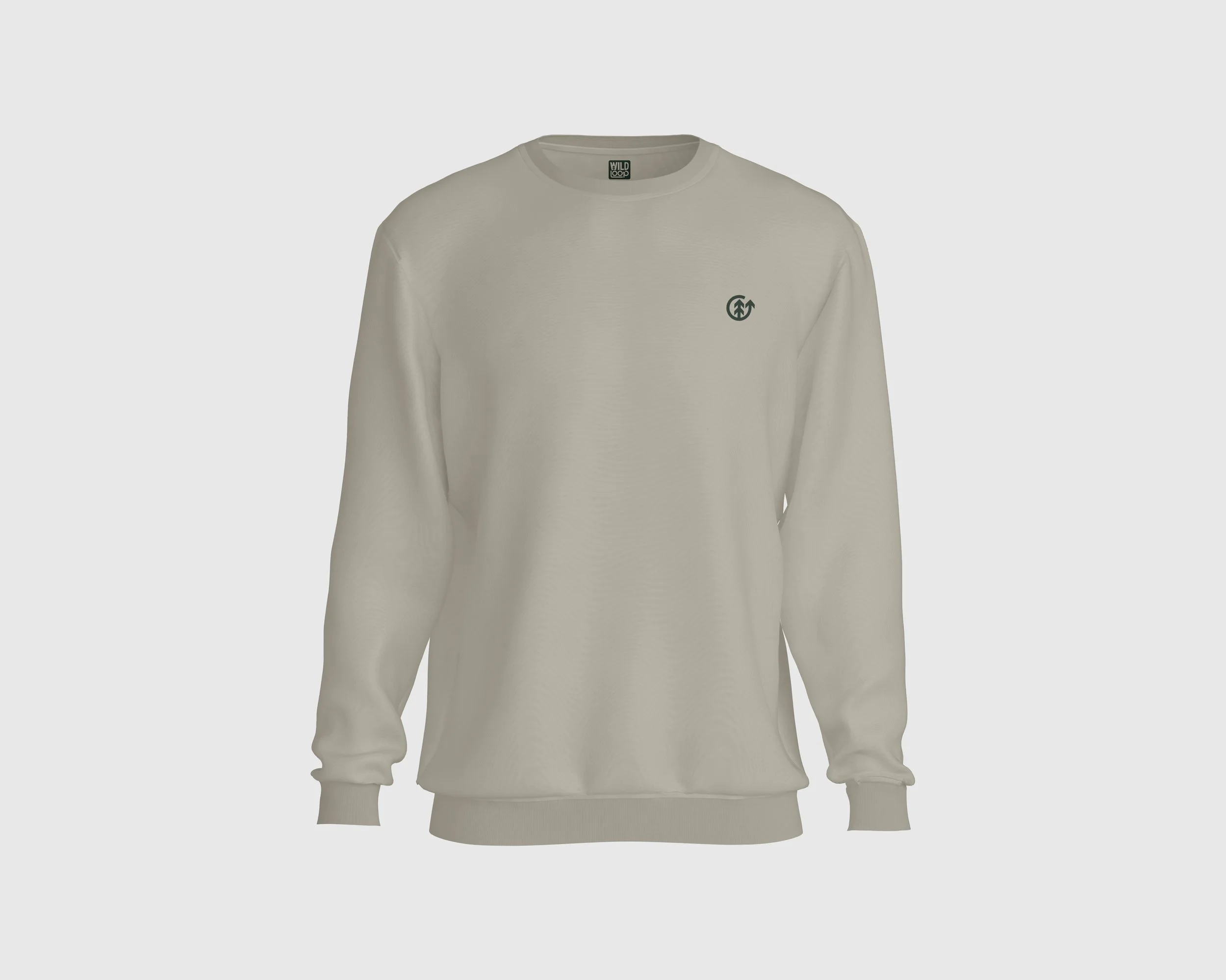
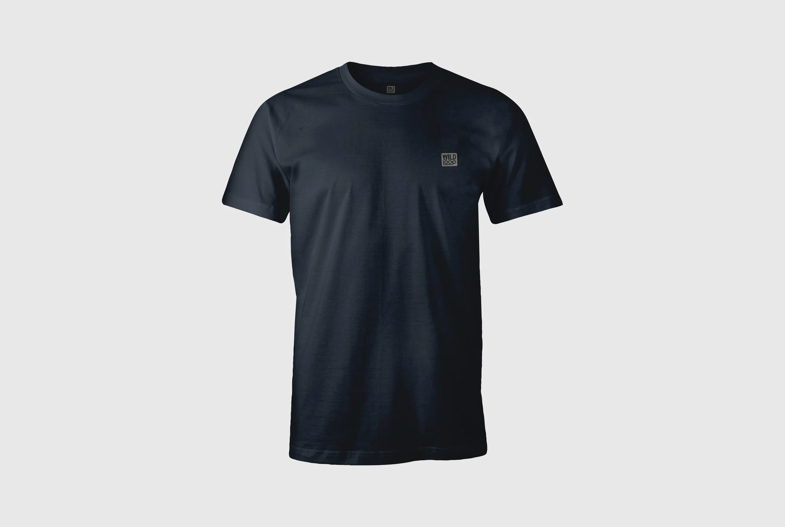
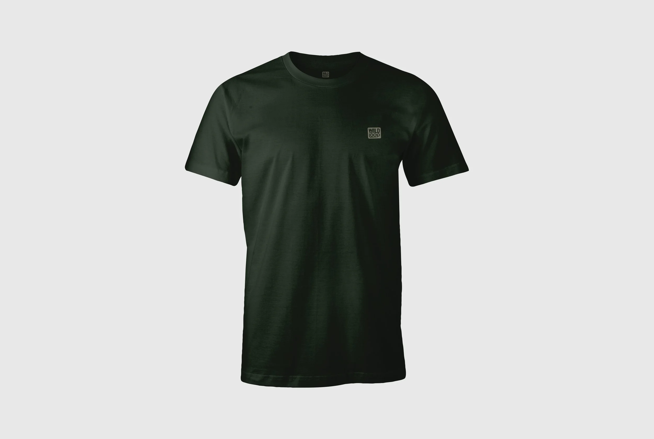
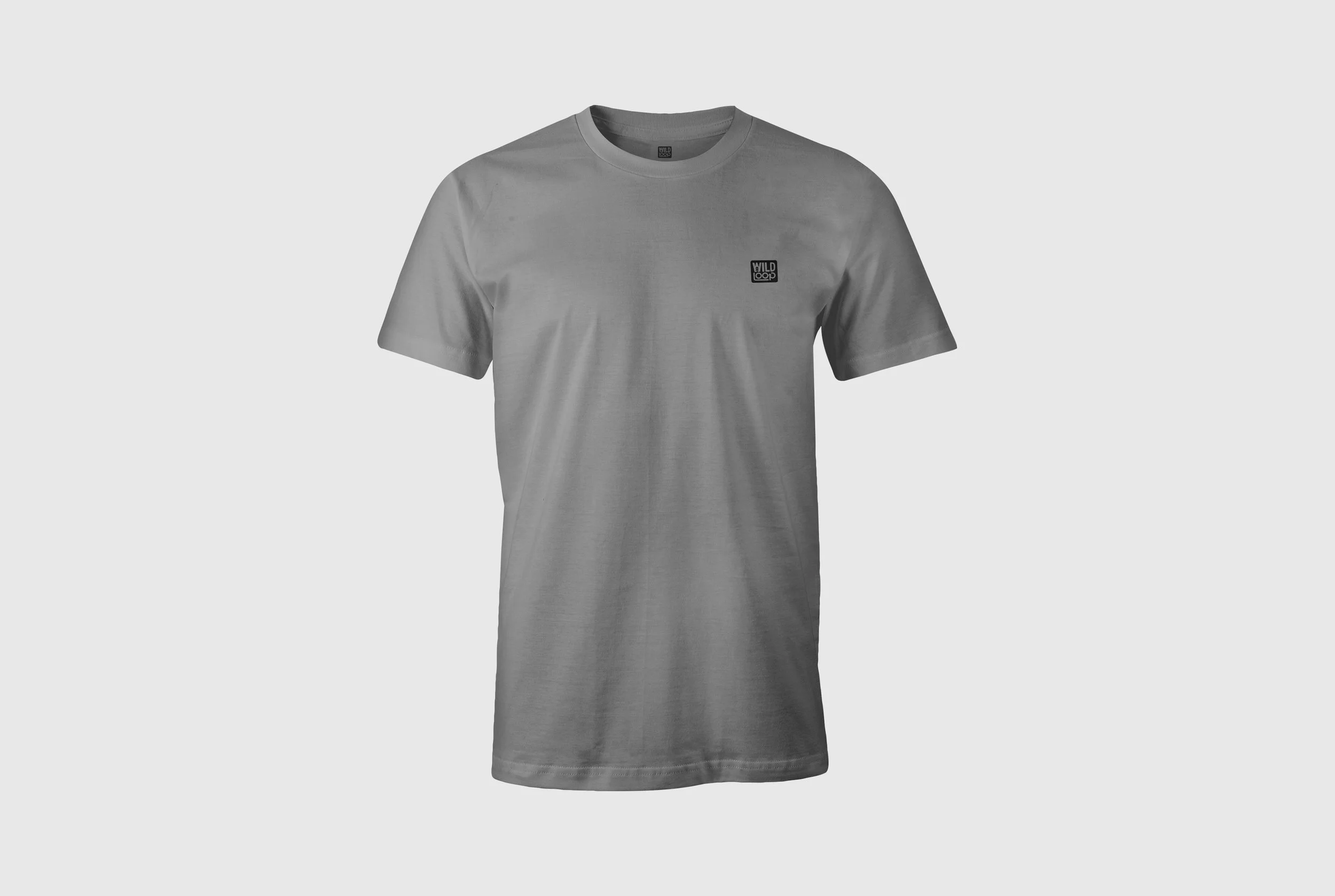
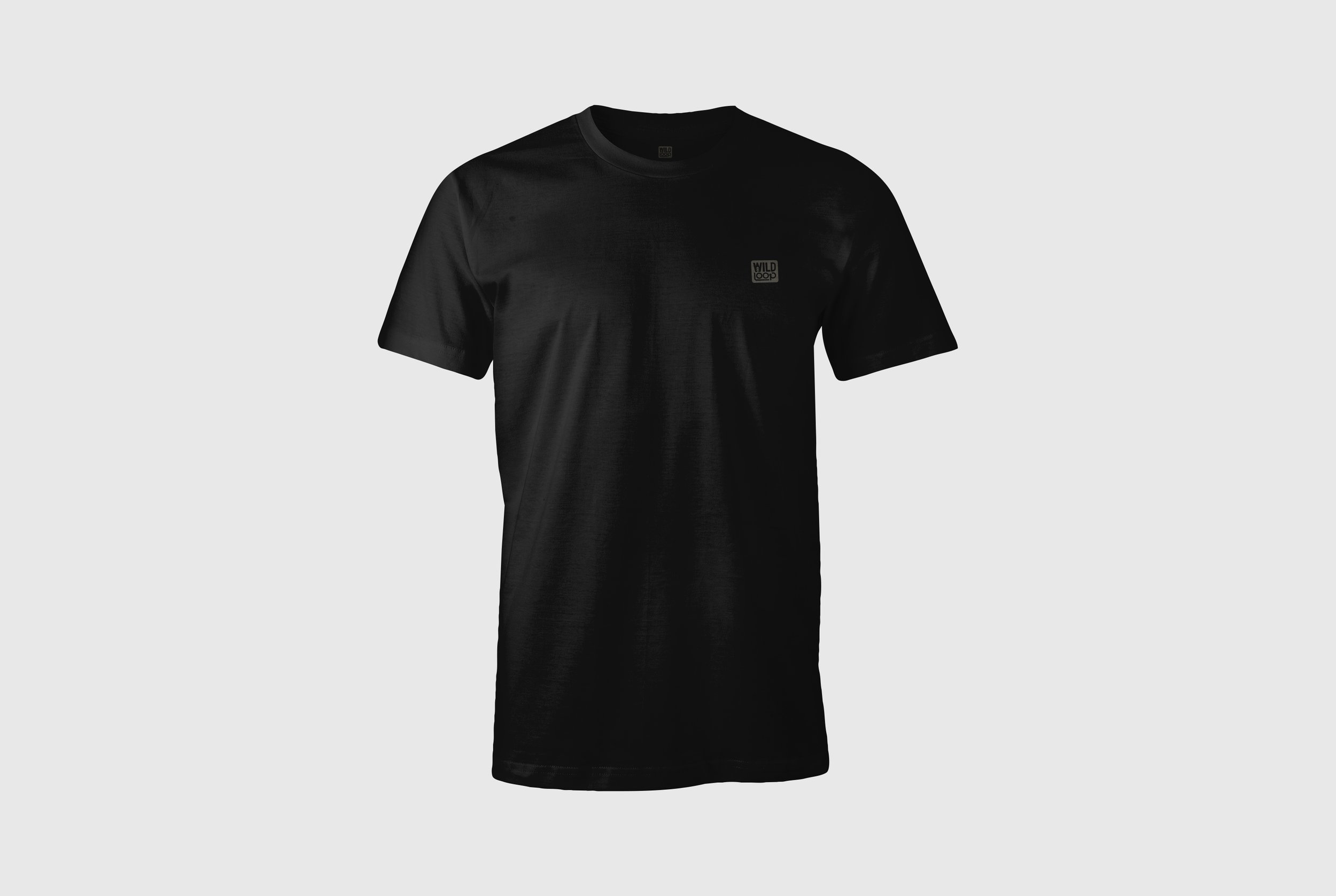
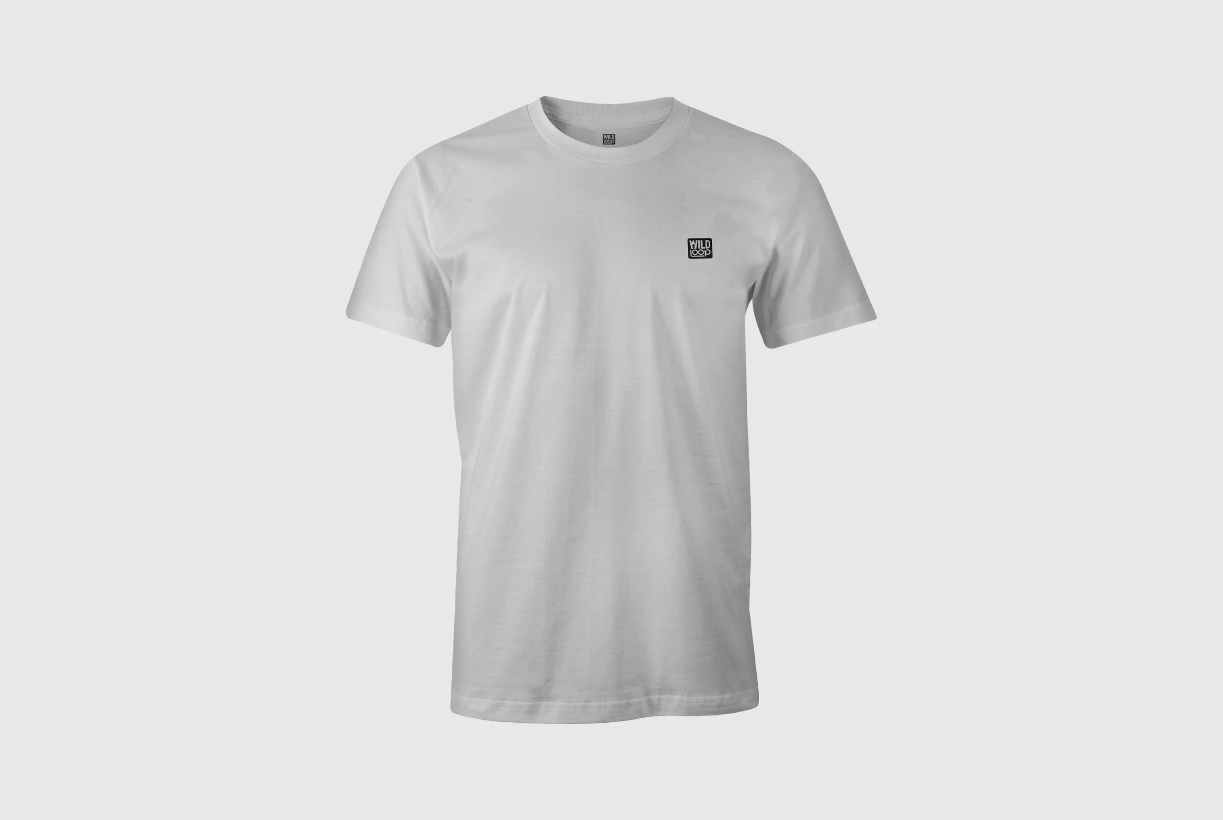
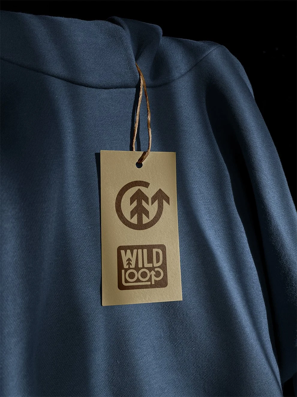
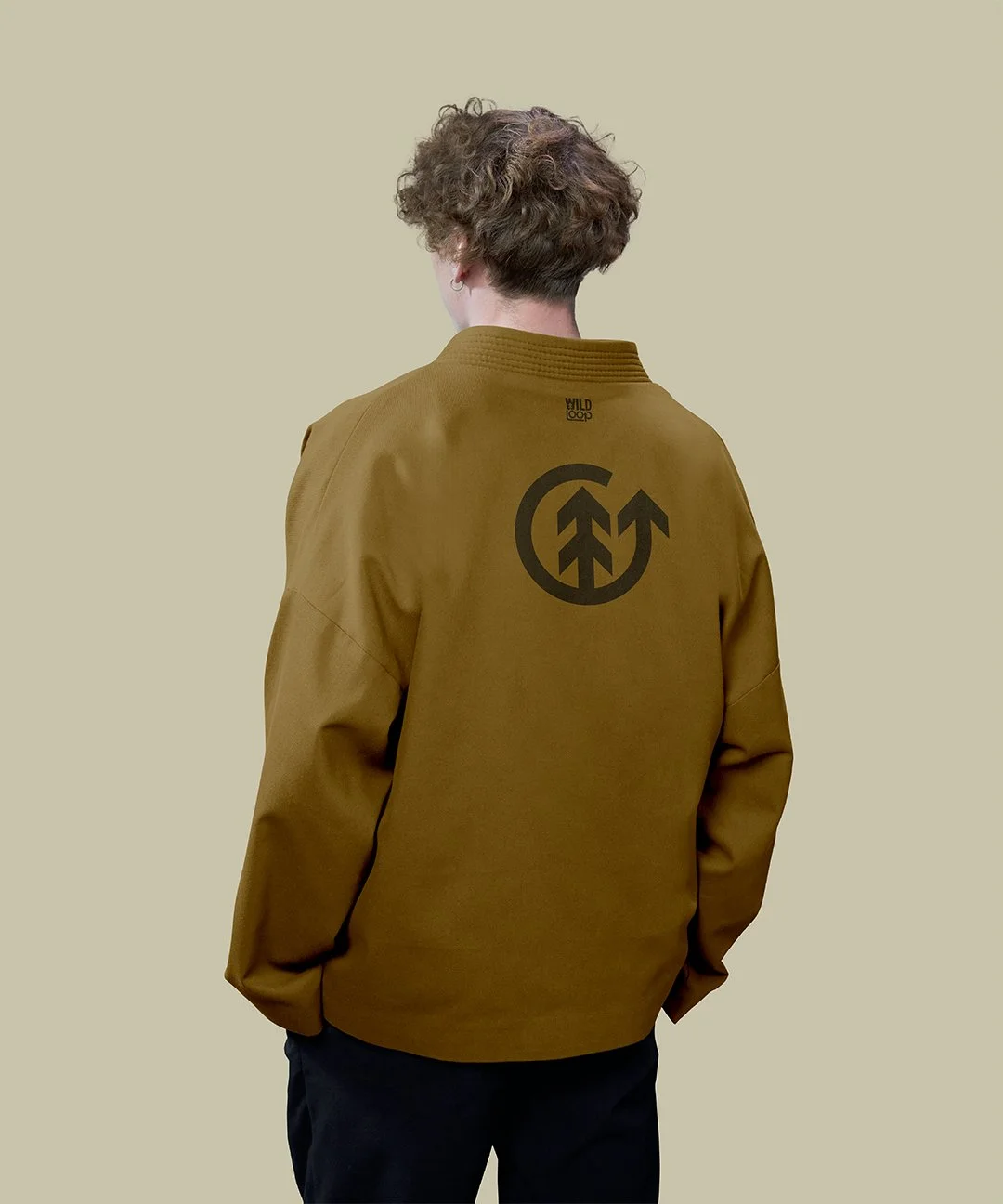
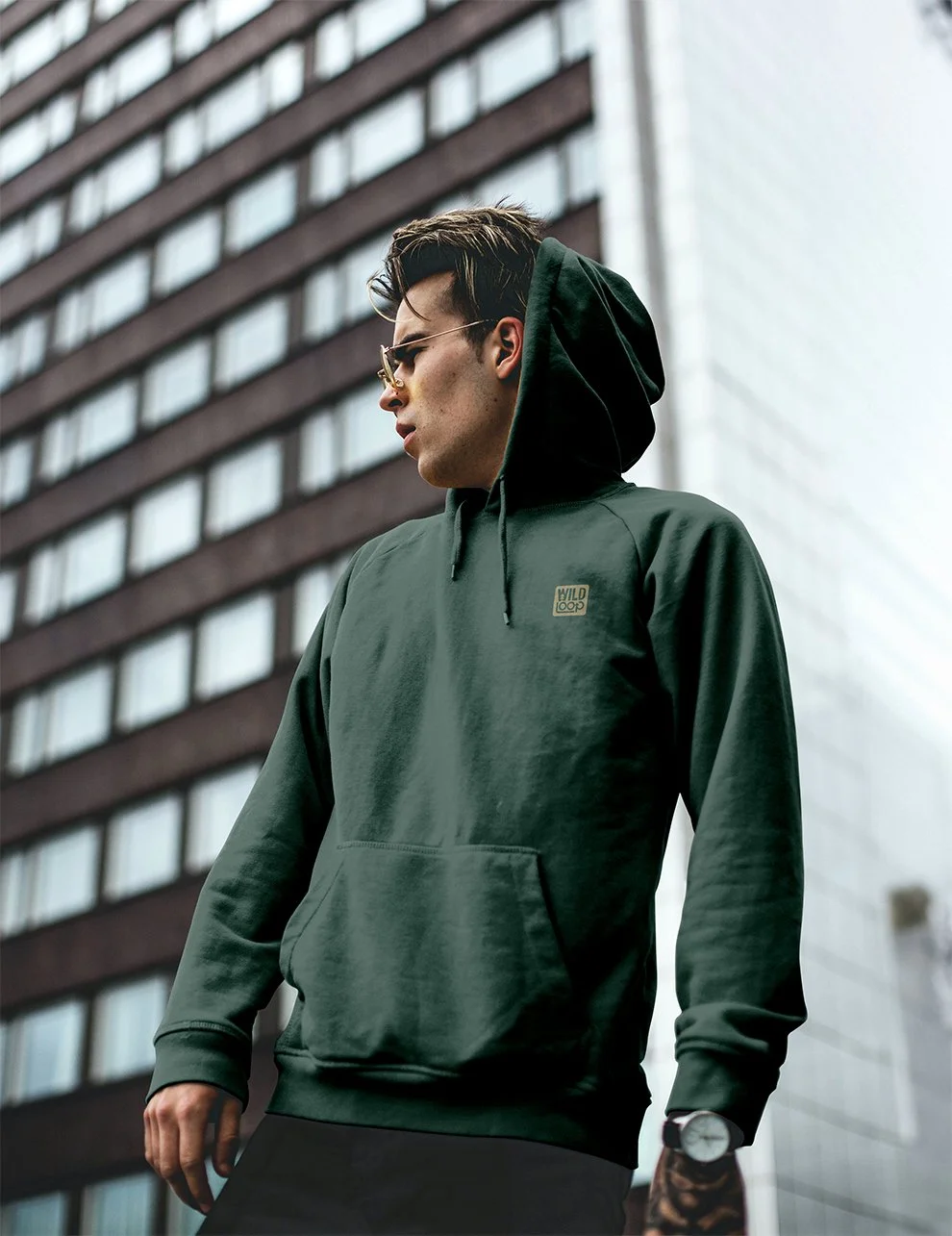
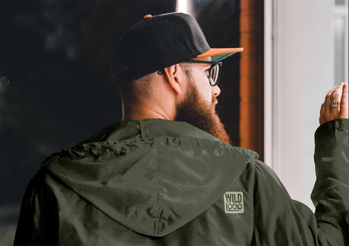
The idea only really proves itself once it’s applied. Seeing the identity on clothing was the point where everything either held up or fell apart. It had to feel natural in that space. Not overdesigned, not forced, just something that fits in with this audience and how they dress.
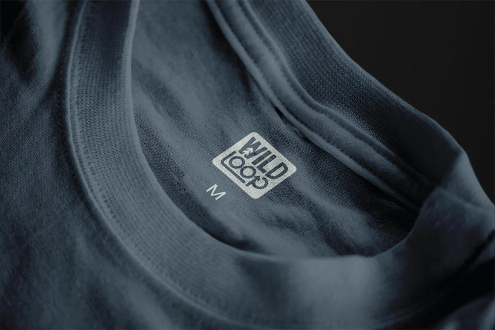
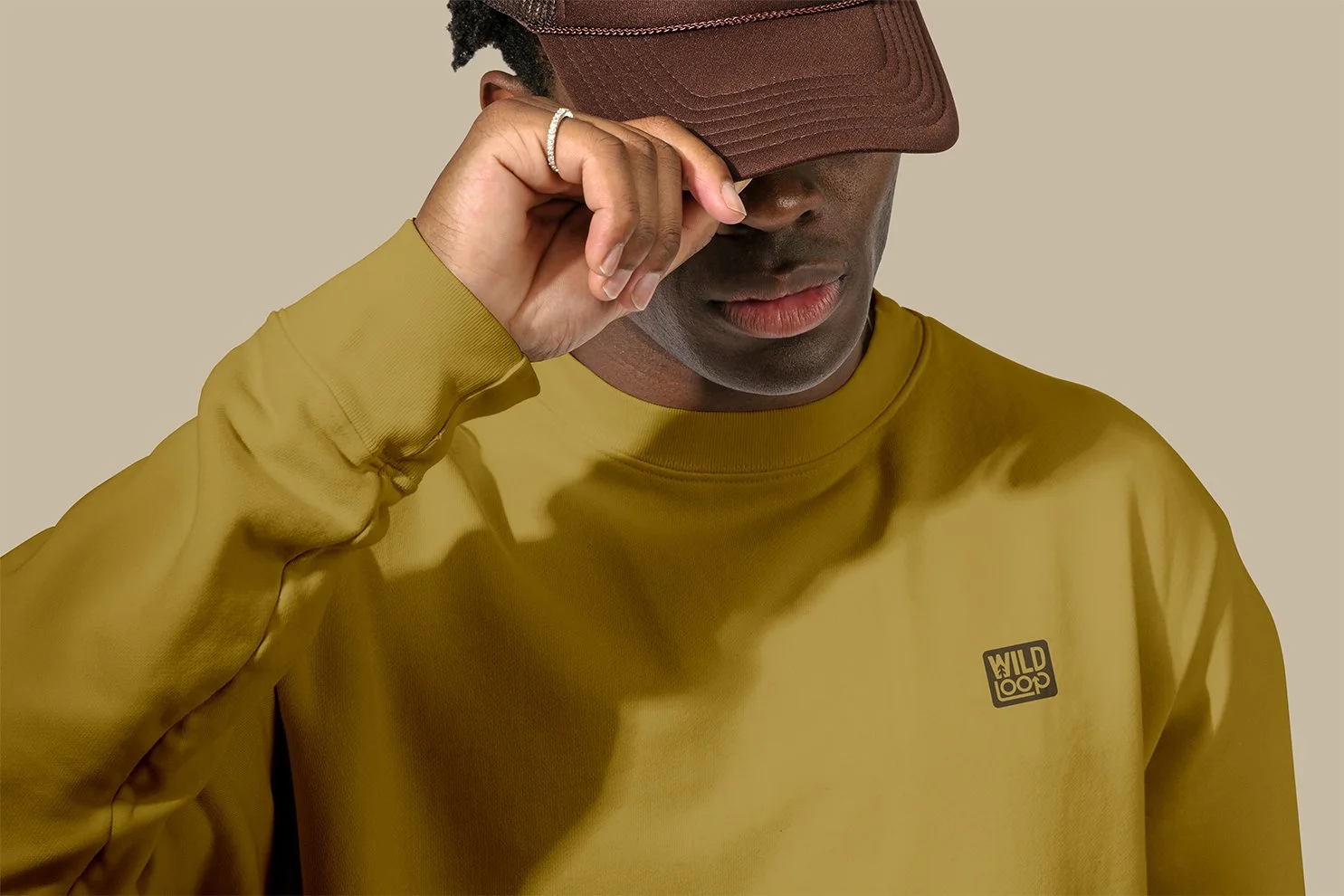
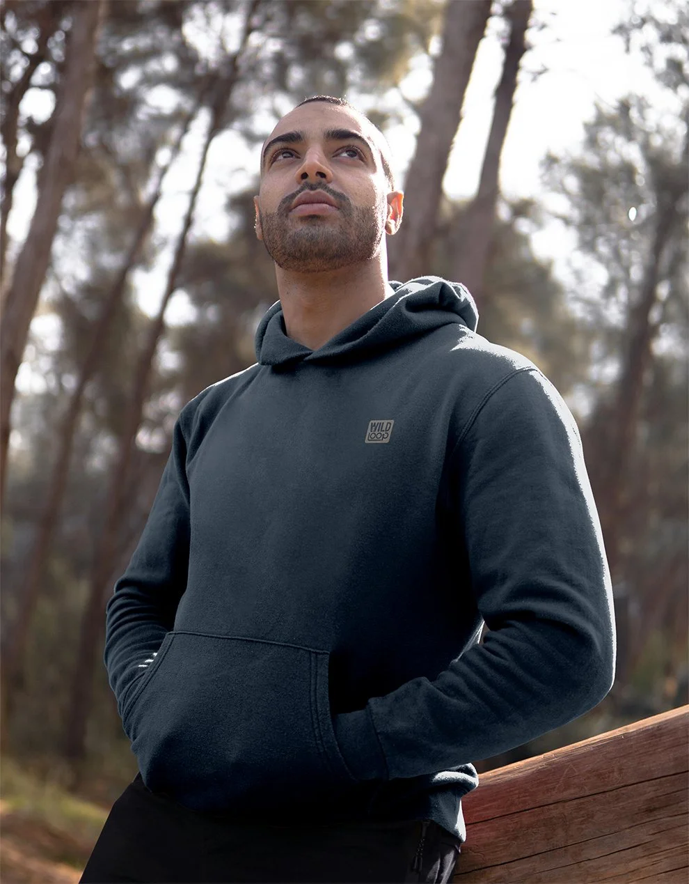
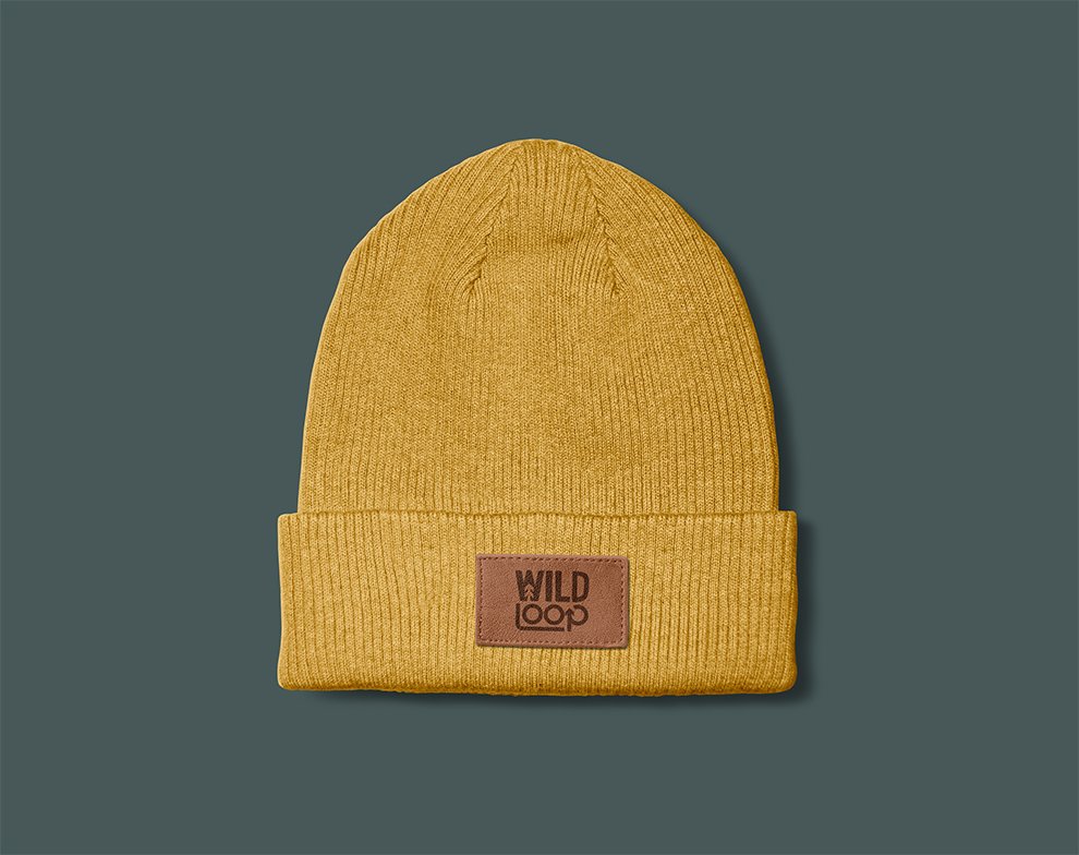
The logo was shaped with that in mind. There’s a sense of movement in it, but it’s controlled. It doesn’t rely on complexity to communicate the idea, which makes it easier to carry across different materials, whether it’s printed or embroidered. The colour palette follows the same thinking. It draws from the wilderness, but avoids leaning too heavily into it. Nothing feels overly rugged or out of place in an urban setting. The tones are grounded, easy to combine, and flexible enough to mix and match whilst keeping contrast in mind. When applied across clothing, everything works together without needing to shout. The logo, wordmark, and colour all hold their own, but still feel connected.
From a practical point of view, it was important that the identity translated cleanly across both print and screen. Whether it’s on a cap, a social post, or part of a wider campaign, it stays clear and consistent. It’s a system that doesn’t rely on one setting to work. It moves between them, just like the people it’s designed for.
The idea only really proves itself once it’s applied. Seeing the identity on clothing was the point where everything either held up or fell apart. It had to feel natural in that space. Not overdesigned, not forced, just something that fits in with this audience and how they dress.
The logo was shaped with that in mind. There’s a sense of movement in it, but it’s controlled. It doesn’t rely on complexity to communicate the idea, which makes it easier to carry across different materials, whether it’s printed or embroidered.
The colour palette follows the same thinking. It draws from the wilderness, but avoids leaning too heavily into it. Nothing feels overly rugged or out of place in an urban setting. The tones are grounded, easy to combine, and flexible enough to mix and match whilst keeping contrast in mind. When applied across clothing, everything works together without needing to shout. The logo, wordmark, and colour all hold their own, but still feel connected.
From a practical point of view, it was important that the identity translated cleanly across both print and screen. Whether it’s on a cap, a social post, or part of a wider campaign, it stays clear and consistent. It’s a system that doesn’t rely on one setting to work. It moves between them, just like the people it’s designed for.
Built to work wherever it’s worn


More projects worth exploring