Getting to the heart
of what’s really offered
Waggy Walks is a new dog-walking business that wanted to improve how they present themselves. They already had an idea for a logo, but it wasn’t quite landing. It felt more like a starting point than something that could properly represent themselves. So the focus shifted away from the logo itself and onto the bigger picture.
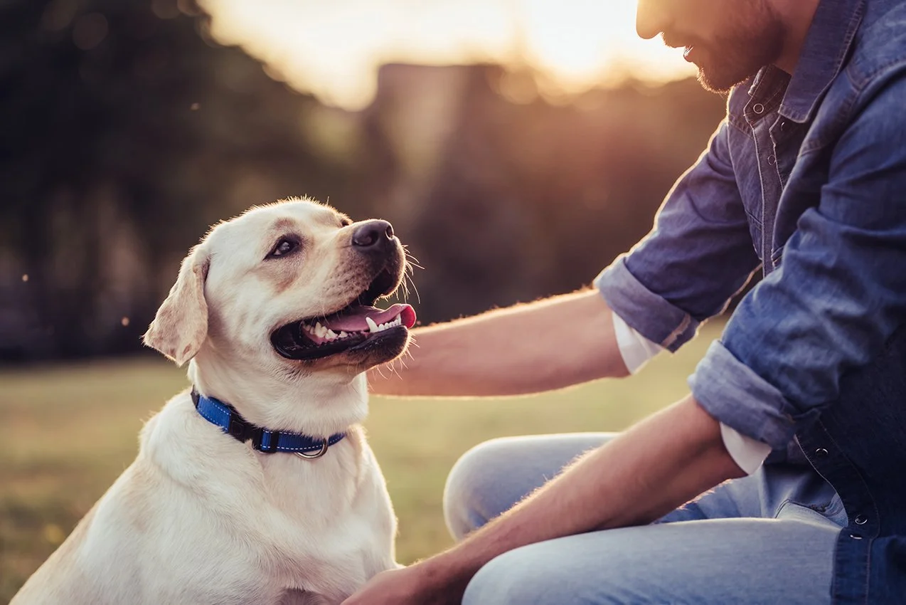
After talking things through, it became clear that the service goes beyond simply taking dogs out for a walk. For a lot of owners, time gets in the way. Walks get missed, routines slip, and the dog feels
the difference. That’s where Waggy Walks steps in. It’s not just about covering a task, it’s about giving dogs the exercise, attention, and time outside that they need. The result is a happier, more energetic dog, and peace of mind for the owner. That became the idea to build around.
Instead of focusing on the act of walking, the direction shifted toward what that walk actually delivers. A sense of happiness, energy, and care that feels immediate and easy to understand.
Waggy Walks is a new dog-walking business that wanted to improve how they present themselves. They already had an idea for a logo, but it wasn’t quite landing. It felt more like a starting point than something that could properly represent themselves. So the focus shifted away from the logo itself and onto the bigger picture.
After talking things through, it became clear that the service goes beyond simply taking dogs out for a walk. For a lot of owners, time gets in the way. Walks get missed, routines slip, and the dog feels the difference. That’s where Waggy Walks steps in.
It’s not just about covering a task, it’s about giving dogs the exercise, attention, and time outside that they need. The result is a happier, more energetic dog, and peace of mind for the owner. That became the idea to build around.
Instead of focusing on the act of walking, the direction shifted toward what that walk actually delivers. A sense of happiness, energy, and care that feels immediate and easy to understand.
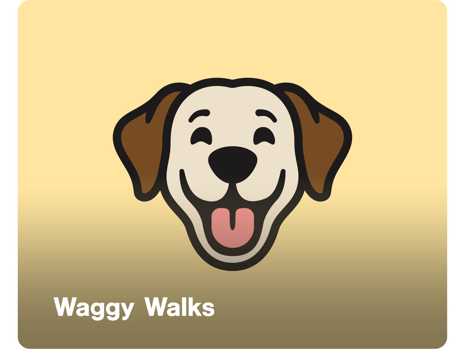
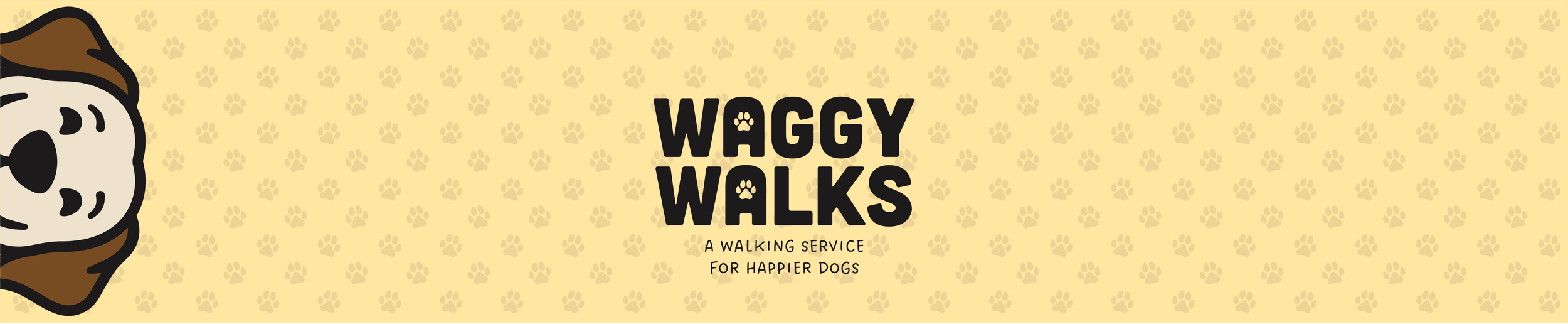
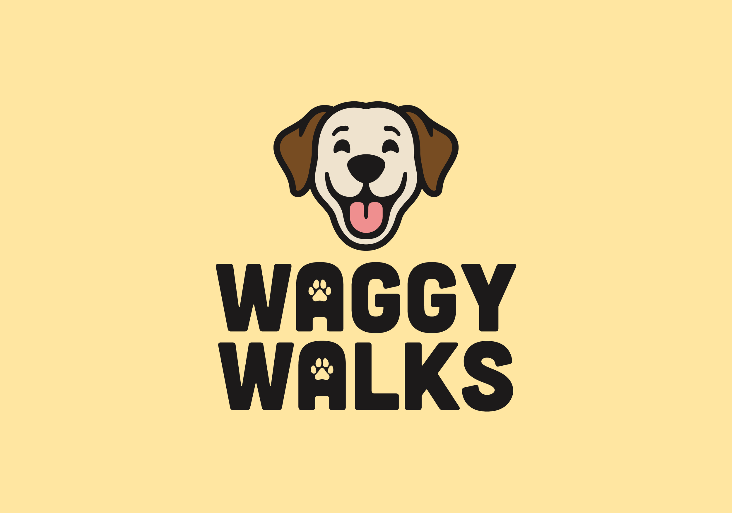
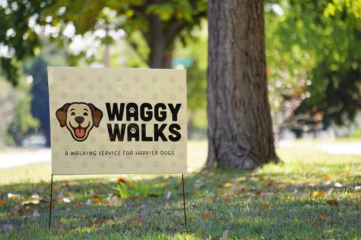
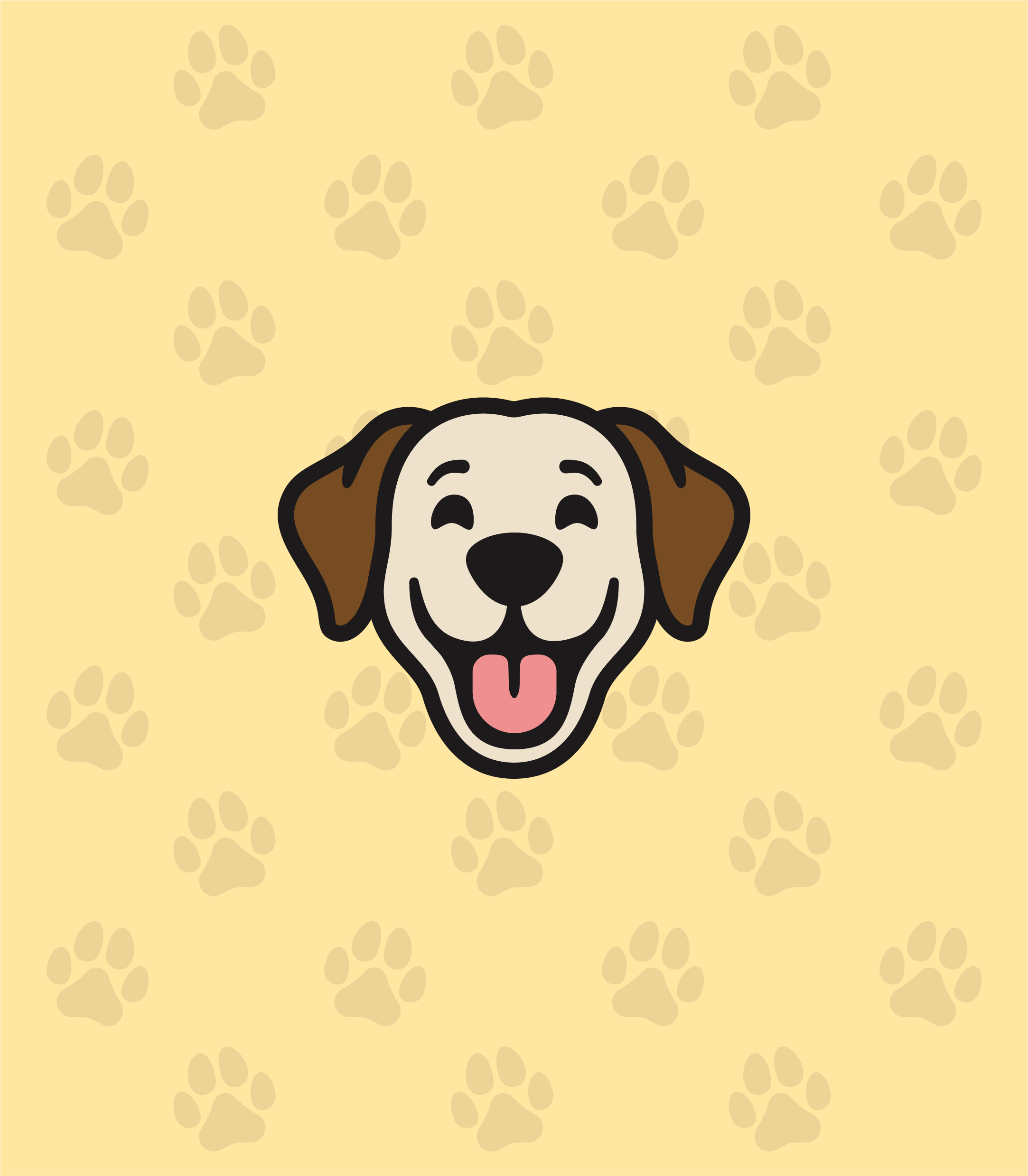
With a clear direction in place, the focus moved onto the logo. A lot of dog-walking brands tend to fall into the same visual space. Paw prints, silhouettes, and fairly safe ideas that do the job, but don’t really stand out. That was something I wanted to avoid from the start.
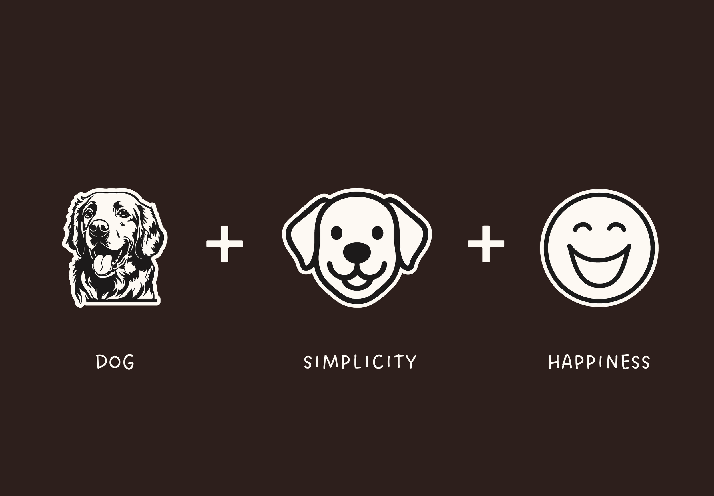
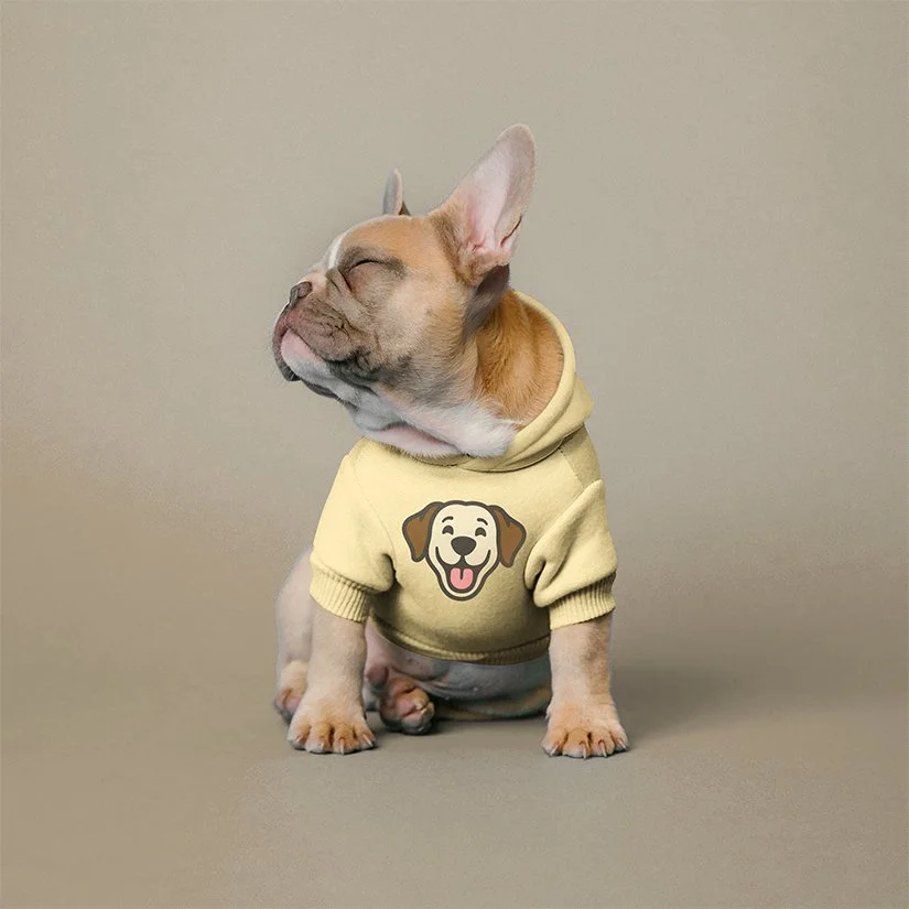
The aim was to create something simple, but with enough personality to reflect what the brand is really about. And this is where the idea came from for what is now The Happy Dog.
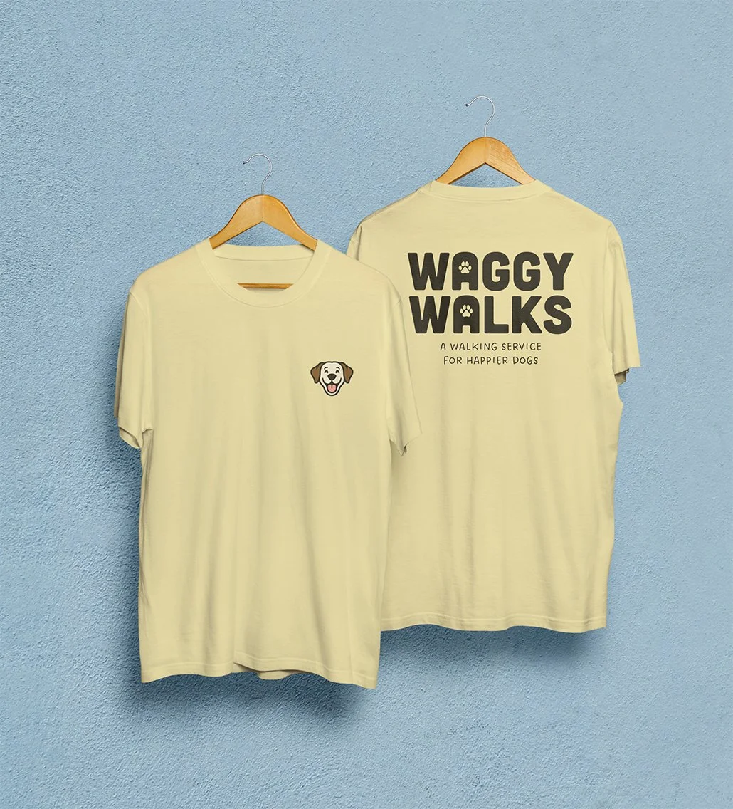
Rather than focusing on detail, the symbol is built around expression. It’s a simplified form, but one that clearly communicates energy, friendliness, and joy. The kind of feeling you associate with a dog that’s been properly looked after. The character itself takes cues from a golden retriever. Known for being friendly, confident, and full of energy, it felt like the right reference point. That same sense of warmth and approachability is what the identity aims to pass on to customers.
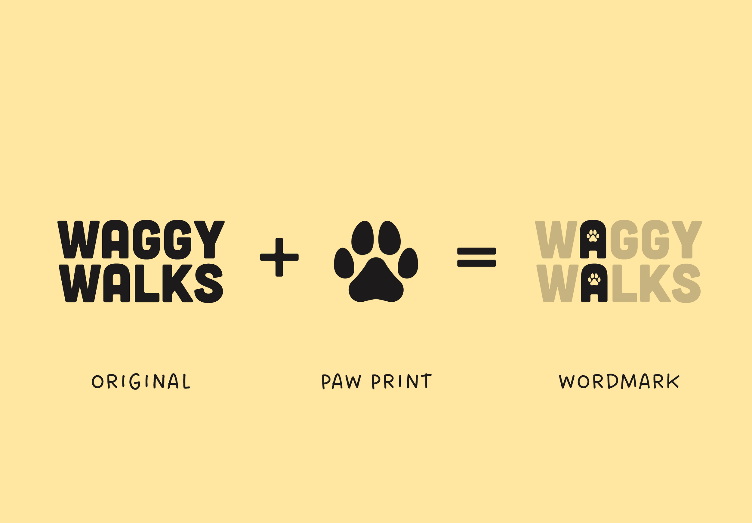
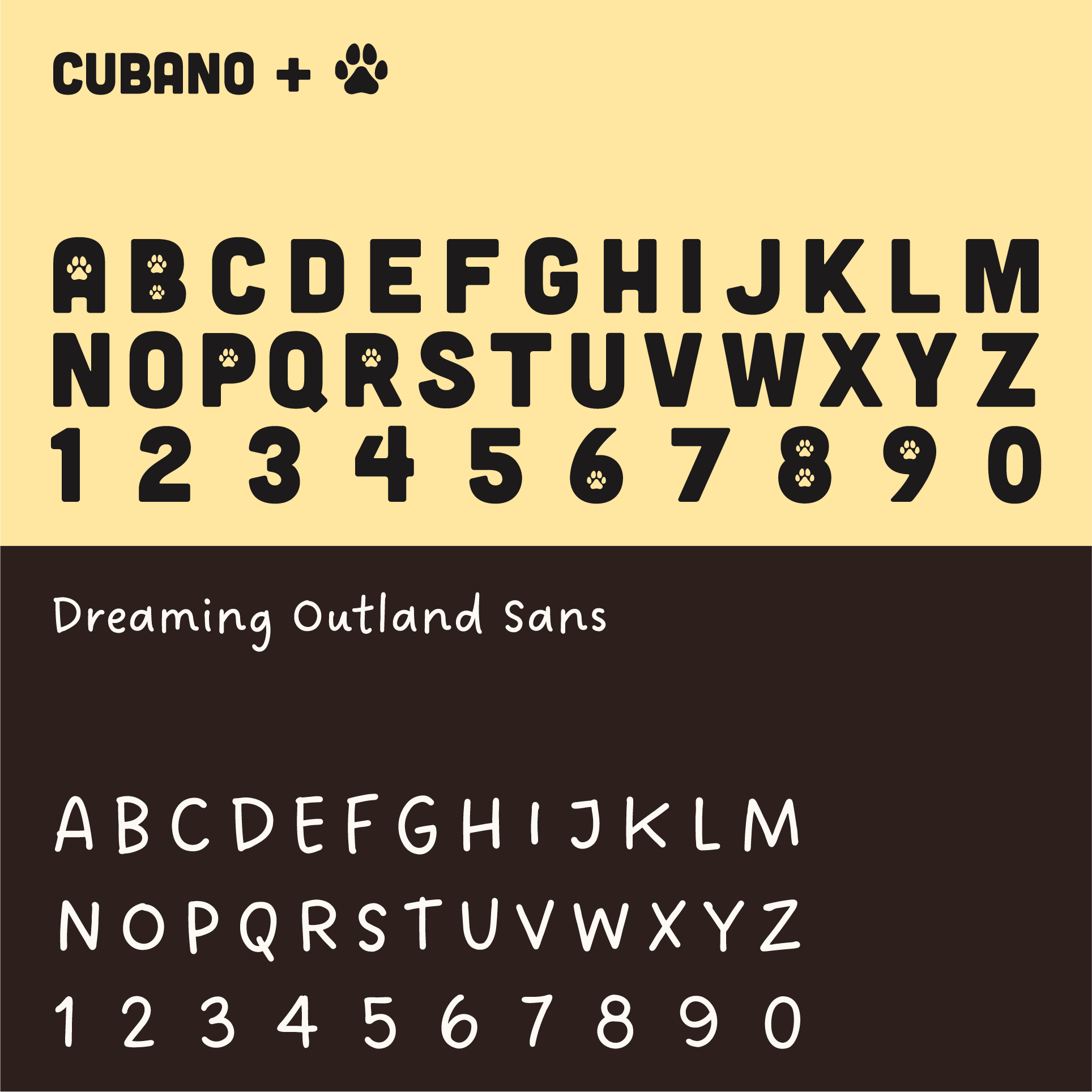
From there, the wordmark needed to carry that same energy. A bold, rounded all-caps typeface gave it confidence and presence, while subtle modifications helped tie it back to the idea.
Small paw print details were introduced into the lettering, giving it character without making it feel overcomplicated. This meant the wordmark can stand on its own when needed, while still holding onto the personality of the wider identity.
Building a logo that captures
feeling, not just the service
With a clear direction in place, the focus moved onto the logo. A lot of dog-walking brands tend to fall into the same visual space. Paw prints, silhouettes, and fairly safe ideas that do the job, but don’t really stand out. That was something I wanted to avoid from the start.
The aim was to create something simple, but with enough personality to reflect what the brand is really about. And this is where the idea came from for what is now The Happy Dog.
Rather than focusing on detail, the symbol is built around expression. It’s a simplified form, but one that clearly communicates energy, friendliness, and joy. The kind of feeling you associate with a dog that’s been properly looked after. The character itself takes cues from a golden retriever. Known for being friendly, confident, and full of energy, it felt like the right reference point. That same sense of warmth and approachability is what the identity aims to pass on to customers.
From there, the wordmark needed to carry that same energy. A bold, rounded all-caps typeface gave it confidence and presence, while subtle modifications helped tie it back to the idea. Small paw print details were introduced into the lettering, giving it character without making it feel overcomplicated. This meant the wordmark can stand on its own when needed, while still holding onto the personality of the wider identity.
Bringing the personality through
in every part of the brand
Bringing the personality through in every part of the brand
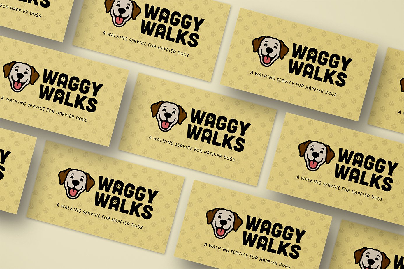
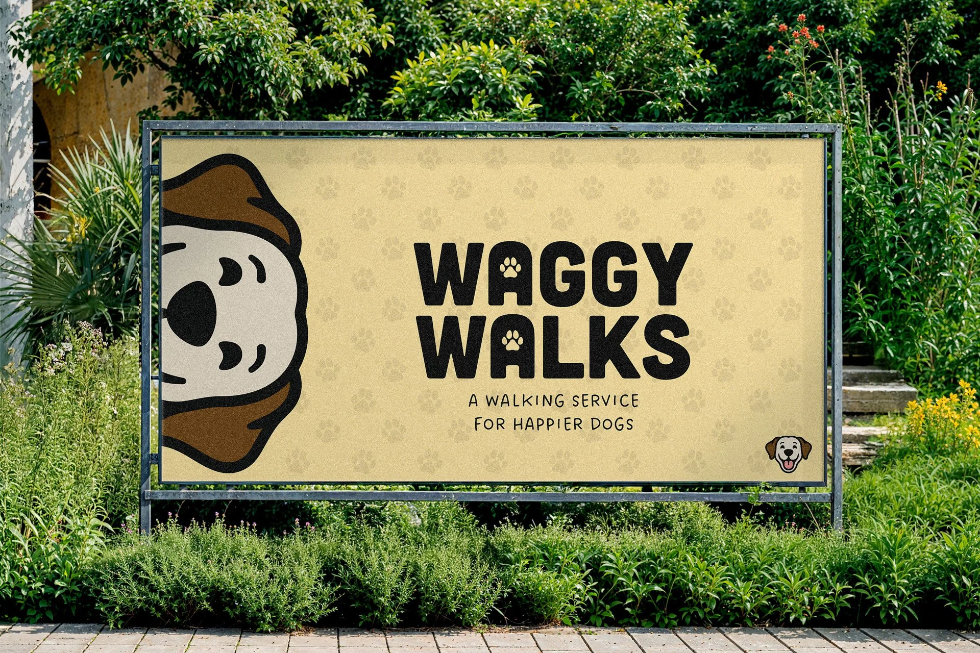
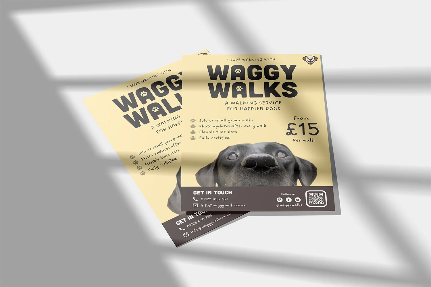
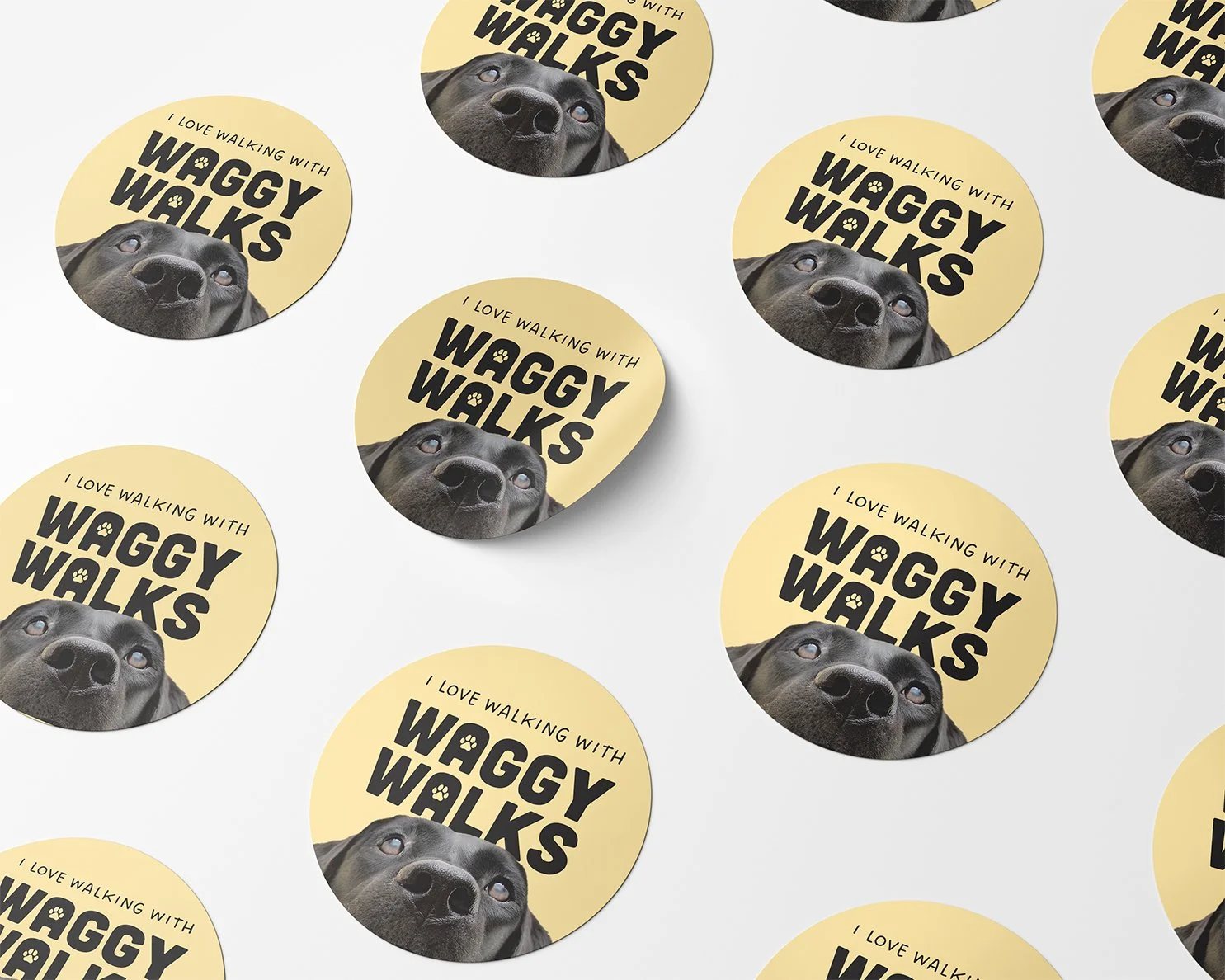
After the core identity was shaped, the focus shifted to bringing everything together in a way that feels clear and consistent. The tagline, “A Walking Service for Happier Dogs”, reinforces the idea in simple terms. It keeps things grounded and easy to understand, while still tying back to what the brand is really about.
A handwritten style was chosen to support that tone. It adds a sense of friendliness and approachability, making the brand feel more human and down to earth without losing clarity.
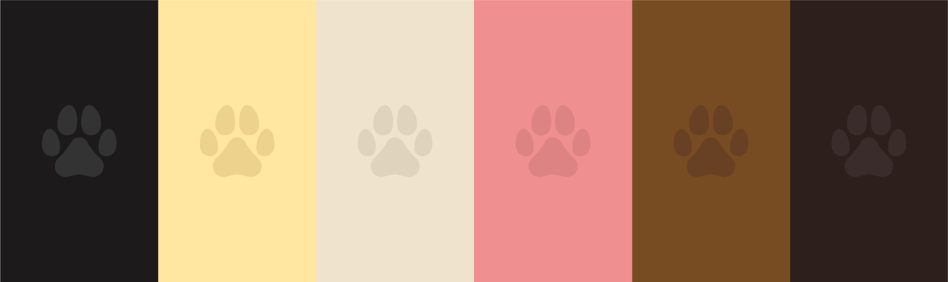
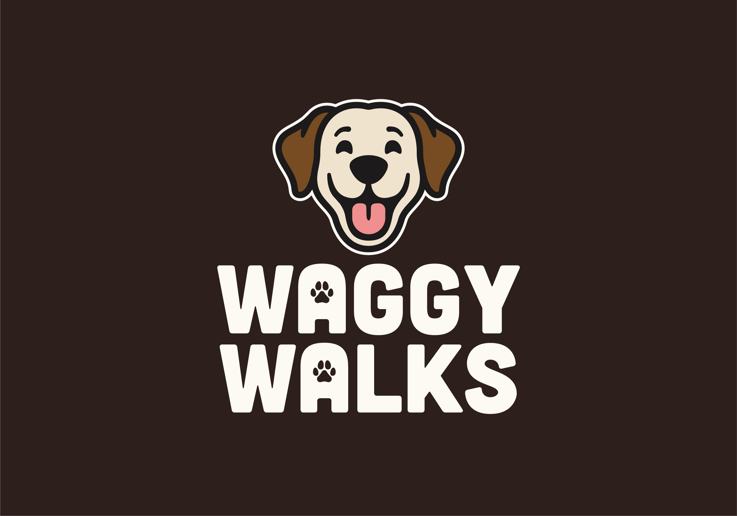
Colour plays its part as well. Warmer tones help create a sense of trust and energy, while still feeling a slight connection to the outdoors. It’s a balance that keeps the brand feeling both natural and confident. When everything comes together, the identity feels cohesive and easy to recognise. The logo, wordmark, typography, and colour all work in the same direction, giving the brand a clear voice without complicating it.
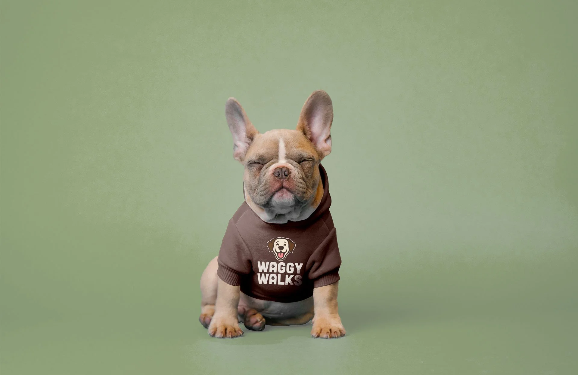
From there, it was about making sure it works in the real world. The identity was applied across social media, print, and supporting materials to help the business get started properly. Whether it’s on a screen or in someone’s hand, it hold’s a strong presence.
The result is a brand that stands out, feels approachable, and communicates exactly what it needs to. It gives people confidence in the service, and makes it clear what Waggy Walks is there to do.
After the core identity was shaped, the focus shifted to bringing everything together in a way that feels clear and consistent. The tagline, “A Walking Service for Happier Dogs”, reinforces the idea in simple terms. It keeps things grounded and easy to understand, while still tying back to what the brand is really about.
A handwritten style was chosen to support that tone. It adds a sense of friendliness and approachability, making the brand feel more human and down to earth without losing clarity.
Colour plays its part as well. Warmer tones help create a sense of trust and energy, while still feeling a slight connection to the outdoors. It’s a balance that keeps the brand feeling both natural and confident. When everything comes together, the identity feels cohesive and easy to recognise. The logo, wordmark, typography, and colour all work in the same direction, giving the brand a clear voice without complicating it.
From there, it was about making sure it works in the real world. The identity was applied across social media, print, and supporting materials to help the business get started properly. Whether it’s on a screen or in someone’s hand, it hold’s a strong presence.
The result is a brand that stands out, feels approachable, and communicates exactly what it needs to. It gives people confidence in the service, and makes it clear what Waggy Walks is there to do.


More projects worth exploring